HTC p3600 review – a powerful communicator with a sensory screen
HTC p3600, the new communicator is in front of me. I don’t know much about it yet. But I already see that the device is powerful, beautiful and very comfortable to use…But only for those, who favor the Windows Mobile system. I do not consider myself a supporter of the Microsoft mobile solutions and I look at the communicator from aside (not to say from an opposing side). Nevertheless, I have to bow my head before the p3600 capabilities. There is so much in this mobile phone that I am not sure there is anything to add. Maybe, a sliding keyboard, although, it will be a different communicator, then…
Yes, the p3600 is a great device. I see some of its disadvantages, but all of them are far-fetched and have nothing to do with the real nature of things. What do you want from a Symbian smarts fan anyway? I won’t sprinkle my head with ashes nor will I throw out my smart phone. This won’t happen. And I won’t transfer to WM either. So what will happen, then? A few happy days of testing this charming baby with grumbling to follow – oh, those constant problems with that MS. Don’t believe those sad voices. This device is perfectly fine. And I won’t find any essential disadvantages in it. This is for sure as I am writing the review after I’ve tested it. Even though, I’ve honestly tried my best to find anything that would defile the system and this specific communicator.
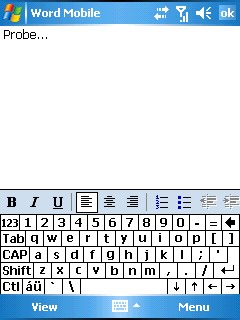
There is one more thing, though. I’ve got a pre-production model that completely lacks russification. The commercial model will be russified – on the system level. The only discomfort is that I can’t type in Russian using the device. Otherwise… I would use it to write the review. Well, it has an external keyboard. Install the driver, open the Pocket Word and – there you go. The screen is surprisingly good. The by far larger screen of my pocket (standard, 3.5 inches diagonally) looks dull and ugly. Little pigeons can carry great messages...
I think I got carried away. A preface is a preface. We need some preliminary conclusions, general mood to set the rest of the work, so to speak. So, the preliminary conclusions. A recommendation, to be exact. Or a friendly advice. If you have a free eight hundred dollars lying around in your pocket and you wouldn’t be against buying yourself a new smart and the store has specifically the HTC p3600 (someday very soon, I hope) – don’t think long. Take out your wallet and buy this wonder. And don’t listen to me if I say something negative, but do if I say something good. Because this device is the one of the best on today’s market.
Please not that it’s not the best one, but one of the best. Why? Because there are no limits to perfection… Here are the preliminary conclusions. Although, the final ones will not be much different.
Very white, very bright
The plastic of the р3600 front and back panels reminded me my favorite iPod – the one with a fixed disk (not video, but the iPod itself, although it plays the video equally well). So I take out the player and put it beside the iPod. You won’t believe it – the same thing. The material is very similar. A milky glossy plastic that, from my point of view, has a phantom “three-dimension” quality to it – in the sense that it has a sort of thickness that you can see. As if the plastic is transparent with white paint on the inside… In short, it looks excellent.
Having in mind the scandals about iPod’s adherence to scratches, I have to note right away that it’s nonsense. To scratch the new Apple player is as hard as to scratch the wing of a new auto. You can easily do it with a nail, but you will have a hard time scratching it with your hand. And the plastic of the HTC communicator is firm and quite solid – if you treat the device with possible care without throwing it around. I give р3600 a solid A for the material of the frame panels.
Besides the white plastic, the frame also has a silver “belt” that embraces the communicator at the bottom and sides, and a surrounding button block. The situation is worse here. It’s plastic as well, with aluminum paint and rough by touch as the result. I didn’t try to scratch it (I felt bad), but I got a feeling that it’s easily done… Although, I haven’t seen one scratch. And I couldn’t scratch the silver plastic with my nails.
The communicator feels like a thick and quite solid “chocolate” in your hand. Stout, not very heavy or long – about a quarter smaller than a regular pocket PC, if you don’t pay attention to the thickness. The size is 108х58.2х18.4 mm, weighs 150 grams… The frame right away reminds me of my favorite Palms. This design is called “solid” there. You can take out the battery and exchange it for a new one (if the old one is dead) here, unlike the Palms. But I am talking about the feeling, not technology. The communicator seems to be really robust.
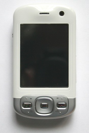
You can see a slit of the main phone speaker in the upper part of the front panel. A multicolored LED signal is located behind it (inside of it). It blinks green in the waiting mode and orange in charging and computer synch mode. I am not very used to such light indication, but I unexpectedly (for myself) liked very much. It blinks, so it’s alive…
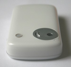
The window of the second camera lens is to the right, near the indicator. There is not much sense in it in the absence of a 3G net and, consequently, service of the television-telephone system. A VGA sensor, a lot of noise, although the picture on screen is quite fine… I turn it on first thing when I get my hands on a phone with two cameras. It’s interesting, after all. And if the picture of this camera is fine, then the main camera should be excellent. My intuition didn’t let me down in the р3600 case. There is a great camera in this communicator. It’s really great, I am not embellishing.
Sometimes in the mornings (while HTC р3600 is still here), I take the device into my hands. I turn on the second camera. Look at myself. And say – “How are you doing, man?” And he, the one in the communicator, sadly smiles at me. I guess he is not doing that good…
Well, yes. The camera window is covered by a tiny round glass. It is drowned into the front panel so the lens is protected from mechanical abrasions.
The sensor screen is located below, taking up the whole front panel. It is not that big, in comparison to the pocket PC screens – 2.8 inches diagonally (240х320 pixel resolution with an output of 65 thousand color shades). But the surface is hard, you can say that it’s even “glass” (why do I need the quotation marks, maybe it is glass?). The screen quality is staggering. Again, I am not embellishing. There is no sun during these dreary November days (who made them up?), but I think that the screen should not fade in bright light. The screen covering has very good sensitivity. The screen does not bend under the stylus; the picture does not go with rainbow shades. And I get the impression that the р3600 is also quite solid. It’s not very easy to scratch it with a stylus. And it’s obviously an advantage.
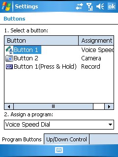
Control buttons… there are not many of them at the first glance. On the second – a whole lot. Take a look. You can see a joystick with an active (four positions) framing and central button. There are two more phone buttons to the left and to the right of it – answer and hang up. Is that all? No. A large silver cover plate around these buttons and the joystick consists of four more buttons. There are a couple of soft keys above, a system menu control (Windows Mobile analog of the “Start” button in big Windows) on the left and an OK button (it is another button for aborting an action – I haven’t figured out the reason for its name) on the right.
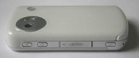
But that’s not all! There is a navigation wheel on the left edge of the communicator frame – the jog dial (here it’s called the Jog Wheel) that Sony discovered for us a long time ago. You can look through the system menu, phonebook and travel through the program menu. And it functions as a confirmation button (or start and choose) when you press it. A very useful gadget… A button that duplicates the lower left button on the front panel is located below the wheel. It controls the “Start” menu.
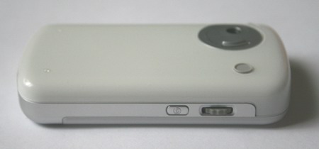
There are a few more buttons on the right edge. The upper most button is the communicator switch button. But not only that. In the regular mode, a slight press of the button sends the device into hibernation – the screen turns off and the indicator blinks green (in synch with the mobile station signal). Other buttons don’t work… You can answer an incoming call by pressing any button. You don’t have to wake up the communicator as it turns on automatically. You can manually wake the communicator by slightly pressing the switch button.
I liked this mechanism very much. The screen is sensory, after all. The device can unwittingly run something inside of your pocket. And in this case – it stays quite and does not bother you… By the way, the sensory mechanism (scheme, to be correct) of the screen sensitivity is turned off after you dial the number on the screen keyboard and during a conversation. So it’s impossible to start a program when the device comes in contact with your face. Every detail is thought out.
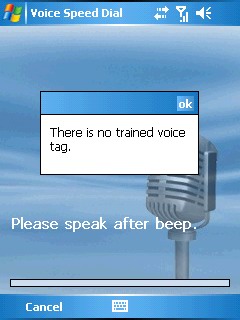
The voice dialing system switch button is located below the phone switch button (and lock button as this button locks the device). The system is quite effective. You can work with it.
The cover of the mini SD memory card slot is located lower. The cover is nothing special – due to the weak silicon loop. And it’s hard to open – the lock is tight.
The camera shutter switch button (an CMOS sensor is installed here, so there cannot be a real electromechanical shutter) is located on the lower edge. If you turn the device so the right edge becomes the upper one, you’ll get an exact replica of digital camera.
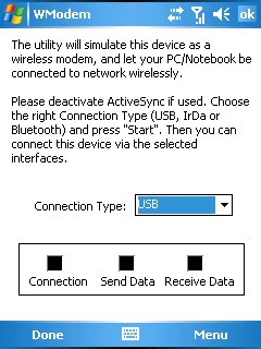
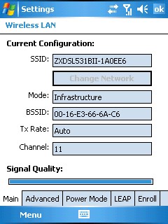
There is nothing on the upper edge of the communicator and on the left one you can see a microphone hole, standard (!) mini USB port – that’s really great, and also an IR port window. By the way, communicator is set with full collection of interfaces – USB, IR port, Bluetooth and Wi-Fi modules. It is a fully set, universal device that can be connected to the PC and Internet via any available means. I have to especially note the excellent Wi-Fi functioning. The communicator connected to the home service-access point and became a third device (besides the two home PCs) that is useful for browsing the Global net. From the couch, kitchen, anywhere – an indescribable feeling of utter freedom. Excellent…
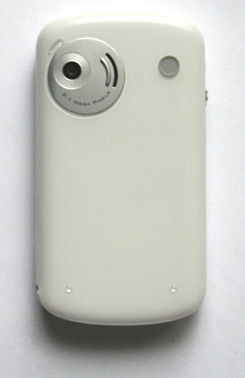
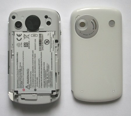
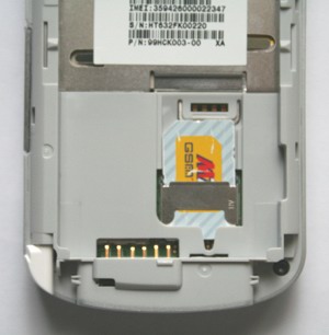
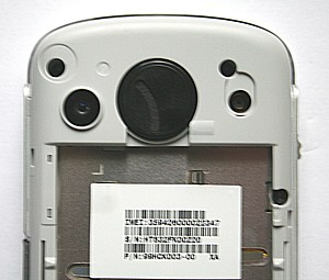
The whole back panel of the communicator frame is the removable cover of the battery compartment. It has only two noticeable elements – a silvery nameplate with a hole for the lens of the built in camera (without a protective glass, it installed directly onto the lens) and a rubber cork for the exterior antennae nest. This cork made me think that the decision is correct – you don’t need to unscrew or take anything out to connect the antennae (in a car, for example). In the same time, the rubber is made in the form of a mushroom and sits tight in the nest. You can see an arched hole on the nameplate. It is located exactly on top of the loud speaker under the cover. The speaker itself makes very loud (not to say, shrill) sounds. This alarm will wake the dead.
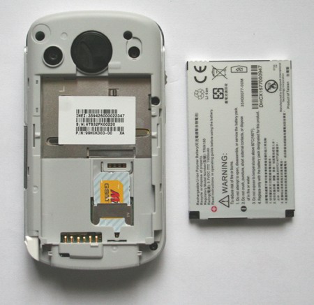
A huge battery with 1500 mAh volume is located under the removable panel (it is fastened with simple locks and you can take it off by moving it upwards). How long does it last? The device is being actively used three days in a row. The battery does not need charging yet. The manufacturer promises about 5 hours of active work and up to 250 hours in the waiting mode. I don’t have any reason to doubt the promise.
The SIM card is located above the battery and has a simple and reliable fastening.
I think that’s pretty much it… It’s time to switch on the communicator and try in action.
The system
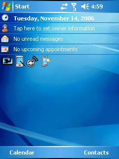
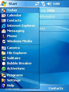
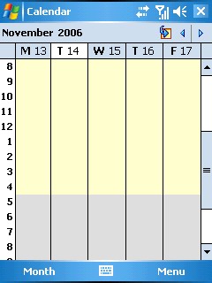
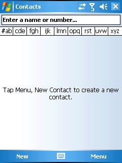
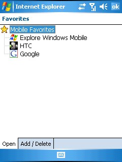
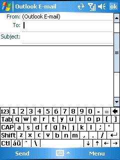
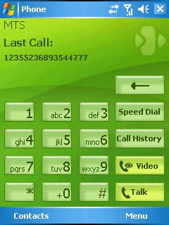
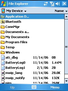
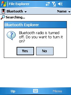
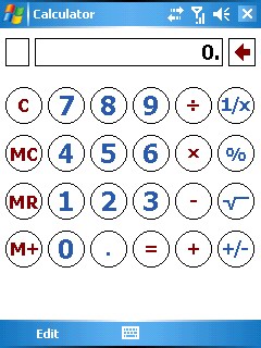
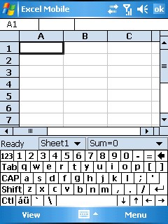
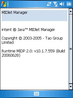
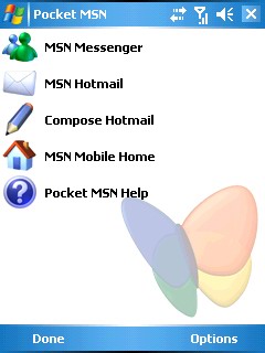
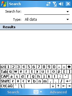
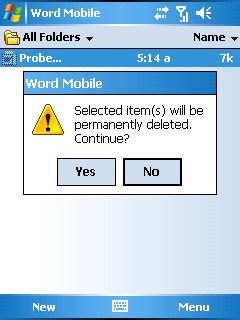
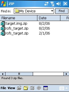
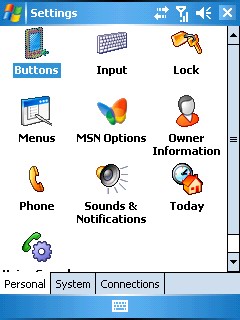
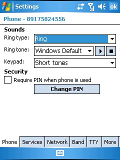
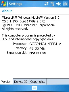
HTC p3600 functions under the Microsoft Windows Mobile OS 5.0. I am not a great fan of that system (as I said earlier), but I have to honestly say that I didn’t find one bug. The device is strong and fast.
The hardware, of course, has a lot to do with it. р3600 has a 400 MH Samsung SC32442A processor. The communicator has 128 MB of ROM memory (the OS and programs are written into it) and 64 MB of RAM memory. That should be enough for any mobile task; however, you’ll need a memory card (the more the better) for saving a lot of programs, music and video content.
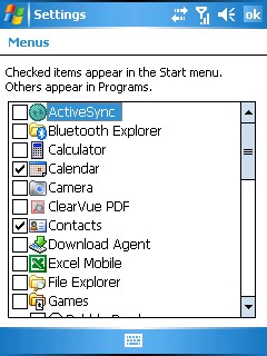
I won’t describe the new capabilities of the WM 5.0 – the system is installed into all new pocket PCs and communicators similar to р3600 (manufactured by the same НТС). I will just say that you won’t get by without a good launcher (to start programs) – otherwise it uncomfortable to work with the communicator as the programs are deeply hidden. But that’s a disadvantage of all devices in the Windows Mobile family. But the problem itself is elementary to solve. There are a lot of programs on the net, including launchers…
I cannot pass by one remarkable р3600 quality. You can read electronic books with the communicator due to the excellent screen and large battery. And, trust me, it’s an excellent reader! The best program, obviously, would be Haali Reader. However, you are welcome to use others.





Multimedia and camera
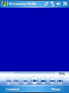
The communicator sounds well. Of course, it’s not an elite МР3 player (with an iPod, for example), but you can without any doubts use the device as a mobile playing machine. Why am I not giving an A to the р3600 in the music section? I heard a lack of base in its sound and the sound itself seemed… a bit flat. It’s because of the set player, where you cannot set the sound. But the owner of the new device can always download and install any other program from the web. And the problem will be solved… And it would be fair to compare a р3600 with an iPod (and that’s what I compared it to). Different class and function technologies. In any case, an iPod cannot dial numbers and as a phone would not get a D, but an absolute zero. (Don’t mind the petty objections, I am just jealous).
HTC р3600 plays video without frame gaps or other delays. I was amazed by the picture quality on the communicator screen, while being pretty used the great film picture on the tiny Nokia smart phone display. Even if I was ready for it. But when I started the video, I couldn’t look away.
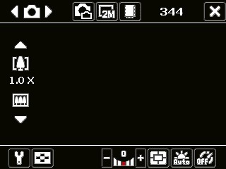
Now the camera… This is the first communicator (and smart phone) of the Windows Mobile family that can photograph. р3600 has two CMOS matrixes – VGA (in the second camera for television-telephone system) and 2.1 mega pixels. And this main sensor is a wonder. By phone standards, the photographs are just outstanding – you can go and print them. Although, the camera lack a flash (it’s LED replica is an insignificant imitation of a full-fledged impulse light, so there are no regrets). But then you can judge with an eye the functionality of the manual exposure.
I start choosing the panorama, while looking at the big screen. And I clearly see how the picture changes – the automatic exposure starts working tuning to the light. The change is discrete. The picture on the screen darkens a bit and then suddenly equalizes. It’s not a disadvantage, but a real work of the automatic mechanism. Its vivid demonstration.
Camera shoots video a bit worse (and that’s understandable). You have to treat portable video devices as an optional bonus, not as one of the main characteristics.
Concerning the camera preferences – they are quite standard for the technology of this family. Although, you have to choose the resolution, white balance and effects from the icons on the viewfinder, not from the menu. And that’s very uncomfortable, although, the screen is very large so you don’t have to strain your eyes in order to see the icons. However, it’s not the size of the icons – you have to set the preferences with the stylus. And the stylus is very small in this device (by the way, I almost forgot about it). And its fastening is uncomfortable – it is set from the bottom, into a canal on the right lower edge of the device frame. Right away, I decided not use it and took out my own – a fat little pen with a fluoroplastic end…
Well, I started on a merry note, but finished on a sad one. Look at the photographs. They are not of a great artistic quality, of course. But look at the technical side. In this sad gray time – a balm for drained with rain soul.


Video sample, mp4, 843 KB >>>
Conclusion
I don’t know how to write the reviews detailing the characteristics of the new device. All those graphs and diagrams bore me. Emotions, feelings, personal impressions are important to me… So, the HTC p3600 left a major impression. It’s a mix of surprise, awe and concern. Why the concern? Well, if Windows Mobile will continue like that, “Big Bill” will have the victory in this sphere as well. I should not care, of course. The important thing is to have the ability to buy these wonderful devices today, tomorrow and the day after. And cheap as well – a few hundred dollars (about seven or eight, to be exact as the device is fully packed) is too much for a communicator. Although… maybe not. If you don’t want to pay for these comforts, you can use a democratic budget phone. Today you can buy a functional model for about fifty dollars.
What did I miss in the р3600? First, the «Nokia» label. Second – a good substitution for the thick skinned “piggy” case that was in the box and which I never used.
I can say about the first one that I hope I won’t be concerned with the absence of a «НТС» logo on a Nokia smart. Competition does not allow sluggishness (although, it would not be fair to accuse Finland of that). Concerning the second one… Well, this device should have at least one disadvantage!
© Nikolay Nadezhdin, Mobiset.ru reviews
Translated by Olga Mexina (info@mobiset.ru)
Published — 07 march 2007