Review of Sony Ericsson W890i √ visiting beautician
It is likely the most interesting update of the device from the Sony Ericsson line. The model can boast about many new features, but whether they are absolutely fresh, we discuss in the article.Table of contents:
- Design
- Interface
- Phone book
- Messages
- Organizer
- Multimedia Menu
- Music
- Connectivity
- Games, applications
- Performance
- Camera
- Conclusion
The device known under the name Al was the most important one for the company concerning the new design strategy. With the very compact chassis, the engineers of the company moved SE in the new market niche, which is used to be dominated by Motorola and Samsung. Sony Ericsson W880i literary stirred up the market, as the company offered the device, that featured the same functionality as the W850i but in the candy bar casing of the small size (here we mean not only thickness, but all dimensions). The success of the handset was proved by the raring demand stimulated by the $600-700 price tag as well. To the present day the W880i remains one of the main stylish devices of the company. Of course, the T650i is not enough to develop the stylish phone lines, as the advantages over the Walkman-solution were doubtful.
If we try to find reasons of the delayed release of the successor, we have only one √ the utilizing of the new platform A200, which is turned out to be green when the sales of the K850i started. Those, who have already purchased the photo focused flagship model, understood why we called it ⌠green■. The others will read very soon the more detailed review of the pros and cons of the new platform. The beginning of November saw the company unveil the successor W890i. The latter has all main disadvantages of the predecessor improved and seems to meet all expectations. But at the same time the design of the W890i reminds rather a pretty youth device priced $150-200, than stylish Walkman solution with a $600 price tag.
Design
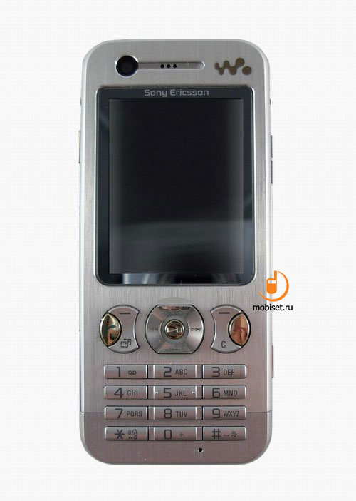
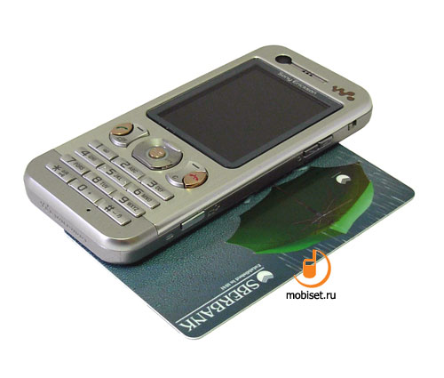
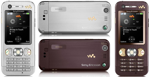
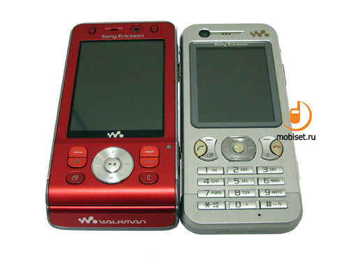
The official images from the press-release make us think, that the phone was designed in the different way than its predecessor. The curved edges, tiny buttons, wide protected screen, unicoloured casing don▓t impress much. Though, these pictures give depthless impression, as if you look through the shopwindow only.
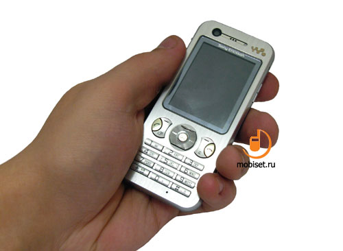
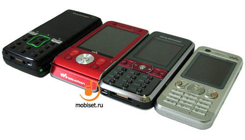
With the phone in your hands, you notice that the curves of edges beef up the ergonomics of the rather small device measuring 103.7x46.5x10mm. The light weight of it (78g) is noticed at once.
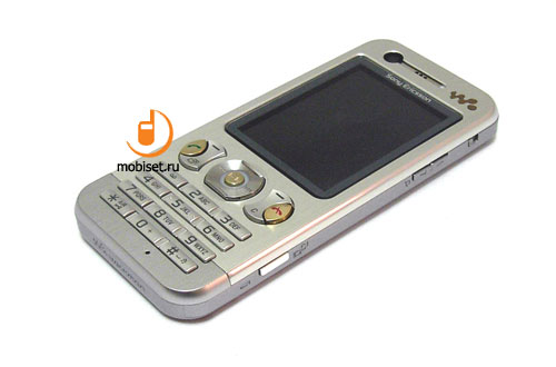
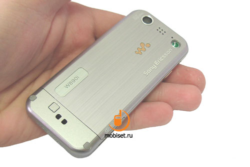
To be precise, you notice feathery, almost weightless casing, that dosen▓t correspond to the metal parts it is made of. Those, who are aware of the metallurgy or work often with different kinds of metals, from the first sight will confirm the omission of steel at all. Really, this light weight allowing to carry the handset even in the pocket of the shirt, shows the lack of the heavy steel. The utilized metal is an anodized aluminium, that neither leave the oxide on the hands after the long work, nor looks solid. Of course, the aluminium hasn▓t been utilized everywhere, and the antenna in the bottom part of the casing obviously proves the plastic frame.
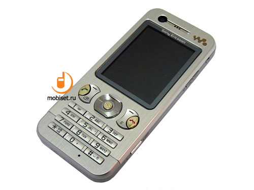
The most elements of the design repeat the predecessor W880i, for example, the loud speaker hole combined with a front CIF-camera lens for video calling. Below you see the protecting screen of the display boasting about scratches resistance. It protects the 2■ TFT screen with QVGA resolution. The brightness of the screen is by one third worse than the same matrix in K790i, K810i, S500i. The vision angles are limited by the thick protecting glass; they are about 150 degrees in both planes. The work in the sunlight causes no problem.
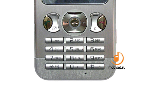
The navigational pad copies the one of the W880i, except the changes of the side glassy keys. The latter now function as the call send and end buttons. Instead of the back key, the left rocker key starts the Active Menu. The ergonomics of key changes neither to the worse, nor to the good.
The numerical keys were changed greatly. Now they look like the jutting horizontal rows featuring small dimensions and high tactile feedback among the rows. The central vertical row comes with flattened ends improving the tactility of the vertical rows. The keys have a smooth travel distance and noiseless clicks. The overall impression from the keypad ergonomics is a mediocre one. From one side, the numerical buttons don▓t punch fingers, from the other, their size wearies us after several messages or several minutes of Java gaming.
The right end of the ⌠0■ button overhang the microphone hole. That▓s it for the front panel.

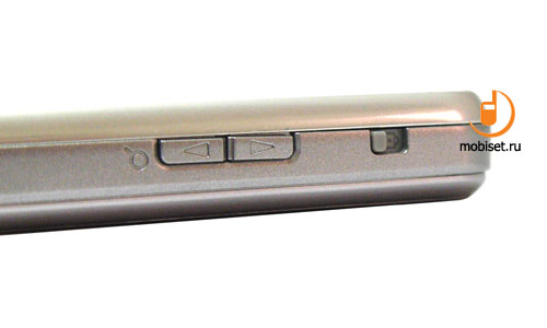
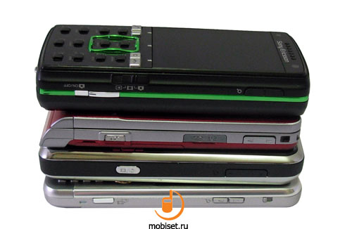
The right edge of the casing houses a small slider reminding the one controlling volume in the preceding model.
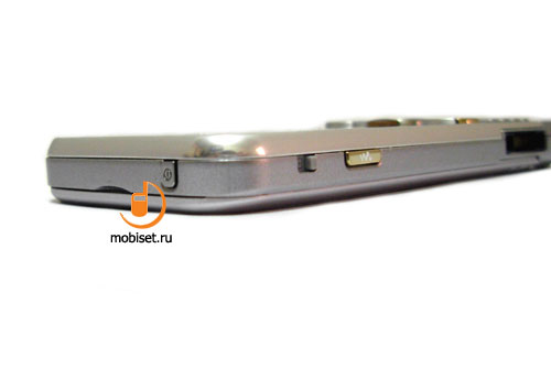
The funny story begins, when you find the same slider opposite on the left side. Its purpose will be discussed a bit later, but now we move closer to the middle of the right edge, where you notice two small and very tactile volume controls. They come with short travel distance providing high ergonomics. The two centimeters separate the bottom edge from the dedicated shutter release/camera button. The later is also easily pressed, as it location makes the ergonomics almost perfect.

The left edge, opposite to the volume control houses the player key, which copies the proprietary item in the main menu.
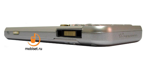
Near the bottom edge of the left side you see Fast Port jack for the all kinds of the wired accessories. Considering the amount of the devices featuring the same jack, we a bit tired to talk about this flaw.
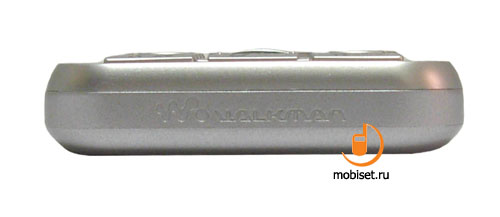
The bottom edge features the brand logo only.
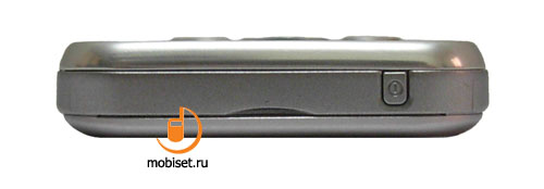
The top end houses a tiny jutting power button. It is sufficiently tight, thus the occasional pressings are almost impossible.
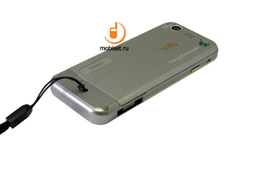
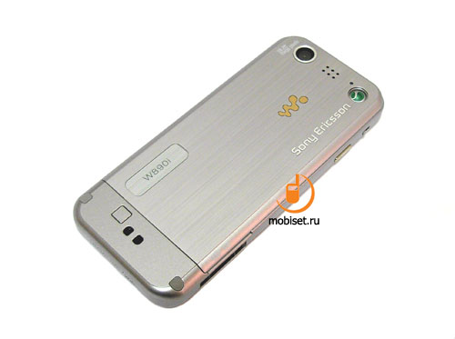
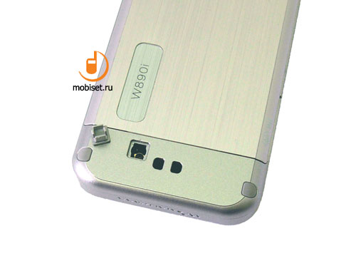
The rear panel has a plastic insert in the bottom. This plastic area features GSM/UMTS antenna and stripe hole.

The rear cover is fixed with the help of the very sliders we▓ve seen on the sides of the casing. To open it we should pull both sliders upwards, put the handset face up on the palm and lift the phone by its sides.
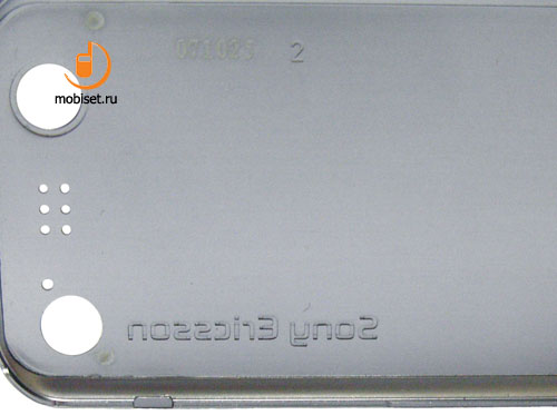
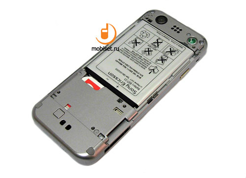
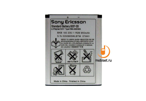
You can also easily remove the cover just pulling it out, as the handset provides no latches, except two ones below. The cover hides the same space as in the T650i except the top loudspeaker and widening battery section. The utilized battery is a unified 950 mAh Li-Ion battery BST-33. It runs 3 days in use with 20 minutes of talks, 2 hours music playback and 30 minutes for other functions.
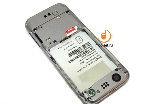
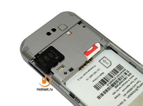
Near the interface jack the manufacturer placed the M2 memory card slot featuring no size limits (theoretically, with a FAT32 it can be extended up to 32 Gb). The slot has a slop block protecting from the memory card jumping, though, after some training, you can pulled it on 20-30 centimeters.
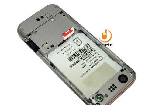
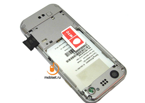
With the battery removed, you can pull in or out a sim from the slot featuring no locks. The antenna hole is placed under the removable plastic plug near the stripe hole.
Interface
In the stand-by mode the corners of the top part of the screen houses the traditional 5-degree signal strength indicator and battery indicator. They frame a field for different system indicators, from missed events and active Bluetooth to silent mode. The indicator of the started Java application was changed into the one reminding the symbol of Active Menu.
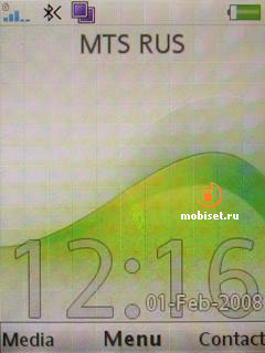
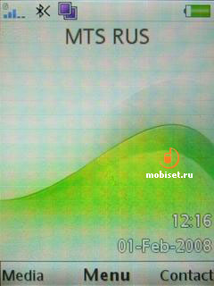
Below on the screen you can find the operator name and system information. The bottom part of the screen shows date, digital clock and timer counting, if it is any started. The first thing attracting your attention is a bold used in the titles of soft-keys. It becomes as small as the date indicator. The changes are caused by the improvements in the phone control system. This is a second, after A100, friendly step of Sony Ericsson towards the more compatible content, developed to the Nokia S40-series phones. Now in the bottom of the screen you see signs both to the soft-keys and affirmation button. But unfortunately, it has no effect on the possibility to appoint the soft-keys. The latter are still bound with the certain functions. The left key opens the Multimedia Gallery, the right one √ phone book. The joystick has now broader capabilities √ it can start the Java midlet. Active Menu remains unchangeable, so it is worth no repeat.
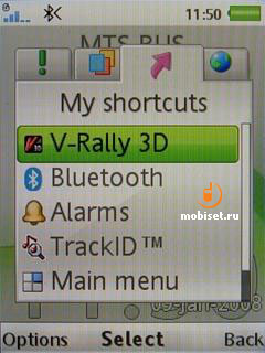
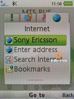
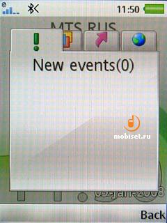
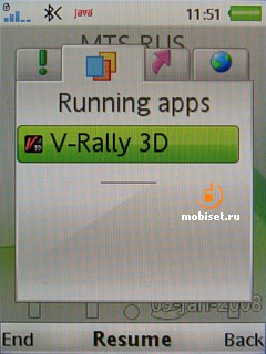
The call send and end buttons partially affect the ergonomics. From one hand, they made the soft-keys free from a function to send call, thus raised the ergonomics in the phone book. The end button allows to forget about long pressing the back button, that we used to move into the stand-by mode. From the other hand, here the phone has a drawback, which was partially improved in the Walkman-solutions featuring the dedicated player button. The thing is that, the call end button turns off the player during the playback. Is it handy, it isn▓t.
To enter the main menu you press now the central affirmative key. The menu consists of 12 items, which are demonstrated in the style depending on the set of the preinstalled icons. The main menu lacks now the File Manager. It was done in order to stimulate a user to try the main novelty of the A200. This function is likely to be fixed after the joystick decline by many fans of Sony Ericsson. As it used to be, there is a digital navigation through the main menu, as well as in most submenus.
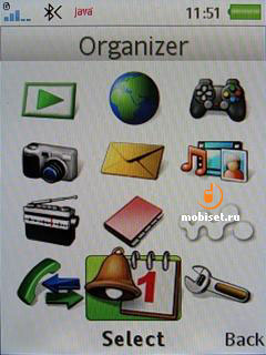
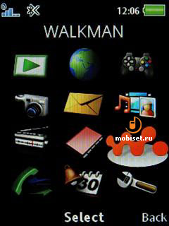
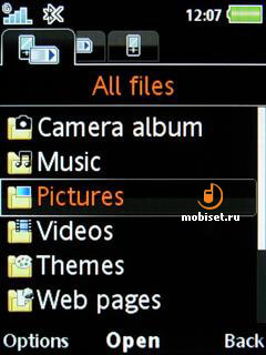
Among the minor improvements we can mention the better animation of the floating windows, as well as not very interesting message notification, which displays both message type and sender. CallerID is implemented in the same way: the half of the screen displays either image or video clip assigned to the contact.
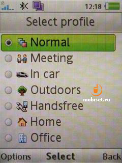
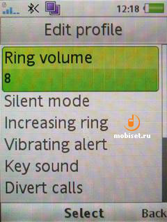
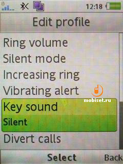
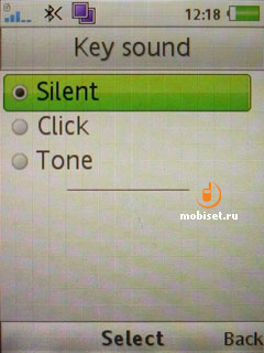
The profiles are still limited by 7 add-ins, which can be changed in terms of the following parameters:
- Ring volume
- Increasing ring
- Vibrating alert
- Key sound
- Divert calls
- Accept calls
- The way to receive a call (certain key or any key except the call end button).
6 profiles may change the names, but the images remain unchangeable.
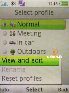
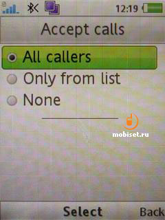
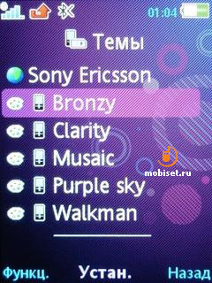
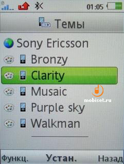
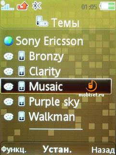
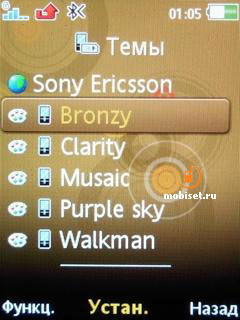
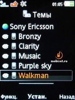
The support to the Flash-animation in the themes becomes a customary thing in all A200-baesd phones of the company.
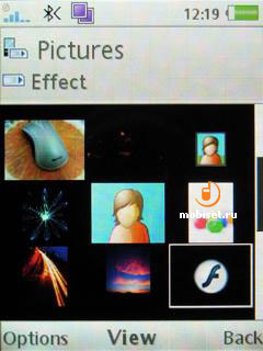
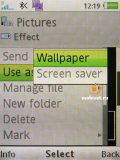
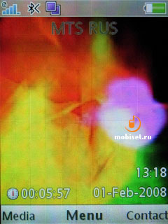
The phone comes with several preinstalled themes matching female users. Though the classical Clarity and Walkman are good enough for men.
Phone book
In terms of the quick search we can mention the correct search by first name and second name, as well as by all phone numbers. As usual, the search is made by the correspondence to the entered name or first numbers of a phone. For example, if you are looking for a number 8 999 000 65 01, the phone shows it after you start entering 8 ┘ in the search field. We▓d like to remind you, that Windows Mobile provides search from any place, and the abovementioned phone number is shown, if you enter, for example, 65. The same is with names and second names.
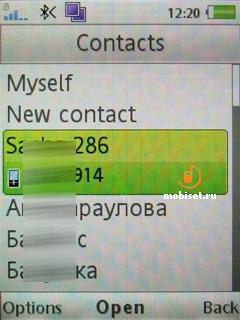
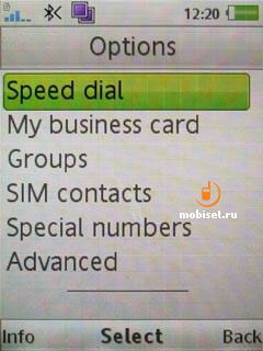
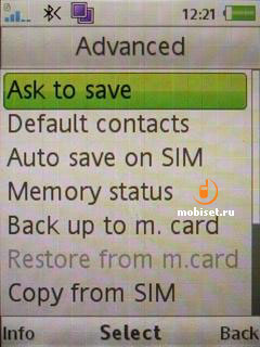
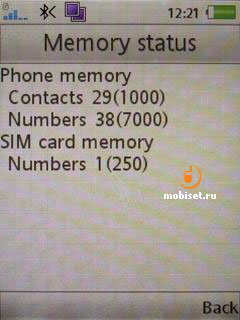
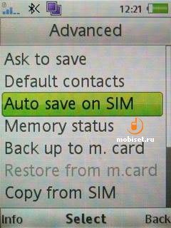
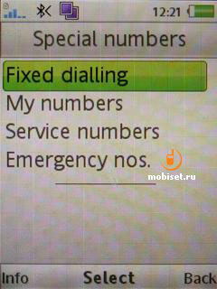
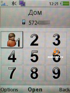
The phone memory saves up to 1000 entries and 7000 phone numbers. Each contact may include the following information:
- mobile, personal mobile, work mobile, home, work and other numbers. In the same section you are enabled to add fax number.
- name
- Web address
- ringtone and picture
- title
- company
- street
- city
- region
- postal code
- country, where the work is.
- the same address information for the residence
- note with up to 511 symbols
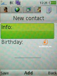
- birthday.
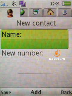
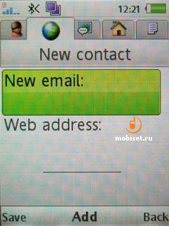
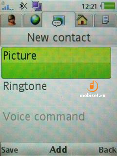
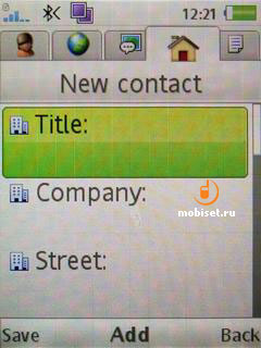
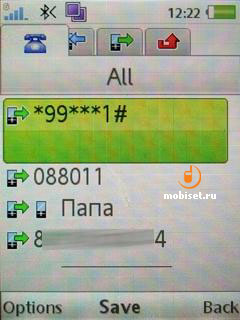
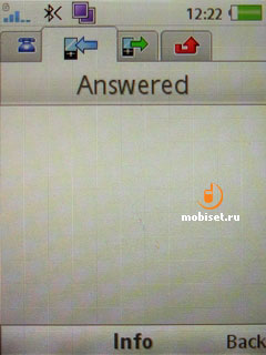
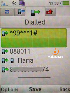
The list of calls is very simple. When selecting a number, you see date and time of the call. The calls can be sorted into received, send, missed calls, as well be shown in bulk.
Messages
The handset comes with a handy application to create SMS/MMS. As usual, you are enabled to view the emoticons as pictures. The maximal size of the text message amounts to 1188 symbols.
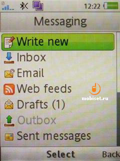
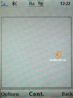
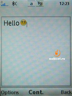
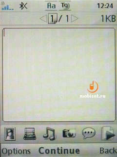
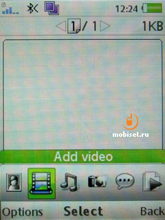
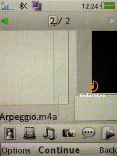
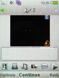
The MMS application remains unchangeable. It has eye-catching interface to create compound messages up to 300Kb. You are enabled to attach audio files, pictures, video clips. The necessary apps to create attachment may be opened right from this menu (camera, voice recorder).
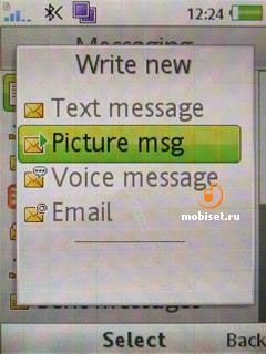
The email client allows to adjust a new account through five steps. Firstly, you enter your name and email address. Then follows login and password, after that the phone suggests your receiving the other settings from the server Sony Ericsson.com/support. If there is no access to the Internet, the last two steps are as follows: choose the connection type (POP3, IMAP4) and enter incoming and outgoing servers.

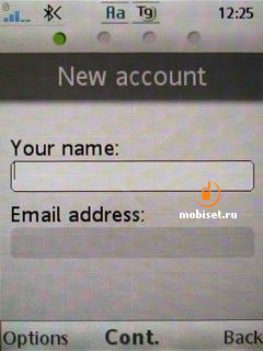
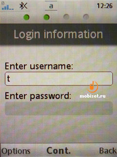
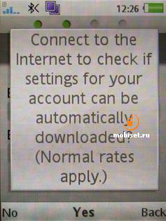
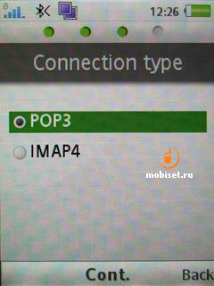
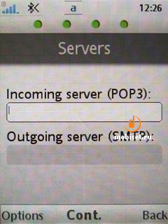
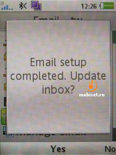
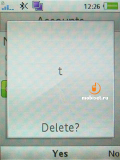
The changes of the interface include only the new background of the reading/writing windows of messages.

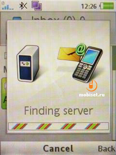
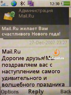
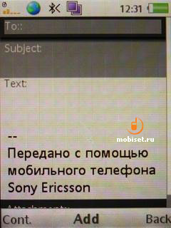

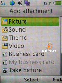
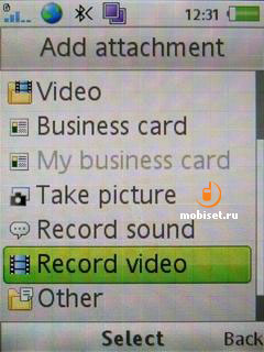
All attachments can be saved in the phone memory √ that is very handy.
Organizer
Let▓s look through the Organizer apps.
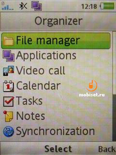
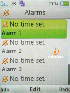
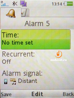
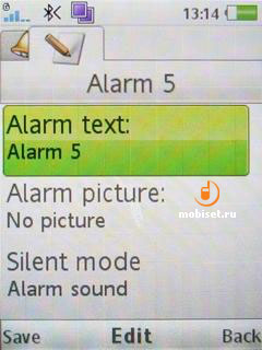
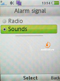
The first one is a functional alarm clock allowing to create up to five alarms. To each of them you can adjust time, recurrent. The phone also makes it possible to choose alarm signal or radio. It is pleasant that you can rename the alarm (for example, to name it ⌠it▓s time to dine■ instead of ⌠alarm 03■), as well as fix an alarm picture. (If we are talking about dinner, there is a plate with soup).
Calendar
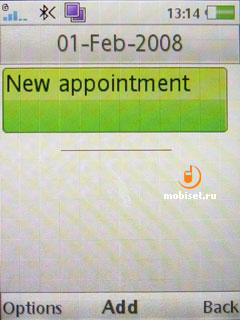
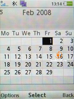
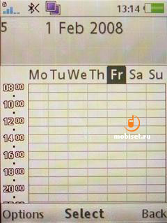
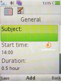
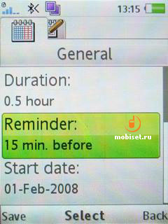
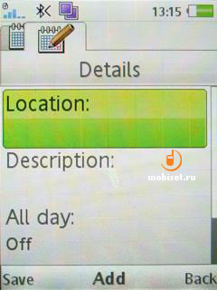
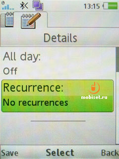
There are two ways of viewing: monthly or weekly with each day having an hourly schedule. After choosing the necessary weekday, you can quickly create a reminder. The latter has lots of settings. They are as follows: subject, start time, duration, reminder (5-30 minutes before), recurrence (daily, weekly, monthly, early), location. To cap it all, you are enabled to add small description of the event. As you see, the reminder is not the perfect one, but it is rather good taking into account, that it isn▓t the separate organizer, but just a function of the mobile phone.
Notes
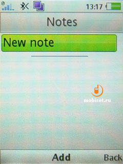
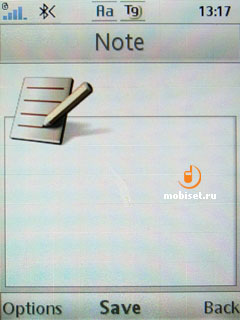
Here you can create common notes 254 symbols long.
Timer
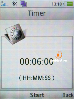
It is a common timer. You fix a time to within a second, and see the count in the stand-by mode.
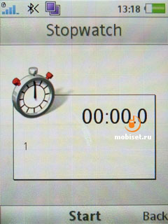
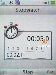
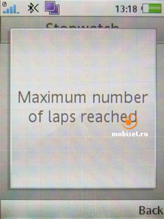
Stopwatch creates up to 9 laps.
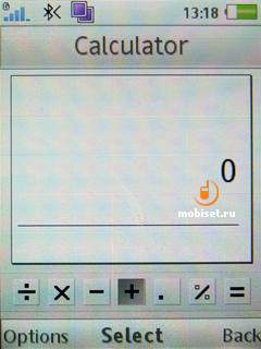
Calculator is noticeable for the possibility to extract root.
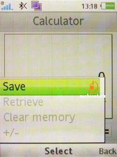
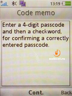
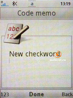
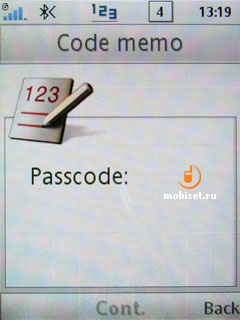
The presence of the code memo is very intrigue. In the rest, the 4-digit password symbolizes only, that these notes are very important.
Multimedia Menu
The main distinguishing feature of the A200 is the main reason why the W910i and the K850i were announced with a big delay. It is a multimedia viewer, who was greatly changed in the platform. As we▓ve already said, the viewer now lacks the common file manager, which is can be found now in the organizer item. Now let▓s discuss why it is interesting and whether it is handy in the everyday use.
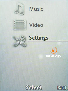
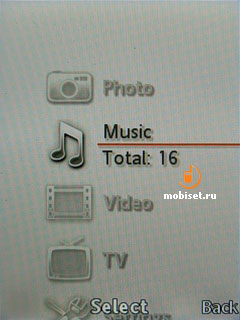
The design of the interface almost copies the menu of Sony PlayStation Portable. The vertical shifts have a nice animation; to the right of an item you see semitransparent floating balls. To chose a necessary item you can use either the affirmative button or decline the navy key to the right. The main menu consists of five items; each of them we▓ll discuss separately. They are as follows: photo, music, video, stream-TV and settings.
Settings
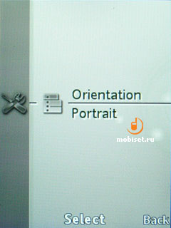
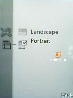
In this item you adjust the screen orientation.
Video
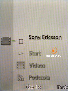
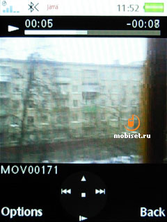
This menu item includes all supported video clips, both made with the camera and others. The window to choose a clip has a vertical list capable to display five clips labeled with thumbnails. The latter are static; when cycling through them, the phone has some jerks.
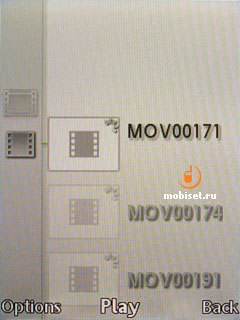
The clips can be viewed with a rate amounting to 30 frames per second. The player has an option to scale a picture when in the landscape mode. After you switch on this orientation the first 3 seconds the screen displays the semitransparent signs of the context keys and duration scale. Then they disappear.
Photo
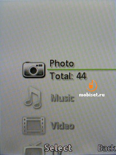
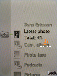
The main novelty of an application is a photo viewer. It can sorts out the stills by latest photo, photo and other pictures. When opening the latest photo, you view photos in the viewer. The camera album has a monthly sorting. The collection section saves all images added to the folder ⌠favorite■. The last item shows all pictures stored in the folder ⌠Pictures■.
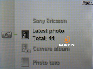
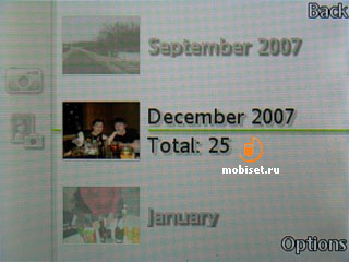
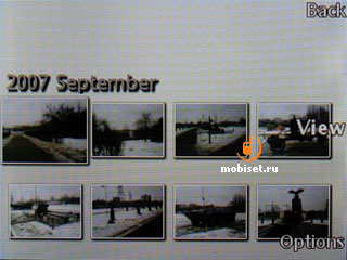
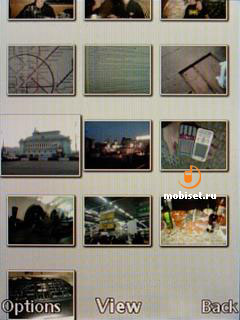
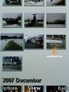
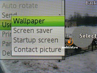
Let▓s enter the camera album. Each month has a thumbnail changing each 5 seconds. We choose the month we need and go to the table of photos, which have this date in EXIF. When looking through the thumbnails below, in the mode of three columns, we see both photos done in the chosen month and the other photos marked with another title. In this viewing mode you can choose the marked image as a wallpaper, contact image, screensaver or greeting. When you choose a thumbnail, the latter is growing smoothly on 20% and in the same smooth way it shrinks, when you choosing the next image. When you press the Option key, a picture smoothly occupies the whole screen. After pressing Back, the image smoothly goes on its place in the table without covering the next pictures. It is an eye-catching moving, though you may get tired of it after a couple of weeks.

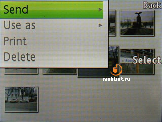
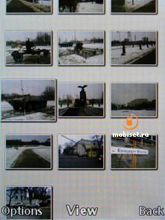
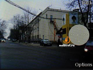
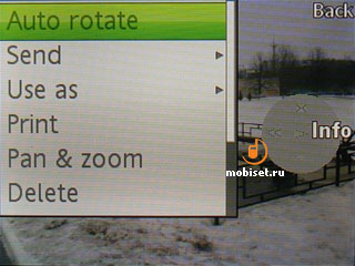
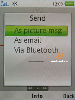
After we▓ve chosen a picture, we go into the viewer. There in the first 3 seconds we see semitransparent signs and symbols of the declines adjusted to the navi key. The context menu of functions lists all standard options of the picture viewer. There as follows: send via Bluetooth, print, PhotoDJ editing and slide presentation.


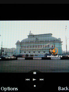
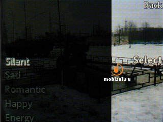
The latter can also be started after pressing the Play button. When we press it, 5 ways of playing appears:
- Silent
- Sad
- Romantic
- Happy
- Energy.
As the vendor intended, this emotional way of displaying photos is the most suitable one to the slide-show. The name of this system of presentation is X-Pict Story. Each of the ⌠moods■ has its type of melody and special type of cycling through the pictures.


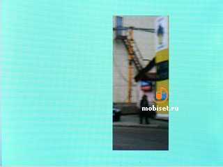
In many cases the effects resemble the comedy detectives of 70th shot in the southern states of the USA. To describe the smooth and nice-looking movements of pictures is dull, so we▓d rather try to compare from memory our guest with Nokia N76.
| Criteria | The N76 | The W890i |
| Styles of passing | no | yes |
| Melodies in the background | yes | yes |
| Choose your melody as a background | yes | no |
| Time of displaying an image | yes | no |
It is a short table. It turns out, that the styles of passing are the only advantage of the A200 over the Nokia multimedia smartphones.
Music
Hurray! Walkman 3.0 is available since now on all phone regardless the presence of the Walkman sub-brand. As our review model does have it label, player item appeared in the main menu right after the described above multimedia menu. Now it has a dedicated player key to open and minimize it locating on the top end of the handset. Of course, the second version of the player was well elaborated and functional in comparison with its rivals, but the competitive vendors have already introduced some new interesting player versions during the last year. The most successful was Nokia, that updated the interface of the music focused smartphones since the N81, and furthermore, S40 5th Edition can boast about rather eye-catching player interface.
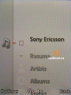
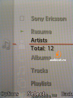
The main difference of the third version of the player is that it is integrated in the multimedia menu and the list of sorting is almost copies the other lists in this program. The same as in the second version, to cycle through the library, that is leisurely refreshed each time when you insert the memory card, doesn▓t necessarily need to use the OK button. It is enough just to decline the key to the right in order to choose and to the left √ to go back. The icons of the sorting times have been moved in the left column and became vertical ones. The context menu, that is called up by the left soft-key hasn▓t been changed.
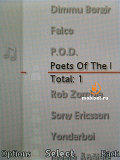
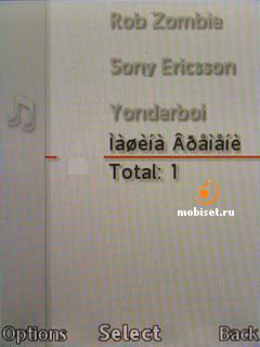
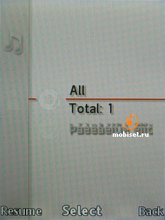
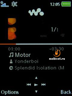
The playing window consists now from the thin progress bar occupying the whole width of the window. The bar has above a small window of Album Art, icons of playing back modes and the current position of the track in the playlist. There is also an information line on the top, where you see the indicators of the signal strength, battery, notifications and time.
Under the line the screen displays the played time and the rest time, ID3-tag and symbols of the navigational key. It is interesting that the navi key itself is equipped with these symbols. When pressing up and down, you call up the current playlist occupying the half of the active window. After changing the orientation in the landscape one, the symbols of the navi key move to the right sight of the scrolling bar.
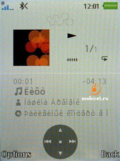
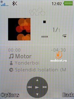
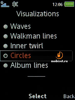
The settings feature a common visualization instead of the album cover, shuffle and repeat settings.
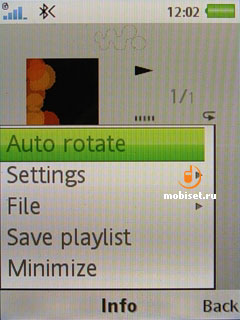
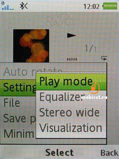
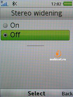
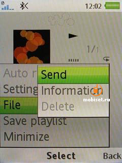
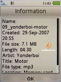
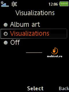
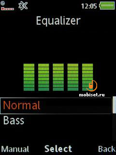
The equalizer has 5 lines. The other remains unchangeable.
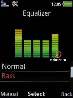
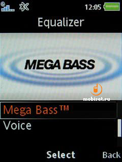
The sound quality hasn▓t changed in comparison with other phones of the company. The same concerns the maximum loudness. It is enough only for the ear-buds-like type of headphones.
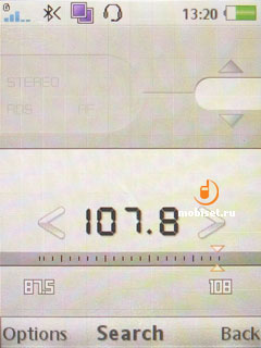
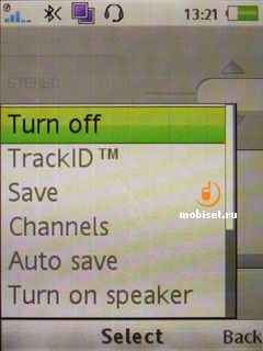
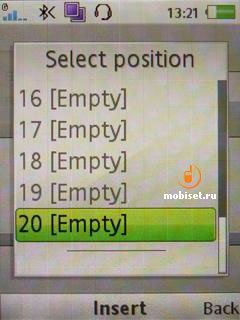
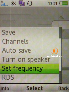
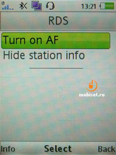
The phone also houses a FM-radio supporting an automatic search for the channels and RDS info stations. All active channels can be saved in the 20 memory cells.
Connectivity
The phone comes with Bluetooth 2.0+EDR module running at 100-120 KB/s. The device provides steady connectivity either when transferring bulky files or with a wireless headset.
To connect the W890i to PC via cable is the simplest task. There is nothing new in it; the safety cutting off by means of Windows utility is another drawback inherent in Fast Port.
Games, applications
The phone comes with several preinstalled games.
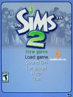
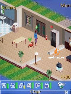
Sims 2 is likely to be interesting to the fans of the Sims PC series. The others are unlikely to choose this simulator.


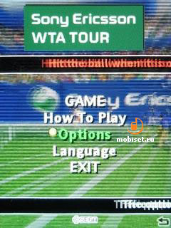
Tennis Multiplayer. The game allows you to play tennis in the network via Bluetooth.
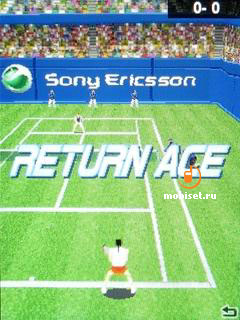
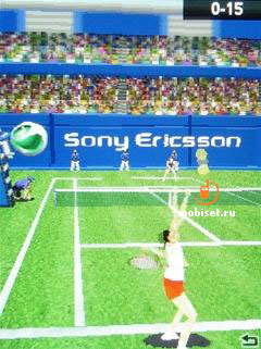
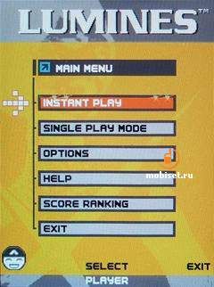
Lumines Block Challenge. The game has a peculiar goal. The idea is to compound a figure like in the tetris. When you compound a 2x2 square, the moving from left to right line will clean this square and you get some scores. The more squares you build, the hirer you score is.


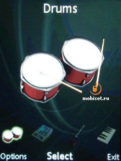
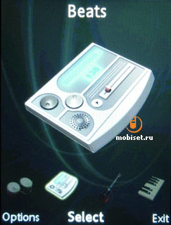
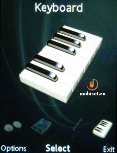
The applications include only Music Mate 4. Unlike the second version, this one can download new samples, for example, electric guitar with Distorted effect.

Performance
Jbenchmark1: 8254
Text: 2953
2d shapes: 1951
3d shapes: 915
Fill rate: 758
Animation: 1677
Jbenchmark 2: 1222
Image manipulation: 369
Text: 713
Sprites: 646
3d transform: 725
User interface: 21973
Jbenchmark 3d
Jbenchmark 3d hq: 462
Jbenchmark 3d lq: 482
Triangles pear second: 37418
Ktexels pear second: 1547
Jbenchmark hd
Smooth triangles: 36891
textured triangles: 32448
fill rate: 1400 ktexels
gaming: 169(5,6 frames per second)
Camera
The phone is equipped with a 3.2megapixel camera without autofocus. The utilization of this matrix is caused by the marketing intension to beef up the specification in the leaflet. Of course, the camera hasn▓t benefited from it; moreover, the lens is much worse than the ones of the T650i, the K790i. The camera interface copies the one installed in the photo-focused flagship model K850i. The only exception is the number of menu items and the switching of modes (photo, video, viewer), that is adjusted to the navi key.
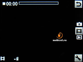
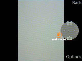
The camera settings are as follows:
- Shoot mode
- Resolution
- Night mode
- Self-timer
- White balance
- Effects
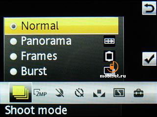
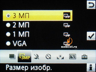
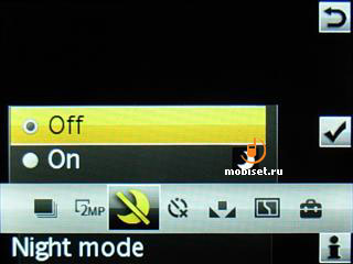
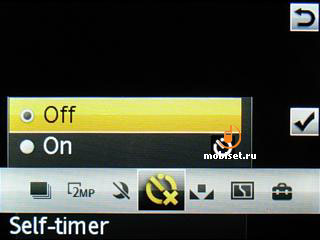
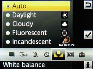
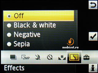
The other available settings include picture quality, review, memory type, shutter sound that can be off and reset counter.
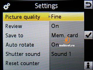
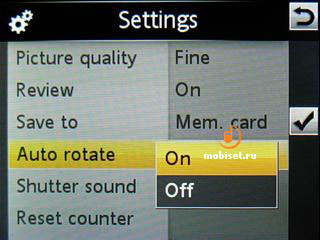
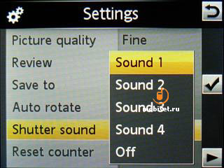
In the video mode you are enabled to adjust clip length, white balance, colour effects and use useless night mode, self-timer, mike and choose the memory time.
The quality of photos and video clips made with the R1DA028 firmware is for you to assess.




Video Sample, mp4, 1.0 MB >>>
Conclusion
We are not going to describe the connection quality as well as the speech rendering, as it is the same as in the previous solutions. The story about the stereo speaker is commonplace: the soft earpiece doubles as the second loudspeaker and has no effect on the loudness. The loudness of the main loudspeaker deserves criticism, as it is identical the loudspeakers in some PDA, for example the HP RX1950. Our guest is twice as quiet then the K790i, the K850i, whereas the sound quality reminds the one of the earbuds connected with a 10 mW amplifier. However, the loudspeaker copes with its main task, when you use as a ringtone simple trills.
There were different ideas of the W880i successor: some customers want to see the broader functionality, the other hope to find a sequel of the stylish device. Unfortunately, the latter have got the W880i after the cosmetic renewal in the face of the W890i. Our today▓s guest should be viewed as the main rival of Nokia 5310, which is a music-focused solution as well. In this case, the simple aluminium casing of the W890i turns into the advantage, whereas the loudspeakers quality √ into the minor trifle.
The phone can be recommended to those, who like the predecessor slimness, but don▓t have a high regard for macro shooting. This device could be the best solution, if it was the successor of the W610i and features a 200EUR price tag.
The tested model runs the R1DA028 firmware and the camera software version 2.5.
╘ Written by Tikhonov Valeriy, Mobiset.ru
Translated by Arina Urban.
Published ≈ 12 March 2008.