Review of Samsung U900 Soul √ Shinning Everywhere
Can an image phone combine business look features with a striking design pleasant to the eye of the user. Samsung company has been giving an affirmative answer to this question for already several years, but it takes efforts to find the reasons to it.Table of contents:
- Design
- Specifications
- Sales package
- Interface
- Phonebook
- Messages
- Applications
- Communications
- Image editor
- Games, Java
- Music player
- Camera
- Phone quality
- Conclusion
For long time Samsung haven▓t been achieving success with image devices, as several years ago the buyers take the company as the one from the middle-end segment. Thus in spite of the success of most budget clamshells and sliders, the company achieved big sales in the top-price segment either by reducing considerably the prices or by spending enormous money on large-scale advertizing. By this way the company beefed up the popularity of D500, D600, D900, the same was with G600, D880 Duos as well as with U600, where Samsung perfected the technology of the sensor keys, which had appeared for the first time in the E900. They treated these keys rather accurately introducing them step-by-step keeping the mechanical navigational key in their first solutions. The U600 is the first device of the company with the whole navigation performed with the touchpad.
The catch is that as any other technology, which can be interesting only theoretically and has worse ergonomics and functionality in comparison with the predecessors, these sensor keys aroused resentment among the targeted users and buyers, which followed the initial WOW-effect. However, Samsung very soon found an interesting way out of the situation: they guessed to extend the first surprise at the technology as long as possible. The solution was to utilize the sensor touch key installed firstly in the E950 with the sensitive transparent glass covering the OLED-screen, which shows the signs and icons of the functions dedicated to this virtual five-way key. So they surprised the buyers, but there was a fly in the ointment, as the E950 didn▓t look like the bright and catching image solution. Thus the device got the following verdict: the technology is developed for technology itself, it isn▓t elaborated for the sake of the users.
February brought the fans of Samsung very pleasant announcement of the U900 Soul, in which the company first after long time has combined two interesting ideas. To put it more exactly, they used catching ideology of the U600 with the aforementioned peculiarity of the E950. Yet, if we think of the couple of the U600 and the D900, we can easily find a pair to our guest. The U900 and the G600 are almost the complete analogues, if we compare the form-factor and specifications. However, it is high time to move to the device, so meet Samsung U900 Soul.
Design
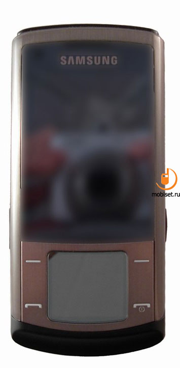
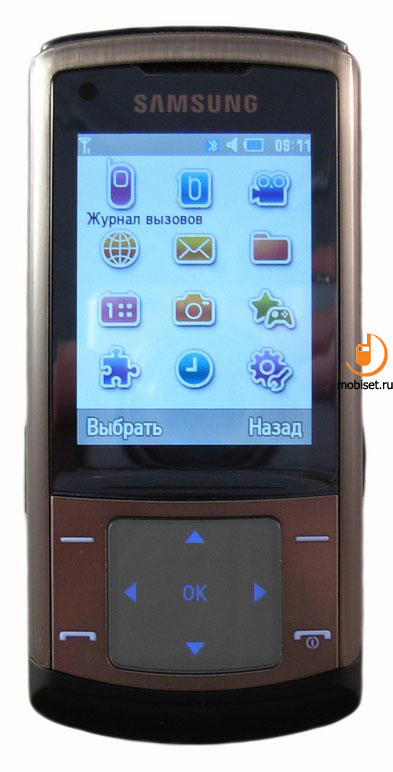
To begin with let▓s sort out the name of the phone, namely Soul. As the notion ⌠soul■ is the abstract one, which doesn▓t have monosemantic meaning, the design of Samsung U900 arouses diverse impression. Moreover, the device is made in the glossy shiny colour scheme, which casts lightness, but the amount of the surface metal inserts moves the device in the business-class niche.
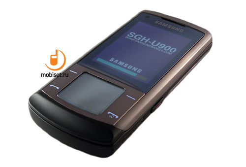
The dark colour of the case, in which our test sample came, adds not only the image appearance to the device, but also the odor of the luxury similar to Nokia 8800 Sirocco.
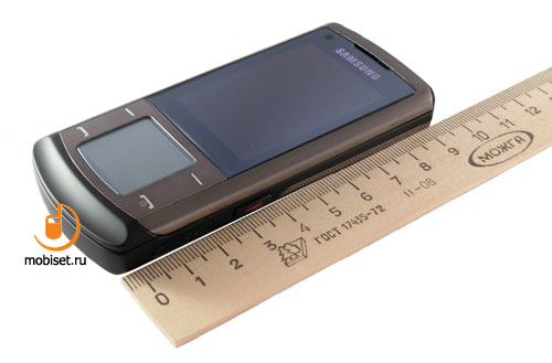
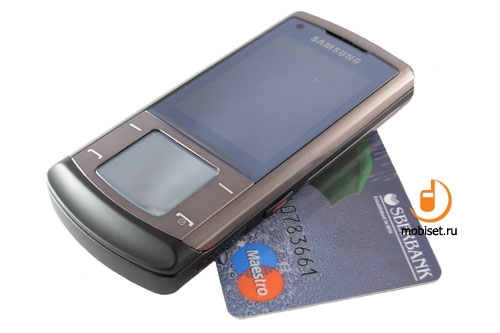
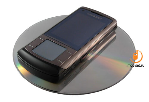
The phone is made in the slider form-factor measured 106.3x49.6x13.3. But the small thickness of the handset in comparison with other phones in the same form-factor smoothes over the substantial width and height of the case. The different curves visually diminish the dimensions of the phone.
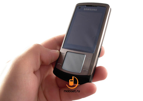
The device fits comfortably in the hand in concordance with the design due to 110g weight. The case is notable for the traditional solid built quality. The only possible drawback is small steel rails of the slider, which cause the 0.5 mm cross gap between halves.
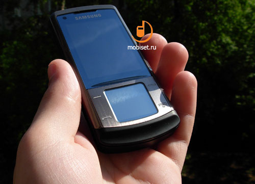
As to the carrying phone in the pocket, its weight prevents carrying it in the breast pockets in the thin summer shirts only. When in the pocket of jeans, trousers and jackets, you don▓t notice it.
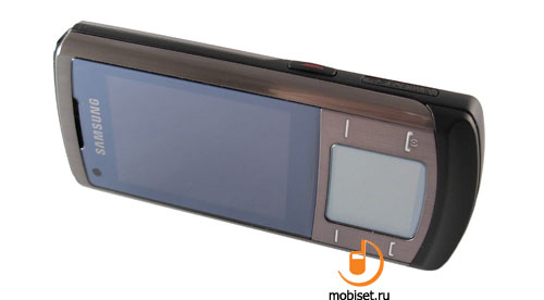
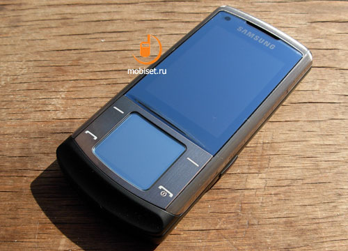
The front panel is made similar to the two devices, which we have mentioned when speaking about predecessors. The U600 handed down to our guest the thin transparent film covering the metal frame of the front panel, as well as a key and a big transparent plastic with the glassy layer.
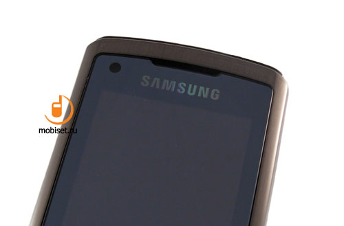
We have a complaint about glassy part, though it is minor one: the high-quality plastic gives a feedback similar to glass. It is rather scratch resistant. The top part of the glassy insert features an earpiece covered with the double grille. To achieve the visual effect the manufacturer used the decorative black grille with big holes like in many other phones of the company. As the phone supports 3G, it is equipped with an additional QVGA camera for video calling.
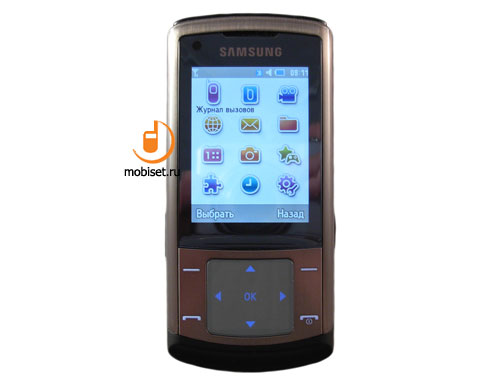
Despite the glassy pad, it is a simple task to make out the main attraction of the protective screen. Of course, we a speaking about 2.2■ TFT screen capable up to 262K colours. Having 240x320pixel resolution and good white balance, as well as the optimal contrast, it provides perfect colour rendering plus high definition. To cap it all, the phone interface is made in the way, when the pixels are almost invisible to the naked eye.
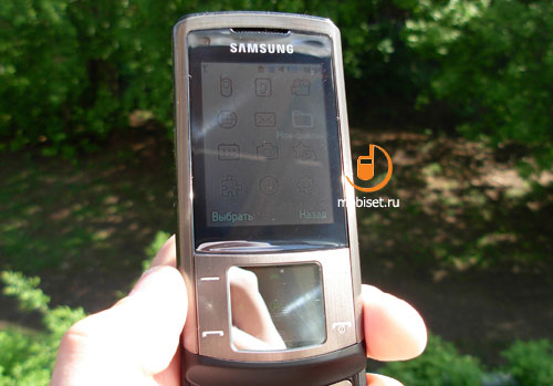
When in the sun, the screen causes no problems thanks to the solid protective glass. The viewing angles measuring 160 degrees in both surfaces cap the deep impression of the matrix.
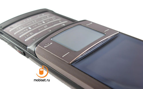
Right under the screen you see the smooth rise of the transparent plastic caused by the rounded form of the metal insert housing two soft keys and call receive/reject buttons in the corners. The latter key is also used for turning the phone on and off.
As we have to deal with the metal plate, though covered with a glassy film, we could expect different problems when working with these keys. But it turned out that they have soft travel with a middle distance. The distinct click almost doesn▓t have any mechanical sound.
And now let▓s move on to the main element of the front panel inserted in the metal keypad. That is a big glass with the glassy pad. Between the glass and the pad the phone is equipped with touchpad, which makes the touch glass very reliable. We name it ⌠glass■ several times not only because it is rather convenient to name the transparent plastic in this way, but also because we failed to scratch it and when knocking on it, you understand that it is resistant to the scratches inevitable in everyday life. However, the touch part is the beginning, as under the screen you easily make out a frame of the 22x19mm screen. The latter has an OLED matrix with 128x112 resolution showing up to 64 colours, except 40 degrees of brightness.
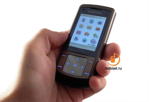
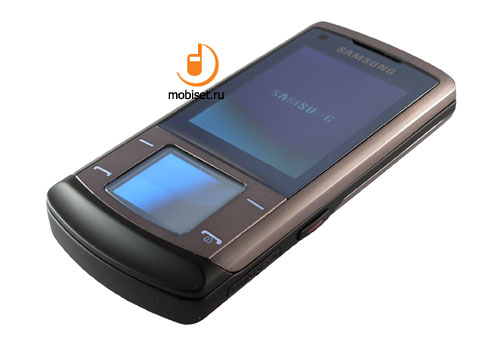
It is curiously enough, but a picture noticeably darkens under the strait sunbeams, though it doesn▓t prevent from making out the pictograms, which locate in the center and do look very interesting.
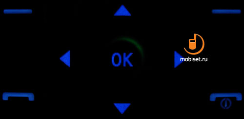
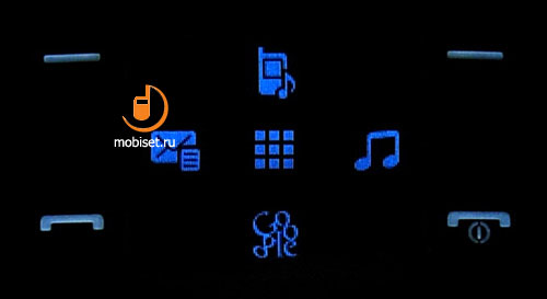
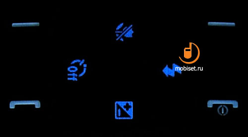
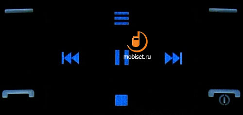
That is the classical symbols of the five-way navigational key, the icons of the corresponding tags, as well as other keys of the current actions, for example, player keys or signs for starting some functions. In terms of navigation we should mention a cursor featuring nice animation made in the form of the rotating semi-circle. This cursor marks the current pressing and it is followed by the next backlighting of the central sign. Another interesting feature of the navigation is the flexible stings, which we will discuss later on. We would like to say in advance, that the ergonomics of the sensor navigation is substantially batter that the one in the F330 and slightly worse in comparison with common mechanical buttons and joysticks.
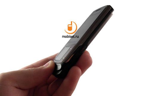
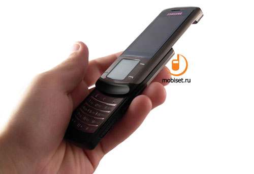
Having the deep slant on the front panel the phone provides convenient opening without leaving fingerprints on the easily soiled protective glass of the screen. The slant is also comfortable in the work due to the light mechanism and smooth travel of the halves along the thin rails. We haven▓t noticed any squeak or friction. On the half of the way the autorefining mechanism works, which makes a dull click when the handset is opened and a clear clap when it is closed. If we try to compare our impression from the slider mechanism we remember just the 6500 Slide and Sony Ericsson W910i.
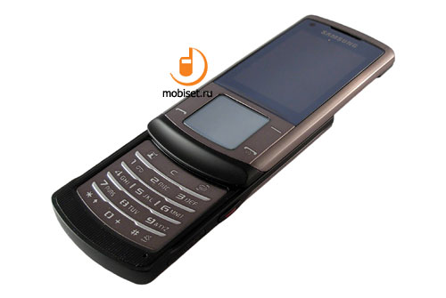
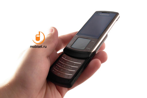
After opening the phone you see the numerical keypad made from the solid metal list covered by the glassy film. Besides the graved cuts of the signs, the metal insert has the vertical lines with jetting out soft silver ridges providing good tactile feedback of the horizontal rows. As the keys have more than the average dimensions, the combined vertical rows of the flat buttons don▓t affect the blind dialing. The top line of buttons is occupied by the edit key flanked by the dedicated manager key to switch the main functions to the right and button for video calling to the left.
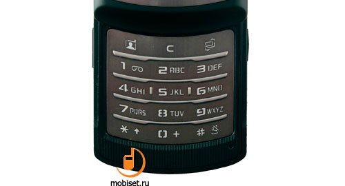
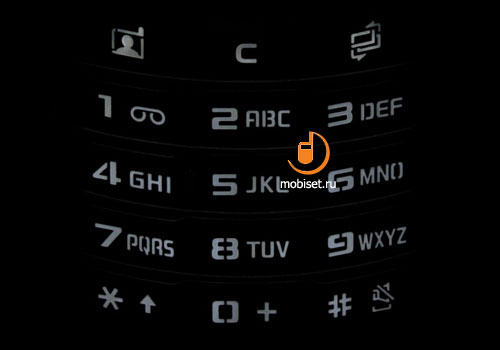
The last thing we▓d like to mention apart from the short smooth travel distance and the distinct click with a specific snap is one centimeter space between the lower row of keys and the end of the case. The latter characteristic in combination with the embedded pad makes the work with the phone even more interesting.
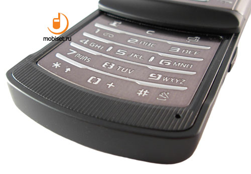
The lower right corner of the case, under the keypad has a small microphone pinhole, which provides good audibility when talking without a headset.
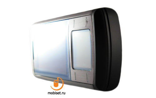
The top end of the phone is bereft from any keys but is notable for the solid glossy insert, as the main part of the case is made of the matt black plastic with a rubber Soft Touch coating. The bottom part of the case as well as the top one is chamfered in order to reduce the visual dimensions. It is all for it, as it can▓t boast about any elements.
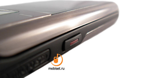
The right side of the handset is much more interesting. Three centimeters above the bottom end of the case, the manufacturer placed a noticeably jetting out dedicated camera key. It has clearly fixed focusing and an indistinct final pressing, which works as the shutter release. We will come back to the peculiar work of the key, when we will describe the camera of the handset, but now let▓s look at the elements locating between the camera key and the lower end of the device.
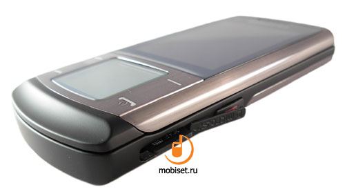
We are talking about the microSD memory card slot. It has a handy groove and its plug can be rotated on 180 degrees up, which allows you to pull the card in and out. As to the maximum card size we don▓t have much good to say: because of FAT16, the phone doesn▓t support cards exceeding 2GB.
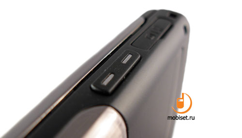
On the other side of the case, exactly on the same place we find a similar plug of the system slot of the classical format. Above it the phone has a small volume rocker key, which you can use for volume adjusting, when the phone is in the left hand and closed. The key notably stands out from the surface. Having soft travel and distinct click, you don▓t face any inconvenience when using it. Close to the bottom end of the side the vendor placed a big stripe eyelet. We managed easily pull in the loop in the eyelet, so the accessories fans are enabled quickly changed the stripes without using tools and spending much time on it.
In the top part of the front half of the phone you see a big camera set consisting of 5 megapixel camera with autofocus, small self-portrait mirror and LED flash. This camera unit is similar to the one installed in the Samsung G600.
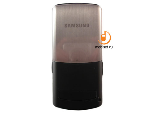
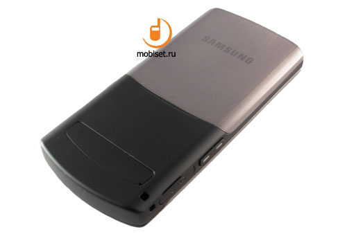
The rear surface as we have already said is made of the black soft plastic, in case your U900 is made in the gray colour scheme. The white U900 comes with a light milky rear panel. In the bottom part you can easily see the pasted insert covering the fixing screws of the case. The top part of the rear panel is made of the steel covered with the protective film which much more easily attracts scratches than the front one. Nevertheless, the cover does it best when giving good haptic feedback, while numerous rails and fixing groove save the phone from plays and squeaks.
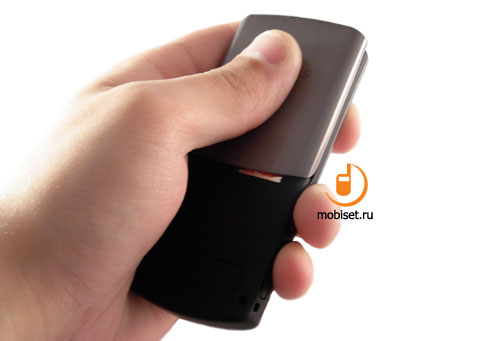
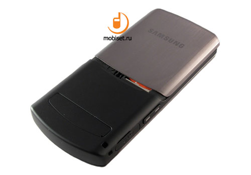
To remove the cover you should strongly press it with the thumbs and pull it up, then you need only lift it up on you and surprise one more time, how interesting the engineering idea of the Samsung designers.
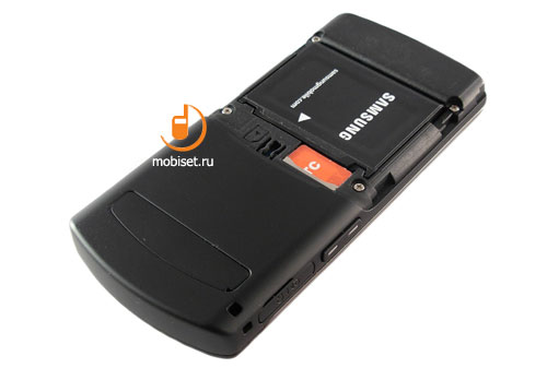
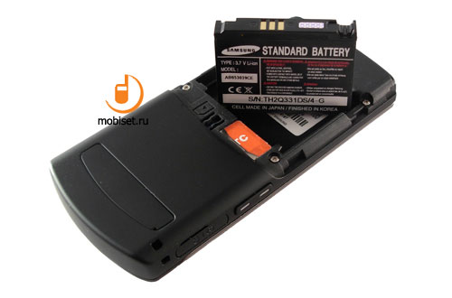
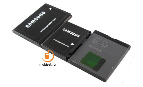
Under the cover we find a compact, rather thick 880 mAh Li-Ion battery. Within Moscow networks run by MTS operator the phone lasted about two days at 30-40 minutes of calls, three hours of music via A2DP Bluetooth, thirty minutes of work with EDGE and twenty minutes of shooting. In case you reduce the activity to 20 minutes of talks, one hour of music via headset, the phone will manages to stay online just under three days. The non-stop gaming, surfing the Net, photo/video shooting and playback discharge the battery in six and the half hours. The result is rather good for this low-capacity battery.
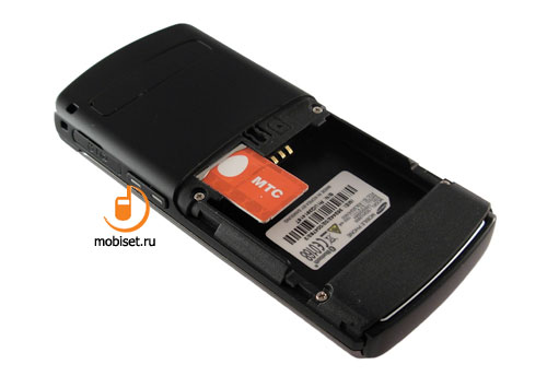
Under the battery compartment we see the sim card slot. The installed battery naturally prevents from the hat swap. The pulled-in sim slightly jets out, thus it will be a hard task to pull it out when it is cold, though now we can forget about cold days.
Specifications
- GSM/UMTS Samsung U900 Soul.
- Band: GSM 900/1800/1900, WDCMA 2100
- Network & Data: GPRS Class 12 (2TX, 4 RX), EDGE Class 10.
Sales package
- Handset
- Charger
- Battery
- Wired headset
- USB data cable
- Numerous user guides and software discs.
In comparison with the sales package declared on the official cite, our sales pack lacks a Bluetooth-headset and a memory card, which of course isn▓t a big drawback, as the 2GB memory cards are affordable at retail.
Interface
When in the stand-by mode we find all main readings in the top bar of the screen. Below it the screen shows small line with date and time. The operator name still stands in the bottom part of the screen, right under the signs of the context touch sensors. The right context sensor is in charge of messages and can boast about a small icon shaped as an envelope instead of the small signature.
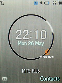
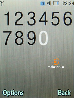
As the handset ships with the 2.2■ screen, the signature of the right soft key doesn▓t seem tiny, thus we fail to understand why they have subsidized the name of the left soft key with the envelope icon. When dialing a number, you can choose among an average print size and a gigantic one with only five signs crammed in one line.
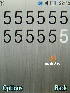
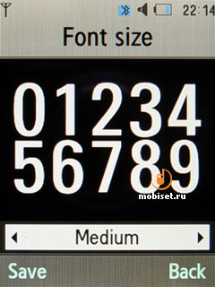
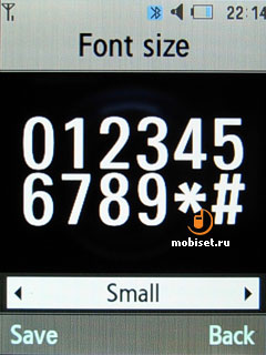
Another special key is in charge of four main (according to the manufacturer) tabs. They are as follows: Call, Messages, Browser and End all (this function returns the phone to the stand-by mode). This menu can be called up, when in any submenu, otherwise, it would have been useless. As before the volume rocker changes the volume of keypad when in the stand-by mode. The camera can be activated by two-second pressing the shutter release key.
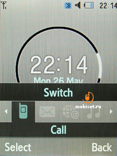
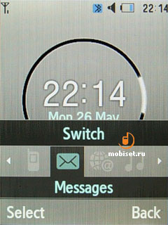
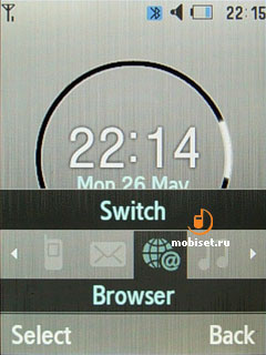
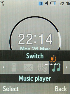
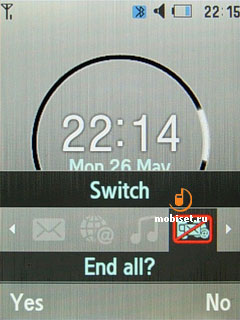
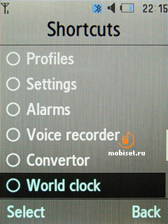
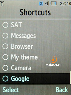
In the stand-by mode we are also enabled to assign most functions to the navigational sensor keys.
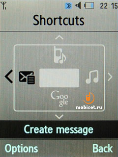
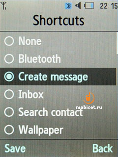
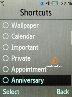
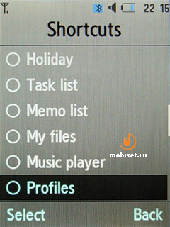
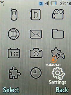
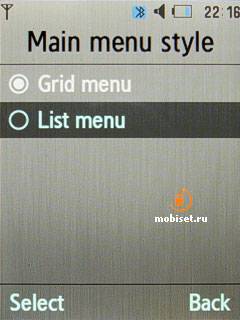
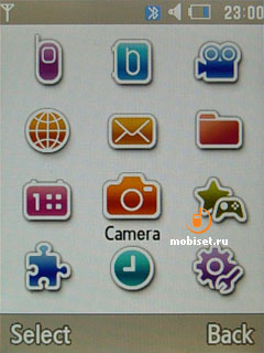
The main menu can be viewed as 3x4 icon grid consisting of 12 simple icons with signatures under them. The icons can be either monochrome or very bright with saturated colours. The interface detailed implementation deserves the most praises thanks to completeness and odor of austerity combined with easy perception.
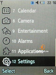
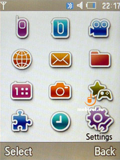
The numerical navigation is available in all menu items. The numeration and subitems arrangement, which are implemented in most cases as the vertical list with the horizontal tabs, are made considering the 12-button numerical keypad.
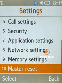
The personalization capabilities of the interface are probably one of the most flexible among the modern mobile handsets.
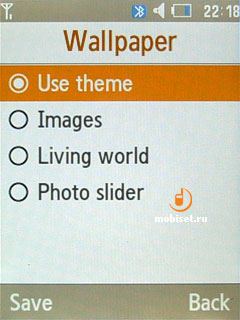
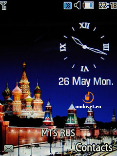
To begin with, we▓d like to mention the capability to use the Living World add-on as the wallpaper, which consist of a set of wallpapers with date and time made in different styles. When in Russia, we see a photograph of the Kremlin and an analogue watch. The information about current picture is taken from the base station of the operator. So you have to travel a lot, to see different pictures on the screen.
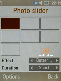
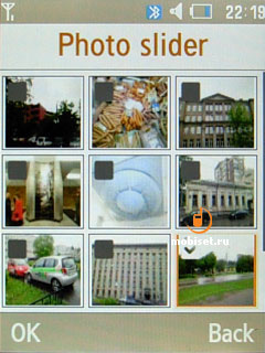
The next creative mean is so called ⌠live wallpapers■. The user can create a sequence of 9 pictures, which will be changed in accordance with the chosen time (3, 8, 15), and choose one of the 8 styles of substitution the previous image.
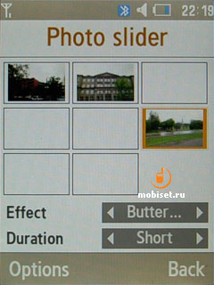
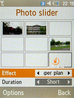
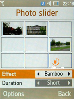
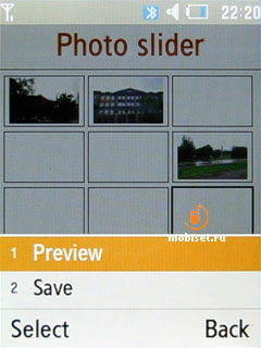
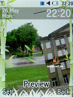
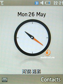
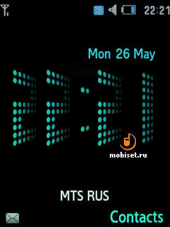
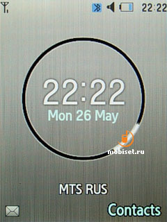
The user is also enabled to adjust the time bar. For your choice there are common watch resembling segmented one, and the like of inverted segmented watch.
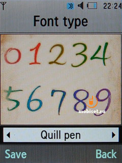
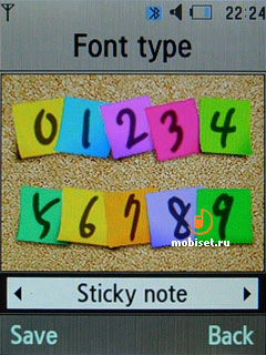
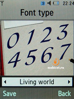
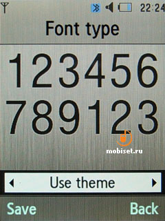
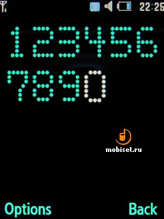
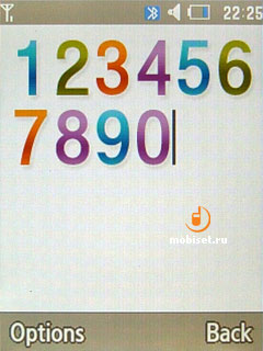
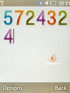
Finally, it is worth to mention the print styles used when dialing. There are two rather usual prints: common Arial and free one with shifted number ends.
To each of them we can adjust size and colour:
- black
- One of the 16 bright colours
- 12-step gradation of one colour for all 12 keys
- Rainbow gradation for 12 symbols.
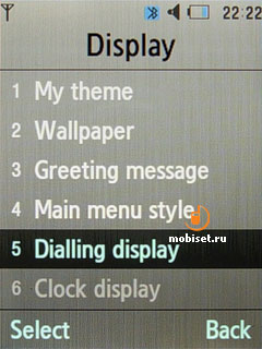
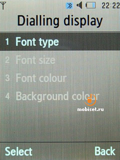
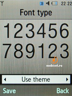
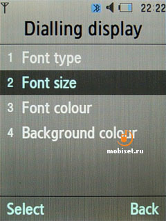
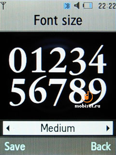
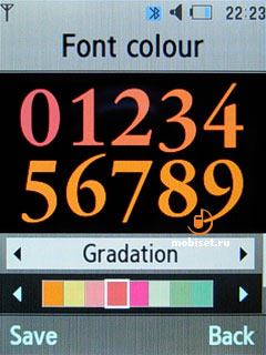
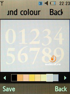
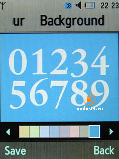
But it is not all surprises. The user is enabled to use animated effects for entering a phone number. The phone can represent the figures as the stickers on the wall , or as if they are written with a pen in the notebook and with a small picture from ⌠All World■, as well as if they are written with an ink pen on the old canvas. All these effects look very exotic and rather handy in work.
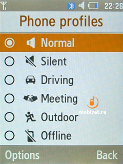
The phone profiles are limited by 7 settings, which can be adjusted by the following items:
- Alert type (call, growing call, vibration, call then vibration, call and vibration, vibration and growing call, silent)
- Voice call ringtone (mid, mp3)
- Video call ringtone
- Volume scale with 7 steps
- Auto call receiving
The same settings except the repeat function are available for messages.
In the last tab we adjust keypad tone (there is no vibration), power on/off types and volume of all signals.
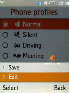
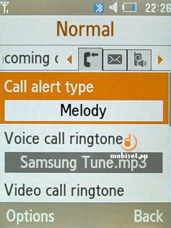
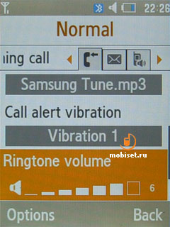
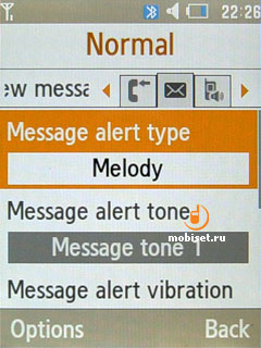
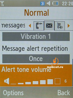
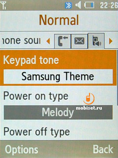
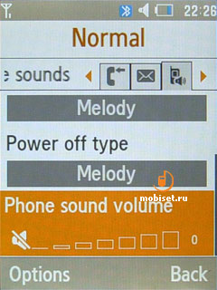
The security option, which is in charge of protecting all information saved in the phone, is also rather good implemented thanks to the possibility to fix passwords, block some sections of the phone book and messages and set a phone lock.
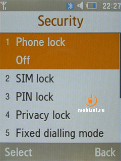
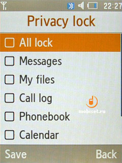
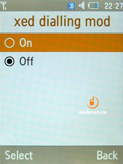
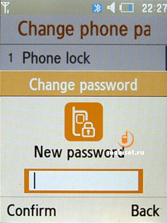
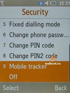
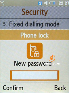
We think that is all main interesting features of the phone user interface.
Phonebook
The way the phonebook organized resembles the smartphones running S60. There are vertical lists, as well as the horizontal tags to switch among the viewing modes, which include groups of contacts or a general list of contacts.
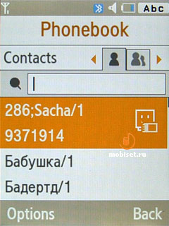
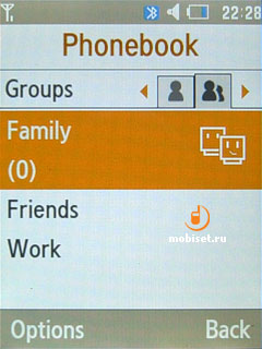
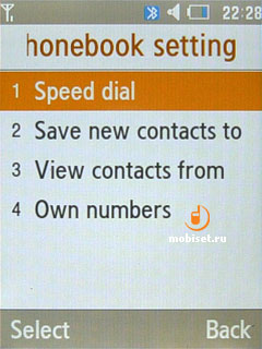
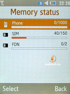
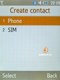
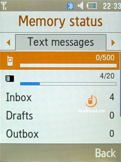
In the phonebook settings you can choose where to save new contacts to. Also you are enabled to change a way of viewing the list of contacts. They can be viewed as a list of either the first names or the second ones. In the settings you find an option allowing to copy all contacts in the phone memory or on the sim, as well as to learn the memory status in all kinds of memory. For example, the phone book can save up to 1000 contacts in the phone memory and 150 contacts in the sim card. The special contacts are limited to 10.
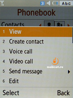
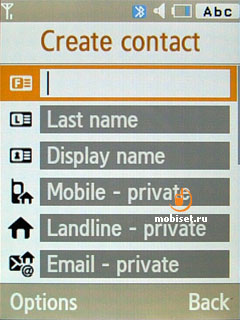
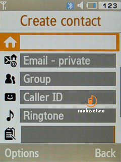
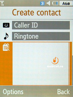
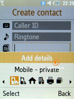
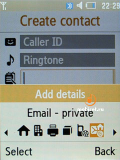
The fields to each contact are as follows:
- First name
- Last name
- Mobile
- Landline
- Fax
- Office phone number
- Additional phone number
- Birthday with a reminder
- Picture
- Personal ringtone (mp3 is supported)
- Group
- Note (up to 50 symbols).
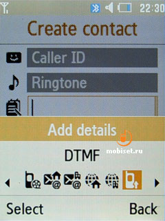
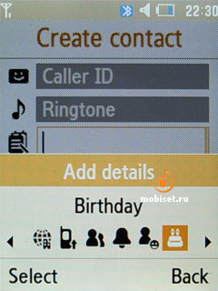
The search can be performed only by first/last names, but it is searching for the coincidence with all first and second names. For example, we enter ⌠H■ in our test phone and it starts searching. But when the search is by 8, it doesn▓t work and list cursor freezes. Other vendors used to do search in the opposite way.
Unfortunately, there is no option selecting several contacts for sending SMS.
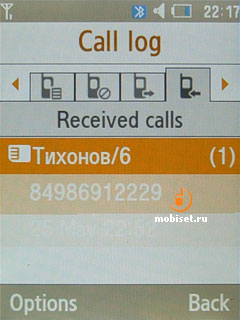
The call lists are a common mean with a horizontal sorting by received/dialed/missed calls, which have a peculiar basket for up to 10 cells. In the basket we are enabled to save unimportant contacts, which we don▓t want to see in the main list of contacts.
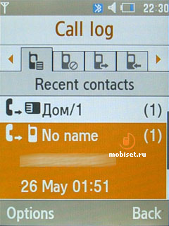
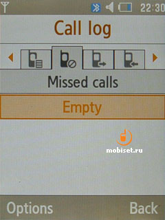
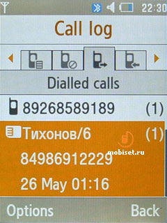
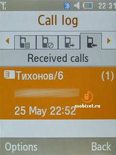
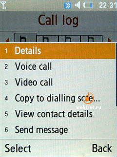
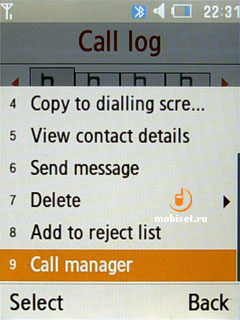
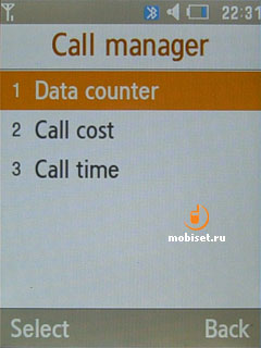
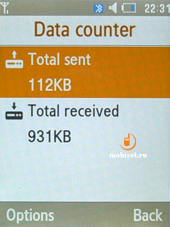
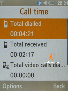
In the main menu you get access to the same call lists, but here you are allowed to learn the call time and duration.
Messages
To work with all types of messages the phone has an application, which similar to the Phonebook consists of many parts. In the first part we find programs for creating SMS/MMS/Email.
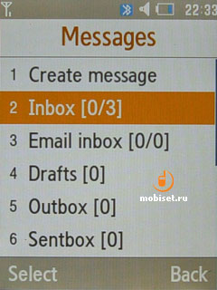
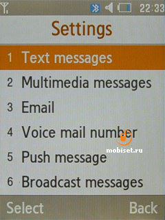
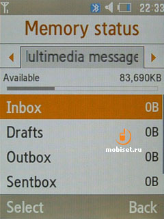
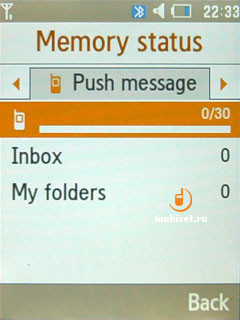
In case we need to create a SMS, we open a common window with a white text field. Depending on the print size the number of lines in the window changes. With a small print the handset shows up to five lines, with an average print √ four, big one, as you can guess, occupies three line. You are also enabled to choose italic or boldface print, add underlining or strikeout. Latterly, there is right/left/justified alignment. Of course, all these effects can be seen only in the Samsung devices.
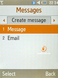
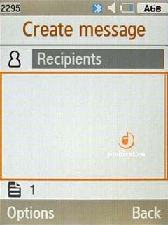
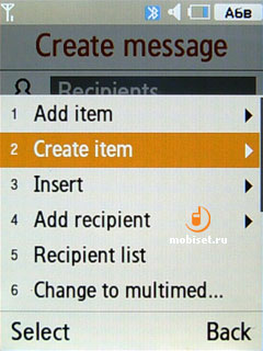
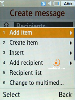
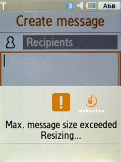
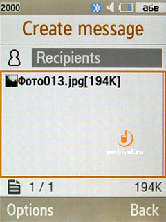
Creating MMS and Email doesn▓t offer many capabilities, thus we are going to mention only some facts. In the MMS part we see the exemplary message structure consisting of four tabs:
- Add message description containing up to 40 symbols
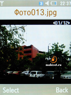
- Add picture, video clip
- Add music and other sounds
- Add text containing up to 1000 symbols.
That is all for options. But we▓d like to mention another option allowing to create one more slide in the message, as well as an interesting item of attachments. In the latter item we can add VCF-file of the contact, task, note or something else from the folder ⌠Others■. When creating email the options remains the same except missing slides and an accent on the very attachments.
Alarm
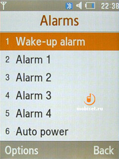
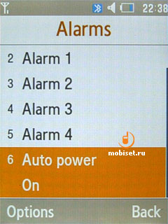
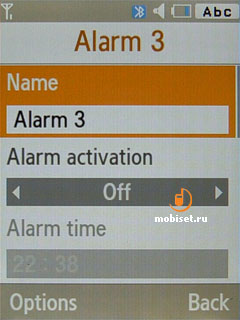
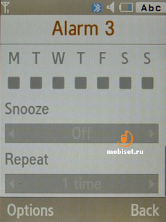
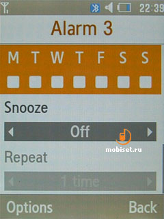
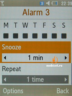
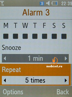
The handset comes with five peculiar alarms. To each of them you can choose name, melody, alert type, loudness, days of work and, of course, alarm time. The alarm can wake you up when the phone is turned off. But the names can be given only to four alarms, as the first alarm has an unchangeable name ⌠wake-up alarm■
Calendar also has an icon in the main menu of the phone.
We are enabled to choose monthly view or weekly by the hour view, as well as to look through the reminders of the chosen day. As the reminders we can use appointments, tasks and anniversaries. The fields containing the information are limited to:
- Details (up to 30 symbols)
- Short note (up to 100 symbols)
- Start date
- End date
- Start time
- End time
Some items can be absent depending on the reminder type. They are as follows:
- Place of a meeting
- Participants
- Priority
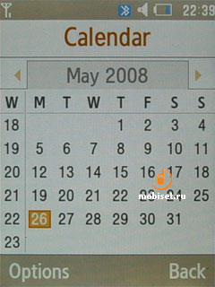
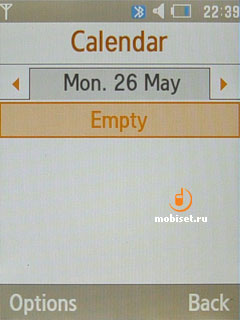
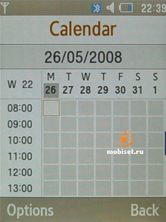
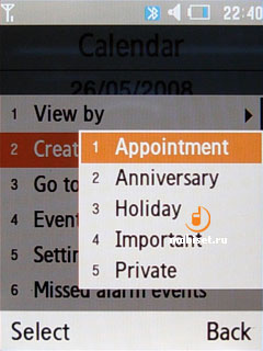
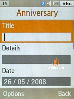
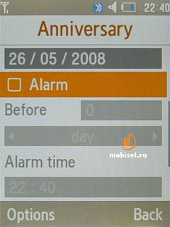
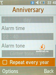
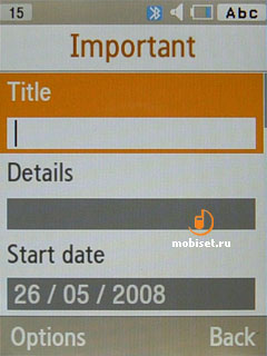
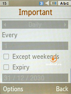
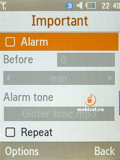
In general, this application for creating reminders suits those, who don▓t often use it.
Applications
Internet
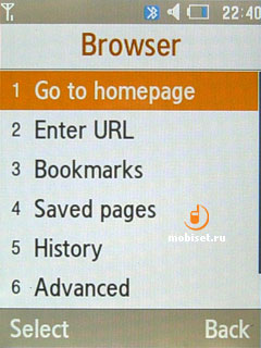
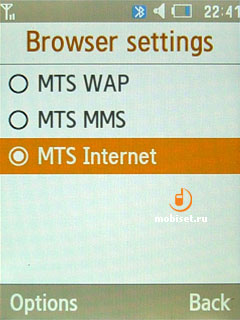
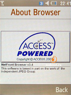
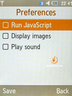
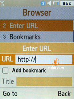
The handset uses Net Front WEB-browser allowing to view either WWW or WAP pages, however, the latter are more often used. The adjusting GPRS-Internet profiles is a tat vague process, while we adjust GPRS-WAP just like that. In the main menu we see Google item featuring two tabs: Google search engine and Gmail WEB 2.0.
Voice recorder
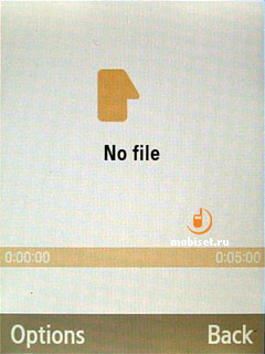
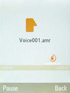
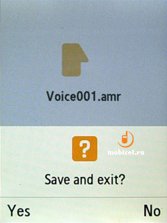
Samsung U900 Soul has a common voice recorder allowing to record voice clips from the mic and save them as amr-files. The maximal duration is up to one hour. When talking you can▓t turn on the record, as there is no special item in the speaking menu.
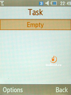
In the task item we can find common notes limited to 20 symbols.
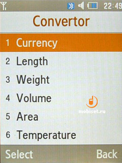
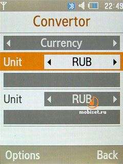
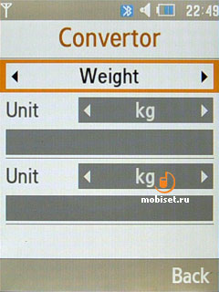
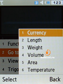
Convertor is sorted by types of necessary values: length, weight, area, temperature, currency, volume. After choosing a tab you want, you can shift it in the convertor window with the help of the top tab. To each value we can find about 8 value measures. Unfortunately, you are unable to add your own measure, though most users don▓t need this capability at all.
Timer
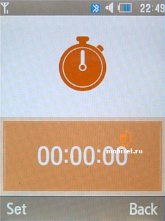
There is a simple timer, which is enabled to fix time from one second up to about 99 hours.
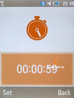
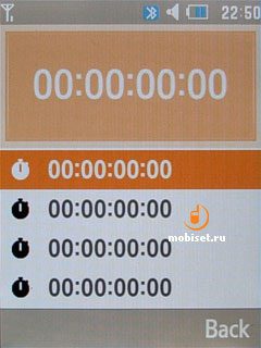
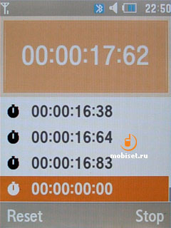
Stopwatch is limited to about fifty intermediate values, which may be not enough only for hours-long ring-races.
World clock
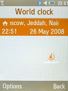
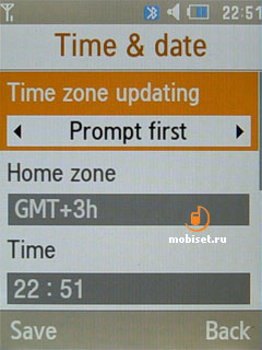
There is a common indicator for the current time in several time zones. Some aesthetes can choose the same country for all three cells.
Calculator
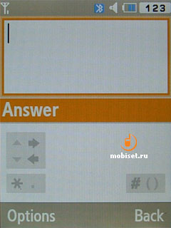
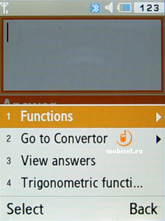
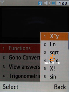
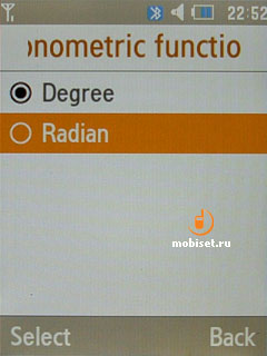
The calculator is interesting for the presence of main algebraic functions including calculating square roots, function X^y, logarithm with 10 base and so on. There is also a possibility to use brackets, what is more you can use several of them. In the everyday life you are hardly use these calculations, while it can be useful for students. Honestly speaking we don▓t remember another phone capable to calculate exercises like 52 (16) and so on. It is handy, that the received values can be easily moved to Converter.
Communications
Bluetooth
It is interesting that Bluetooth 2.0 locates in this menu item. As usual, the supported profiles are placed in the service item. The supported services are as follows:
- Headset
- Handsfree
- Bluetooth stereo headset
- Serial port
- Dial-up
- Basic printing with the help of Pict Bridge technology
- File transfer
- Object push (sending contacts and notes)
- SIM access.
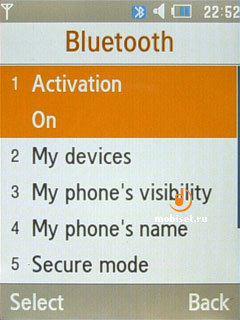
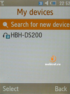
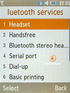
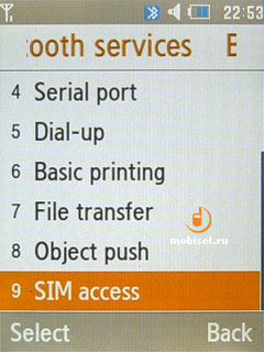
We didn▓t face any problem when working with Bluetooth. The transfer speed was rather good and amounted up to 150-160KB/s.
If you need to connect the handset to PC, you has to have PC Studio installed, otherwise the phone won▓t transfer files with the information recorded on the memory card at the speed totaling 800-900Kb/s and speed data 80x.
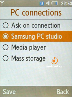
Image editor
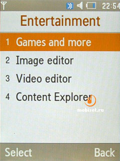
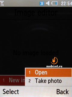
Unlike the previous version of the software, the image editor is placed among the options of the file manager. The latter itself is not something extraordinary, thus we▓d like to describe the image editor. It is rather simple: open a picture in the photo section or take a still with the help of the camera, then the picture is opened in the editor. For your choice there are the following actions:
- Colour effects (sepia, negative, black and white, lightning, crayon pastel, milky, oily)
- Red-eye removal
- Brightness, sharpness, colour balance
- Geometric distortion
- Partial effects
- Add texts, pictures, smiles
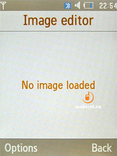
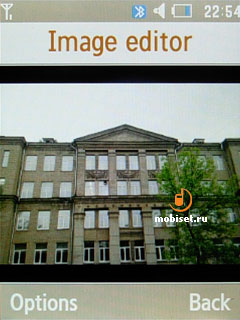
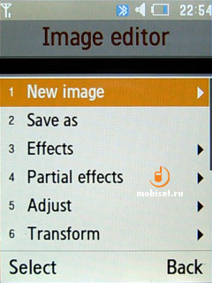
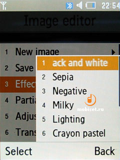
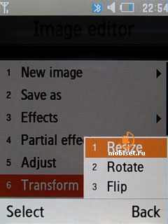

We doubt whether this program is useful in condition of mediocre camera and screen.
Games, Java
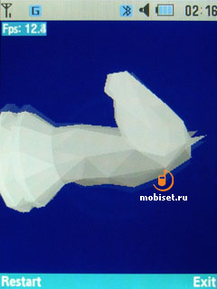
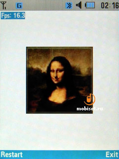
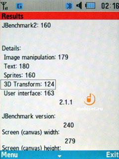
All prototypes have an interesting feature: the sales samples provide an opportunity to install MIDP 2.0 files by means of sending Jar and Jad-file to the memory card. The prototypes don▓t have this feature and they can only download midlets from the Internet. The Java-machine performance depends on the 209 MHz ARM9 processor instead of the common 121 MHz one. Nevertheless, the accepted JBenchmark 2.0 results stand back from Nokia and Sony Ericsson.
Music player
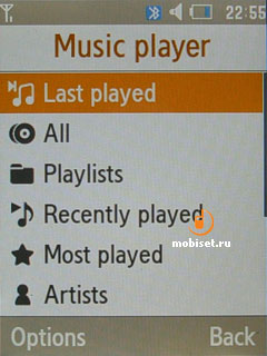
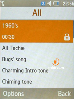
As we have to do with the music-oriented device, this Samsung handset logically can▓t have a common player. The player interface compounds a common sorting window with a playback window similar to the F300.
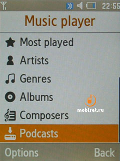
The sorting has the following items:
- Last played
- All
- Recently played
- Most played
- Artists
- Genres
- Albums
- Composers
- Podcasts
The sorting criteria are rather impressive and worth the name of the good music product in 2007-2008.
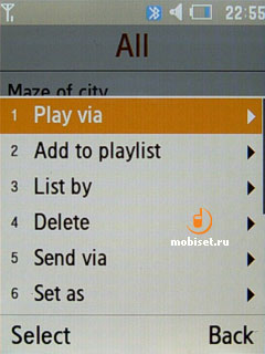
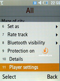
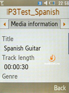
The playback window has the interface resembling Nokia N73ME and so on. However, we can▓t say that the interface copies it, as along with the informational bar above the clock, you find popularity indexes and activated settings under the progress bar. The album cover is rather small. It has an average size (1.2x1.2cm), but still you can make out the outlines on it.
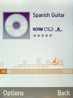
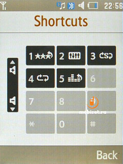
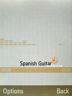
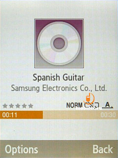
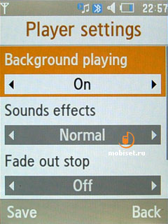
The playback settings are shuffle mode, which is activated when you press 6, when pressing 3 you can repeat track/list. The sound setting is an equalizer, which doesn▓t have a manual adjusting.
The sound effects can be: pop, rock, dance, classic, jazz as well as the mode of broaden stereo, higher dynamic and volume. The three latter effects should logically be apart from the equalizer. But as we haven▓t said there is any equalizer, everything seems ok.
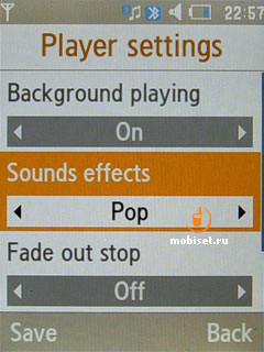
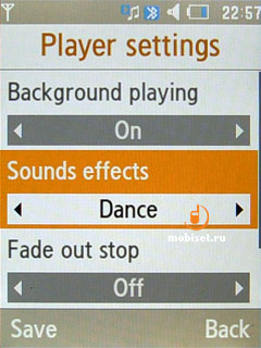
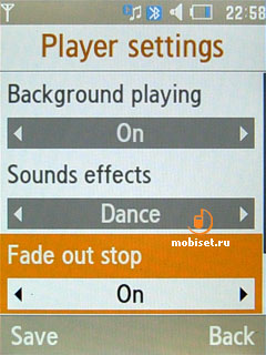
The sound quality isn▓t perfect, but the low and high frequencies are well worked out. They are good enough for playing back in the transport not only with the headphones from the sales pack, but also with other headphones. The latter can be connected to the handset with the help of the 3.5mm adapter from the sales pack. As we▓ve mentioned the adapter, we▓d like to say that there are no reasons to use F330 instead of player. It is much comfortable to use Stereo Bluetooth headset than the wired alternative. That is not only because of the USB port plug, but also because its location.
The handset is also equipped with a FM-radio working in the 87.5-108MHz frequency range. The radio interface copies the player interface except the signs to the navigational sensors which are placed differently.
Among different options we find auto alternative frequency search. Cycling through the saved stations is dedicated to up and down presses, while manual search with 0.1MHz step is dedicated to the left and right keys. The memory is capable to save 100 stations, which will be enough for almost any user.
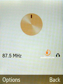
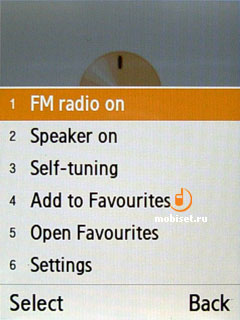
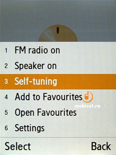
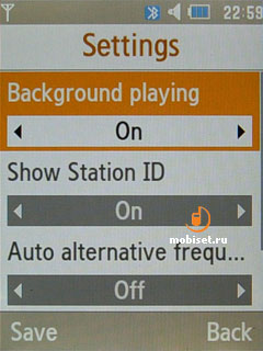
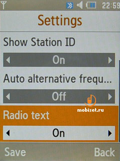
The user is allowed to see RDS-information as the running line.
Camera
The phone ships with a 5megapixel camera with autofocus on board. It locates in the thick jutting out unit in the upper part of the slider. We think it is time to describe work with the camera, as you can take stills only with the slider opened. Of course, there is nothing strange in it, as Samsung G600 also lacks this capability, but the camera interface is designed to use the phone in the horizontal orientation only.
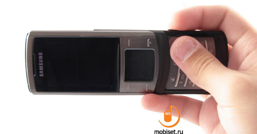
The camera interface settings have no traditional option to choose the portrait orientation. The stills with the vertical orientation have to be scrolled manually. Moreover, the shutter release is dedicated to the side key, while the central sign disappears from the sensor pad. In these conditions we have no possibility quickly adjust white balance, brightness and other things.
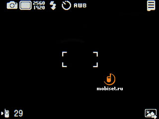
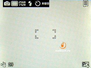
The camera menu gives the user an opportunity to choose active camera, apply frames, view actions dedicated to the numerical keypad, adjust white balance, colour effects and timer (3,5,10 seconds). In the menu we can find the window of shooting modes (single shot, series of shots with fixed resolution, 3x3 grid of shots with 2 megapixel resolution, panoramic shooting) and resolution window (2560 X 1920, 2048 X 1536, 1600 у 1200, 1280 у 960, 800 у 600, 640 у 480, 320 у 240).
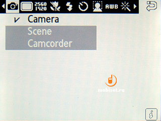
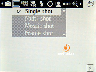
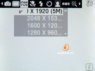
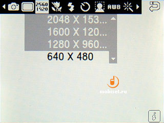
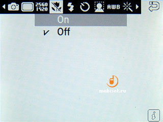
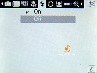
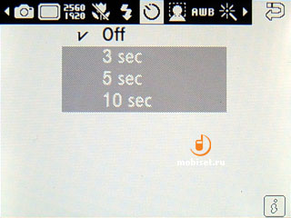
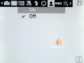
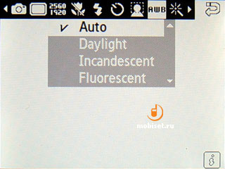
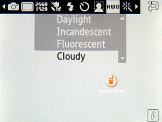
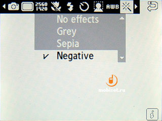
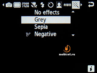
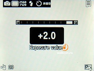
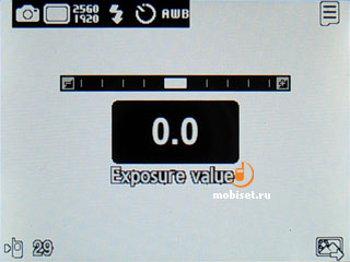
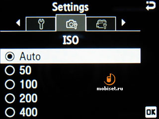
In the settings we can change ISO, turn on the night mode, choose spot or matrix exposure metering, use auto saving of a still, adjust sounds of the shutter release and other actions. Fortunately, we can turn off all these sounds.
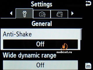
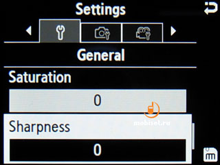
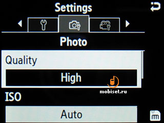
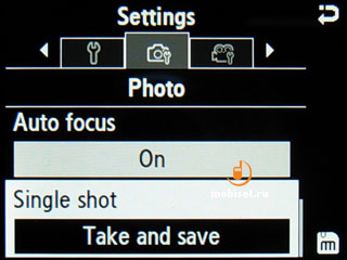
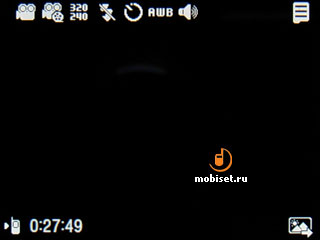
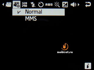
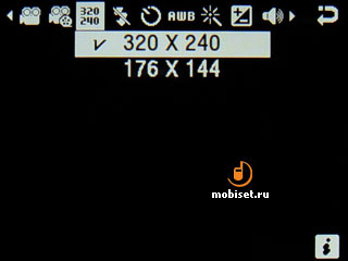
When in the camcorder mode, along with the colour effects, white balance and time we are enabled to choose frame resolution (у 96, 176 у 144, 320 X 240, 352 X 288), turn off sound recording, as well as to adjust the way of limiting the clip duration. The camcorder settings are interesting only for the possibility to choose clips bitrate and adjust clip names.
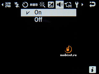
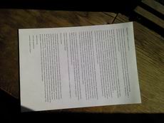
All in all, the picture quality is expectedly average and can be compared with pictures done with Sony Ericsson C902, G900. It is slightly worse than the K850i when shooting in doors, though when out of doors in the sun, the camera has almost no rivals in colour rendering and soft refining. As our guest doesn▓t pretend to be a photo-oriented solution and has rather mediocre ergonomics, it is your turn to apprise some stills we made for you and make your own decision concerning the picture quality.
Comparsion Samsung U900 Soul and Nokia N95.
 N95 - [+] maximize, 2592x1944, JPEG, 1.1 MB |  U900 Soul - [+] maximize, 2560x1920, JPEG, 2.3 MB |
 N95 - [+] maximize, 2592x1944, JPEG, 1.2 MB |  U900 Soul - [+] maximize, 2560x1920, JPEG, 2.2 MB |
 N95 - [+] maximize, 2592x1944, JPEG, 930 KB |  U900 Soul - [+] maximize, 2560x1920, JPEG, 2.3 MB |
 N95 - [+] maximize, 2592x1944, JPEG, 1.5 MB |  U900 Soul - [+] maximize, 2560x1920, JPEG, 2.3 MB |
Samsung U900 Soul camera samples.
 [+] maximize, 2560x1920, JPEG, 2.2 MB |  [+] maximize, 2560x1920, JPEG, 2.3 MB |
 [+] maximize, 2560x1920, JPEG, 2.1 MB |  [+] maximize, 2560x1920, JPEG, 2.4 MB |
 [+] maximize, 2560x1920, JPEG, 2.2 MB |  [+] maximize, 2560x1920, JPEG, 2.3 MB |
 [+] maximize, 2560x1920, JPEG, 2.1 MB |  [+] maximize, 2560x1920, JPEG, 2.3 MB |
 [+] maximize, 2560x1920, JPEG, 2.1 MB |  [+] maximize, 2560x1920, JPEG, 2.0 MB |
 [+] maximize, 2560x1920, JPEG, 2.3 MB |  [+] maximize, 2560x1920, JPEG, 1.9 MB |
 [+] maximize, 2560x1920, JPEG, 2.2 MB | 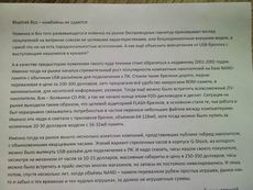 [+] maximize, 2560x1920, JPEG, 2.2 MB |
 [+] maximize, 2560x1920, JPEG, 2.2 MB |  [+] maximize, 2560x1920, JPEG, 2.0 MB |
 [+] maximize, 2560x1920, JPEG, 2.3 MB | 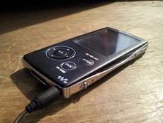 [+] maximize, 2560x1920, JPEG, 2.1 MB |
 [+] maximize, 2560x1920, JPEG, 2.4 MB |  [+] maximize, 2560x1920, JPEG, 2.3 MB |
 [+] maximize, 2560x1920, JPEG, 1.8 MB |  [+] maximize, 2560x1920, JPEG, 2.3 MB |
 [+] maximize, 2560x1920, JPEG, 2.3 MB |  [+] maximize, 2560x1920, JPEG, 2.4 MB |
 [+] maximize, 2560x1920, JPEG, 1.9 MB |  [+] maximize, 2560x1920, JPEG, 2.3 MB |
 [+] maximize, 2560x1920, JPEG, 2.1 MB |  [+] maximize, 2560x1920, JPEG, 2.1 MB |
 [+] maximize, 2560x1920, JPEG, 2.1 MB |  [+] maximize, 2560x1920, JPEG, 2.3 MB |
Video sample 1, mp4, 741 KB >>>
Video sample 2, mp4, 1.7 MB >>>
Phone quality
The signal receiving quality is good as in all Samsung devices, though the location of the antenna in the bottom part of the handset might have affected the voice quality. The earpiece is a tat louder than the average one, though the loudness is provided only with the help of the over-stressed high frequencies, while the others are notably tuned down. In fact there is no loudness reserve due to the utilized voice improving technology. The tracks are played via the same loudspeaker with the average or even worse loudness. Besides, the sound comes with aggressive middle frequencies and basses, which make the sound flat and unpleasant to the ears. The vibration slightly quivers, thus considering its small intensity we may miss calls when the volume is turned off.
Conclusion
The Samsung image slider stirs up permanent feelings. We find it good both on the first day and in a week. It is nice, that the stylish effect of the touch glass with the screen layout is larded with a good work at the higher comfort and tactility. The sensor is handy to work with when the sensitivity is maximal. The vibration together with the animation provides satisfactory tactile feedback, which have rights to exist unlike the previous solution in the phones of the company.
Can the handset be interesting as the image solution considering the acceptable price about $660? Of course, it can. We do think, it is the interesting handset offering the buyers the combination of uncommon control elements, together with good functionality inherent to the devices from the G-series and a case, which has not much metal parts and gives nice tactile feedback. Among the closest rivals of Samsung U900 Soul we can name only Nokia 65 Slide, which is cheaper, but can boast about neither good functionality, nor quality camera, nor pleasant metal haptic feedback. Add to these advantages of the U900 a good stylish odor, and you will logically conclude, that our guest has no competitors.
The targeted audience of the device is young people aged 22-35, as the younger people are greedy for either software functionality resembling smartphones or brands like Sony Ericsson and Nokia. Samsung has always been good for ⌠mature buyers■, which don▓t rush for some superb unexpected programs. To this kind of buyers Samsung offers good functionality of the G600 crammed into a casing, which can compete with Nokia 8800 Arte and Nokia 8600 Lune when it comes to the aesthetic comfort. The aggressive price policy of the company makes the U900 Soul rather affordable, as after the summer the price will go down the psychological level in $620 and we will be able to recommend the device as a good phone of the upper price niche with the good 5 megapixel camera.
╘ Written by Tikhonov Valeriy, Mobiset.ru
Translated by Arina Urban.
Published ≈ 16 July 2008.