Review of Sony Ericsson G502 √ Small Assistant
When the February announcement of the Sony Ericsson G-series, many people thought the UIQ-based smartphones would have this G-index, while the X-series would have to do with Windows Mobile. But why then have they made the G502 running the A200? The answer is in our review.Table of contents:
- Design
- User Interface
- Phone book
- Messages
- Organizer
- Multimedia Menu
- Music
- Connectivity
- Games, performance
- Camera
- Phone quality
- Conclusion
During MWC 08 Sony Ericsson introduced many devices with new indexes, but they didn▓t explain the meaning of them. Consequently the public had to think by themselves of what was hidden under the indexes X, C, G examining the introduced handsets. Thus there was an idea, that the G-series handsets could be used as the popular UIQ-based smartphones, which attracted those, who were frightened off by the brain twisting smartphones. The G700 and G900, which we have reviewed earlier, also satisfy these criteria and allow the users to subsidize their K800i, K810i, K600i with these aforementioned handsets, getting many new functions without losing the old ones.
In the end of the May we saw the third member of the G-series, namely the G502. At first glance it was a common device slightly beneath the G700 comparing the class. But after a good look at the Spy Photo▓s, we noticed, that the device had different keypad from the other UIQ-devices, while the buttons on the keypad was similar to these installed in the Sony Ericsson A200-based phones. Later the vendor confirmed, that the G502 had nothing to do with smartphones, so we can say that today we review the common phone, which nevertheless is from the G-series.
As so uncommon device has appeared, we should explain some facts about the series, where we will soon see one more smartphone, which is used to be known as the P5i, though its real name was the G902. The series offers the customers very handy means of communication. It resembles the Nokia E-series, but without esprit de corps. These devices provide a user with the convenient phone with the common multimedia and that is all. Partly, it looks fanny, as the hardware possibilities, except the cameras, copy the other solutions from the K-, W- and C-series.
Design
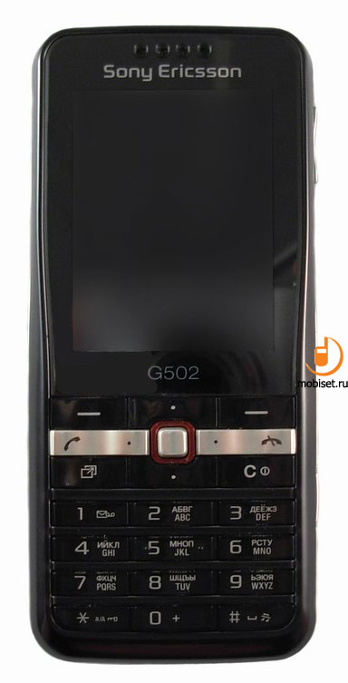
Sony Ericsson G502 is in fact the simple cosmetic renewal of the K660i, which came in sale in March 2008. That is way the compact dimensions of the casing are accepted as something common due to the wide-spread tendency of increasing dimensions because of the increasing the hardware characteristics.
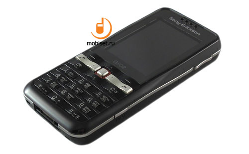
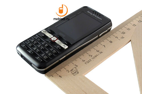
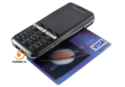
Judge yourself, the candy bar phone with rounded ends measures 102.7x46.2x14mm. The device lies comfortably in the hands thanks to the fine-textured matt plastic, which the most part of the casing is made of. The phone slips from the palm due to the sleek plastic, which is inherent in the Low End segment. The latter is the segment, where our guest is positioned by the vendor.
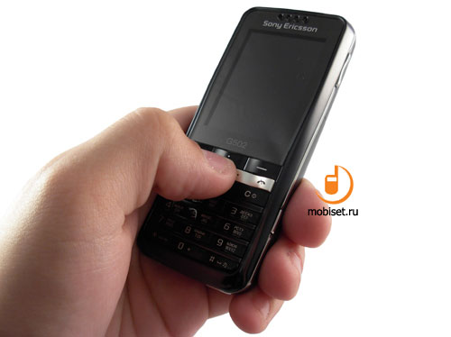
If we compare a common candy bar phone of the company of the higher class with Sony Ericsson G502, the latter looks if not a tiny one, but at least scaled. The compact dimensions go together with 83g weight corresponding to the plastic casing. The light weight allows to carry the phone in the breast pocket of the shirt or in the light pocket of jeans. Trousers, shorts and other summer clothes also suit this light compact device.
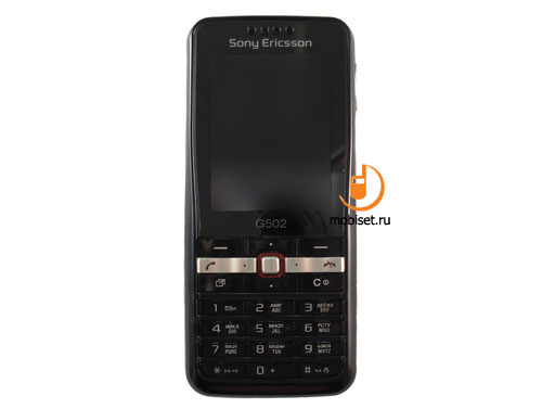
The whole front surface consists of the partly jetting out frame setting off the glossy surface, which consists of the thick protective glass of the screen and keypad. Let▓s start the review as usual from the top to the bottom. Close to the top end of the body we see four holes of the earpiece, which covered with the tiny grille.
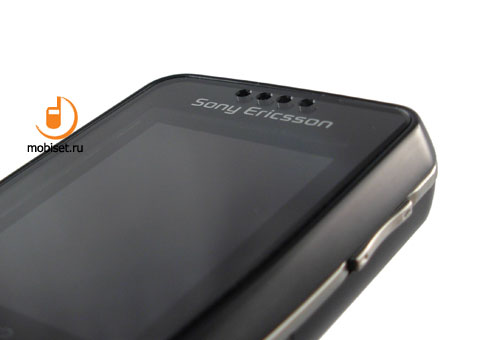
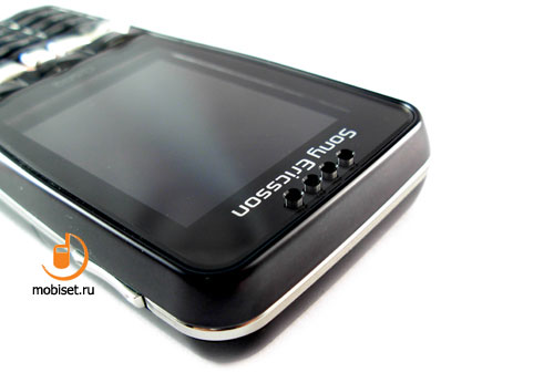
As the glass is 2 mm wide, the earpiece hole attracts pieces of dust, which can be removed with the help of a brush.
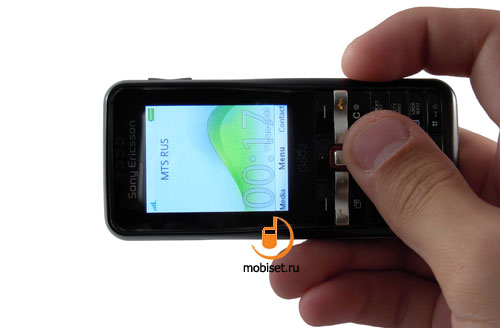
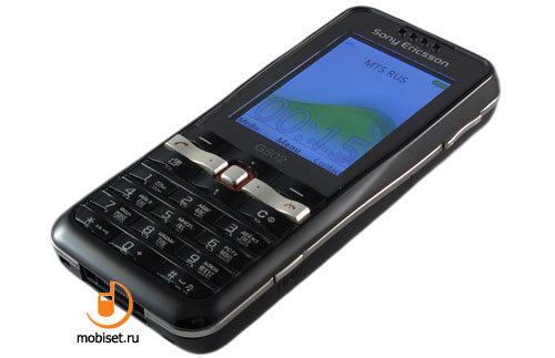
Below you find a 1.9▓▓ TFT screen with 240x320pixels showing up to 262000 colours. This screen is notable for its lower colour temperature, while brightness and contrast of the picture are good enough even for the exacting lovers of colours. Unfortunately, the brightness doesn▓t mean the correct colour range. The black colour gets notably yellow; the evenness of the backlit leaves much to be desired.
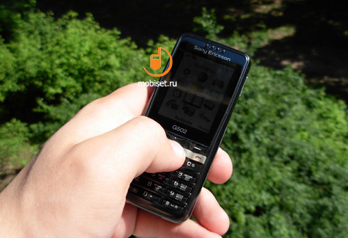
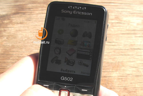
In the sun the screen looks rather bad, as the small physical dimensions together with the thick protective glass lower the sharpness, not to speak of the substantially faded picture. The viewing angles are limited by the same protective glass and measure 120 degrees in both surfaces.
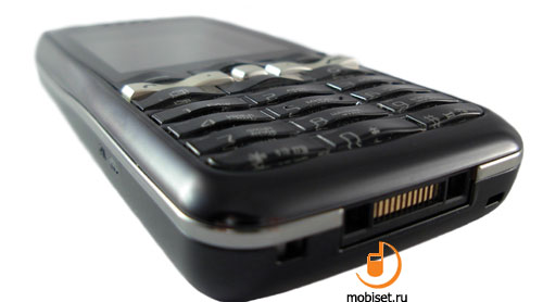
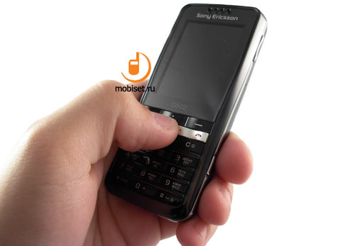
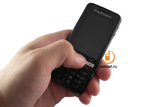
Under the screen the vendor placed an amusing keypad without boundary between navigational and digital keys. That▓s way it is more convenient to describe the keys by the colours. Let▓s start with four curved horizontal rows of digital keys, which are placed right before the rounded slant in the bottom part. The curved form provides a perfect tactile feedback. The substantial space between rows also impresses. The glassy keys are made of the transparent plastic with a black surface layer with small letters on it. The latter are interestingly blurred when looking at the phone at different viewing degrees. The travel distance is a bit shorter than usually, slightly tough; the click is distinct; the mechanical snap doesn▓t irritate the ears. We haven▓t felt any inconvenience, when working with the lower row of keys thanks to their substantially jetting out position.
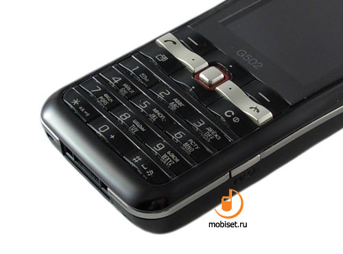
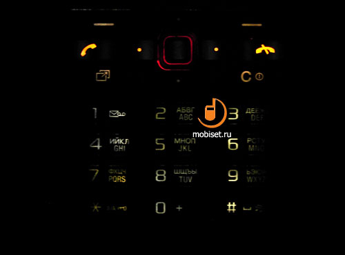
The navigational pad of the keypad consists of the two similar stripes made of the transparent plastic with black bottom layer which is a bit thicker. There is a shifted silver wave between them, which deepest places are placed parallel to the highest places of the black rows. If we speak about the side vertical rows of keys, on the top you see two soft-keys. The silver lines houses call receive/reject buttons on the sides. The bottom line utilizes Active Menu and reject buttons on the sides. For the first time the reject button in Sony Ericsson also doubles as the phone power key. The central keys form a cross with a hollow in the center. The latter houses a square silvery affirmative key framed with a red band. Thanks to the wide space between the central key and the other four keys, the navigational pad works well. It is interesting, but it does well, when ⌠blind■ working, as well as the other keys. The keys of the navigational pad have the same distinct click and mechanical sound.
The sides of the body utilizes curved silvery band, which makes the matt black plastic more attractive.


The left side is free from any elements, thus we go to the right side. The latter is interesting for the noticeably jetting out curved volume rocker key, which is harmoniously inserted in to the silvery band.
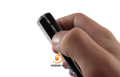
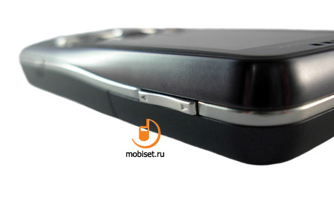
The key has a tough distinct clear click. The concaved form comfortably allows to adjust volume when talking both with the right and left hands.

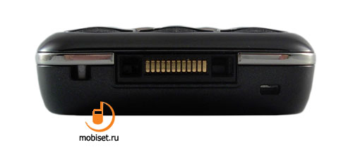
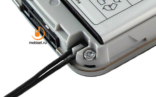
The left side houses no controls. The bottom end has Fast Port to wire all kinds of peripherals. The mic hole is moved closer to the bottom end. To the left of the USB port the vendor placed strap hole. The loop of a strap is put on the stub hidden under the battery cover.
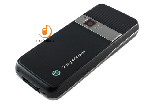
The rear fascia of the phone consists of the flat cover, which slightly rises near the top end, as it stands close to the chamfered silvery insert. This prominent part houses a big lens of the 2Mp camera without autofocus. Nearby you find a small window of the red LED, which works when shooting. Under the insert you see a relief black piece. Their joint is made as a long chink, from which you hear sounds of polyphonic loudspeaker.
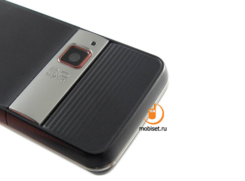
This solution looks interesting, as it is rather difficult to close it, consequently sound is audible everywhere.
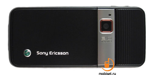
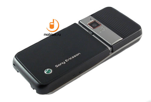
As we have already said, the whole rear fascia works as the battery cover. To remove it the vendor provided the handset with simple latches without holders. Moving the cover a bit down, you release the latches , then you should just lift it and amaze, how thin it is.
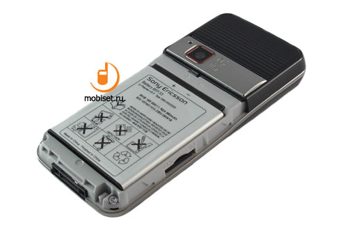
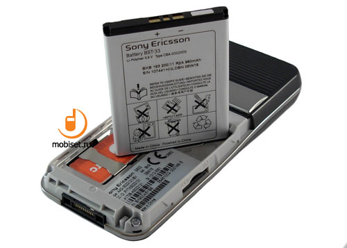
Under the cover you find 950 mAh BST-33 Li-Pol battery. It gives 4 days of battery life with 20 minutes of talks, 30 minutes of gaming and one hour of music.
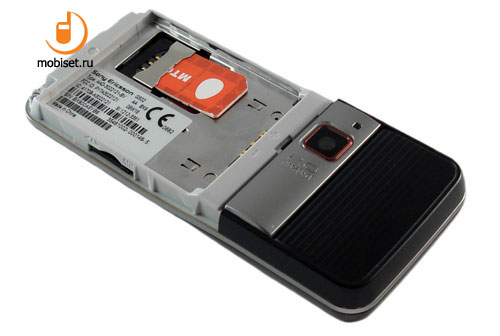
Under the battery you see a small SIM slot without holders, which can prevent drawing. The memory card slot is placed on the left end of the body, which is closed by the cover. The phone supports all Memory Stick cards.
User Interface
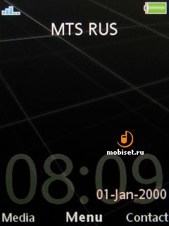
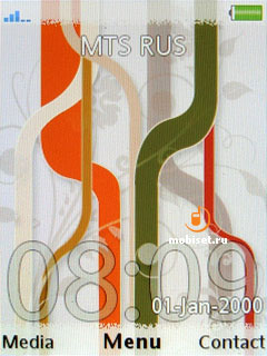
In the stand-by mode the corners of the top part of the screen houses the traditional 5-degree signal strength indicator and battery indicator. They frame a field for different system indicators, from missed events and active Bluetooth to silent alert mode.
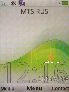
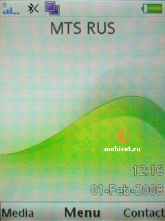
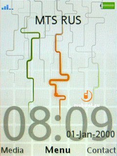
Below on the screen you can find the operator name and system information. The bottom part of the screen shows date, digital clock and timer counting, if it is any started. The first thing attracting your attention is a bold used in the titles of soft-keys. It becomes as small as the date indicator. The changes are caused by the improvements in the phone control system. This is a second, after A100, friendly step of Sony Ericsson towards the more compatible content, developed to the Nokia S40-series phones. Now in the bottom of the screen you see signs both to the soft-keys and affirmation button. But unfortunately, it has no effect on the possibility to appoint the soft-keys. The latter are still bound with the certain functions. The left key opens the Multimedia Gallery, the right one √ phone book. The joystick has now broader capabilities √ it can start the Java midlet. Active Menu remains unchangeable, so it is worth no repeat.
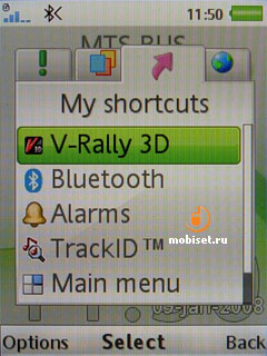
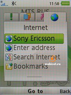
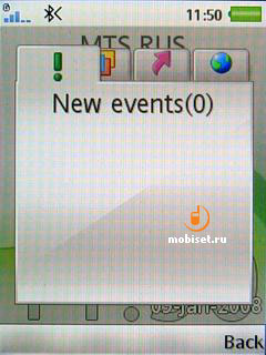
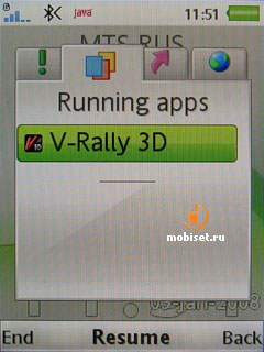
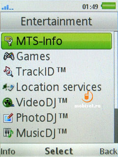
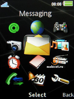
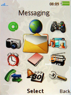
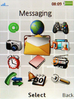
To enter the main menu you press now the central affirmative key. The menu consists of 12 items, which can be viewed as 3x4 grid. The submenu can be viewed either as a list, or as a list with horizontal tabs.
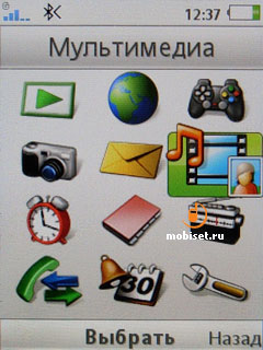
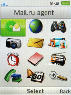
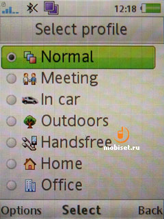
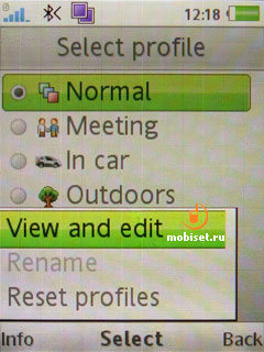
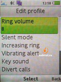
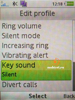
The profiles are still limited by 7 add-ins, which can be changed in terms of the following parameters:
- Ring volume
- Increasing ring
- Vibrating alert
- Key sound
- Divert calls
- Accept calls
- The way to receive a call (certain key or any key except the call end button).
6 profiles may change the names, but the images remain unchangeable.
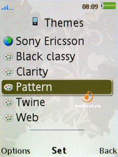
The main device for personalization is functional themes. There five preinstalled themes, which can▓t change the icons.
Phone book
In terms of the quick search we can mention the correct search by first name and second name, as well as by all phone numbers. As usual, the search is made by the correspondence to the entered name or first numbers of a phone. For example, if you are looking for a number 8 999 000 65 01, the phone shows it after you start entering 8 ┘ in the search field. We▓d like to remind you, that Windows Mobile provides search from any place, and the abovementioned phone number is shown, if you enter, for example, 65. The same is with names and second names.
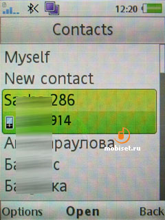
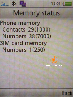
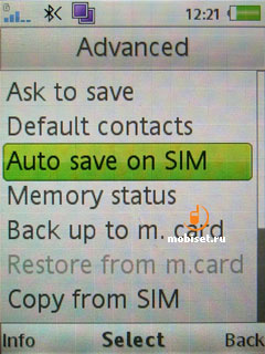
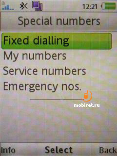
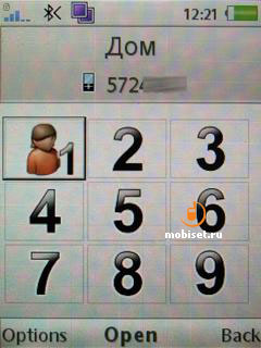
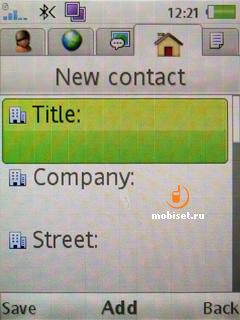
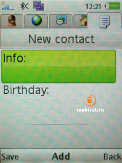
The phone memory saves up to 1000 entries and 7000 phone numbers. Each contact may include the following information:
- mobile, personal mobile, work mobile, home, work and other numbers. In the same section you are enabled to add fax number.
- name
- Web address
- ringtone and picture
- title
- company
- street
- city
- region
- postal code
- country, where the work is.
- the same address information for the residence
- note with up to 511 symbols
- birthday.
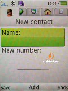
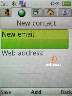
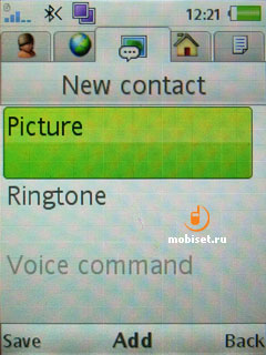
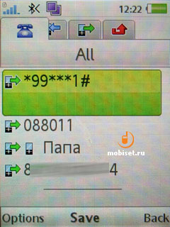
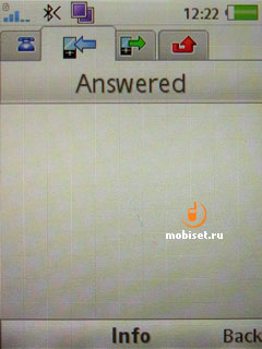
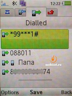
The list of calls is very simple. When selecting a number, you see date and time of the call. The calls can be sorted into received, send, missed calls, as well be shown in bulk.
Messages
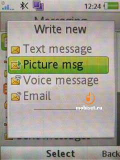
The handset comes with a handy application to create SMS/MMS. As usual, you are enabled to view the emoticons as pictures. The maximal size of the text message amounts to 1188 symbols.
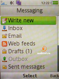
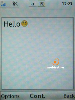
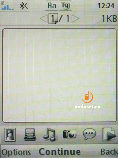
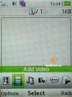
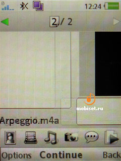
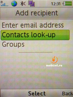
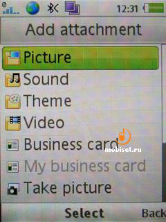
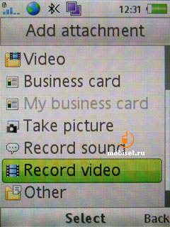
The MMS application remains unchangeable. It has eye-catching interface to create compound messages up to 300Kb. You are enabled to attach audio files, pictures, video clips. The necessary apps to create attachment may be opened right from this menu (camera, voice recorder).
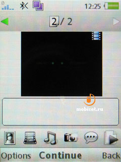
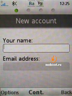
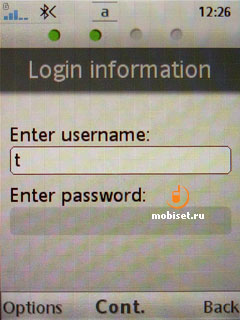
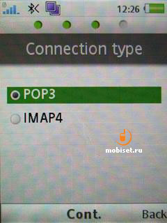
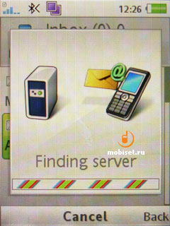
The email client allows to adjust a new account through five steps. Firstly, you enter your name and email address. Then follows login and password, after that the phone suggests your receiving the other settings from the server Sony Ericsson.com/support. If there is no access to the Internet, the last two steps are as follows: choose the connection type (POP3, IMAP4) and enter incoming and outgoing servers.




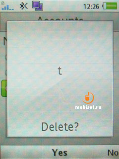
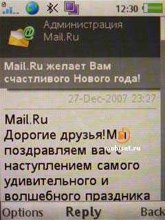
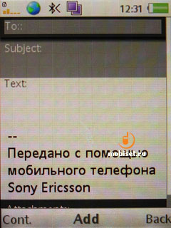
The changes of the interface include only the new background of the reading/writing windows of messages. All attachments can be saved in the phone memory √ that is very handy.

Organizer
Let▓s look through the Organizer apps.
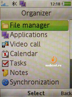
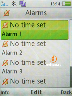
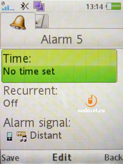
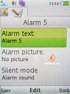
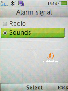
The first one is a functional alarm clock allowing to create up to five alarms. To each of them you can adjust time, recurrent. The phone also makes it possible to choose alarm signal or radio. It is pleasant that you can rename the alarm (for example, to name it ⌠it▓s time to dine■ instead of ⌠alarm 03■), as well as fix an alarm picture. (If we are talking about dinner, there is a plate with soup).
Calendar
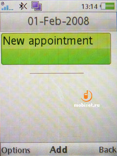
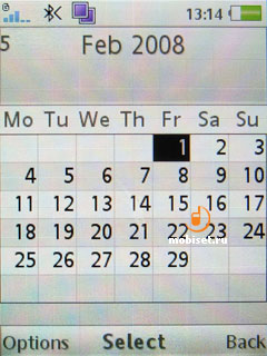
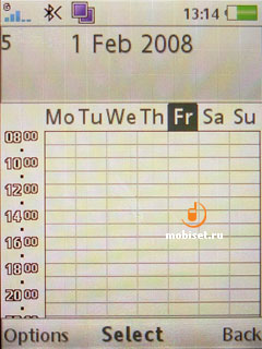
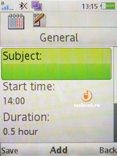
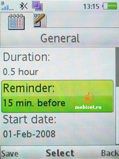
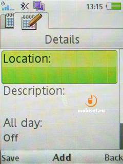
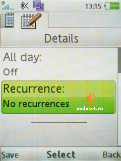
There are two ways of viewing: monthly or weekly with each day having an hourly schedule. After choosing the necessary weekday, you can quickly create a reminder. The latter has lots of settings. They are as follows: subject, start time, duration, reminder (5-30 minutes before), recurrence (daily, weekly, monthly, early), location. To cap it all, you are enabled to add small description of the event. As you see, the reminder is not the perfect one, but it is rather good taking into account, that it isn▓t the separate organizer, but just a function of the mobile phone.
Notes
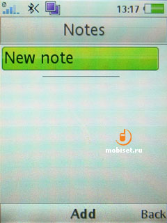
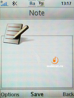
Here you can create common notes 254 symbols long.
Timer
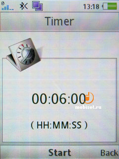
It is a common timer. You fix a time to within a second, and see the count in the stand-by mode.
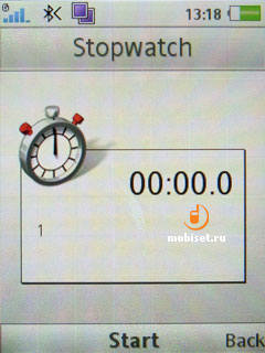
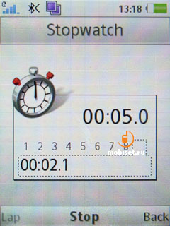
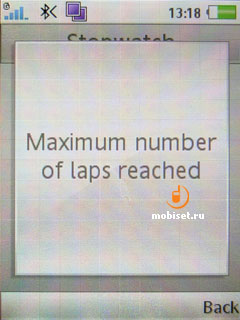
Stopwatch creates up to 9 laps.
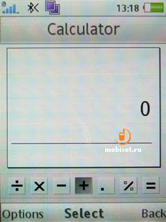
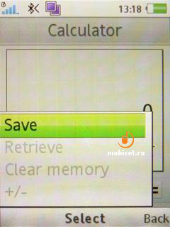
Calculator is noticeable for the possibility to extract root.
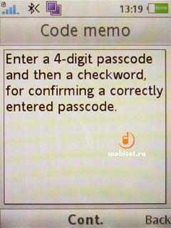
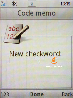
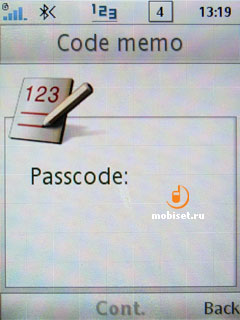
The presence of the code memo is very intrigue. In the rest, the 4-digit password symbolizes only, that these notes are very important.
Multimedia Menu
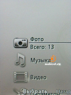
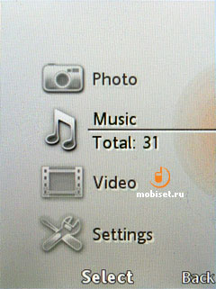
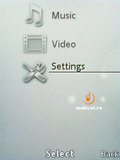
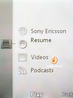
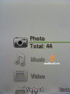
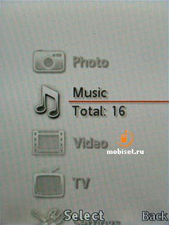
The design of the interface almost copies the menu of Sony PlayStation Portable. The vertical shifts have a nice animation; to the right of an item you see semitransparent floating balls. To chose a necessary item you can use either the affirmative button or decline the navy key to the right. The main menu consists of five items; each of them we▓ll discuss separately. They are as follows: photo, music, video, stream-TV and settings.
Settings
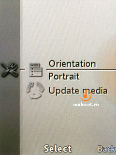
In this item you adjust the screen orientation.
Video
This menu item includes all supported video clips, both made with the camera and others. The window to choose a clip has a vertical list capable to display five clips labeled with thumbnails. The latter are static; when cycling through them, the phone has some jerks.
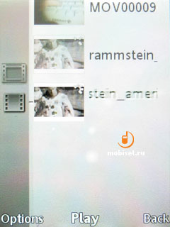
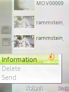
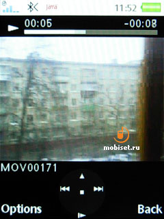
The clips can be viewed with a rate amounting to 30 frames per second. The player has an option to scale a picture when in the landscape mode. After you switch on this orientation the first 3 seconds the screen displays the semitransparent signs of the context keys and duration scale. Then they disappear.
Photo
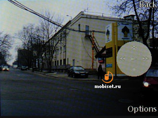
The main novelty of an application is a photo viewer. It can sorts out the stills by latest photo, photo and other pictures. When opening the latest photo, you view photos in the viewer. The camera album has a monthly sorting. The collection section saves all images added to the folder ⌠favorite■. The last item shows all pictures stored in the folder ⌠Pictures■.
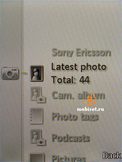
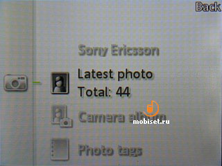
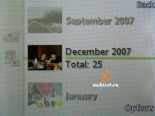
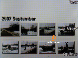
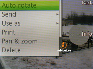
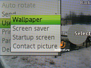
Let▓s enter the camera album. Each month has a thumbnail changing each 5 seconds. We choose the month we need and go to the table of photos, which have this date in EXIF. When looking through the thumbnails below, in the mode of three columns, we see both photos done in the chosen month and the other photos marked with another title. In this viewing mode you can choose the marked image as a wallpaper, contact image, screensaver or greeting. When you choose a thumbnail, the latter is growing smoothly on 20% and in the same smooth way it shrinks, when you choosing the next image. When you press the Option key, a picture smoothly occupies the whole screen. After pressing Back, the image smoothly goes on its place in the table without covering the next pictures. It is an eye-catching moving, though you may get tired of it after a couple of weeks.
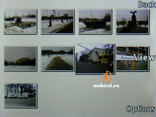
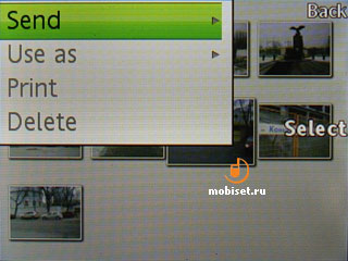

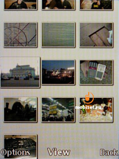
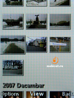
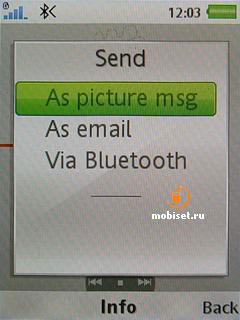
After we▓ve chosen a picture, we go into the viewer. There in the first 3 seconds we see semitransparent signs and symbols of the declines adjusted to the navi key. The context menu of functions lists all standard options of the picture viewer. There as follows: send via Bluetooth, print, PhotoDJ editing and slide presentation.
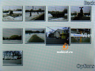

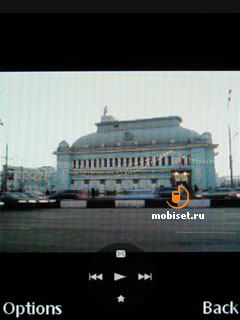
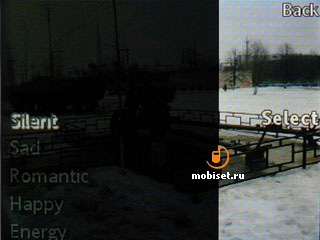
The latter can also be started after pressing the Play button. When we press it, 5 ways of playing appears:
- Silent
- Sad
- Romantic
- Happy
- Energy.
As the vendor intended, this emotional way of displaying photos is the most suitable one to the slide-show. The name of this system of presentation is X-Pict Story. Each of the ⌠moods■ has its type of melody and special type of cycling through the pictures.




Music
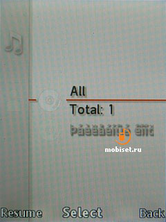
The main difference of the third version of the player is that it is integrated in the multimedia menu and the list of sorting is almost copies the other lists in this program. The same as in the second version, to cycle through the library, that is leisurely refreshed each time when you insert the memory card, doesn▓t necessarily need to use the OK button. It is enough just to decline the key to the right in order to choose and to the left √ to go back. The icons of the sorting times have been moved in the left column and became vertical ones. The context menu, that is called up by the left soft-key, hasn▓t been changed.
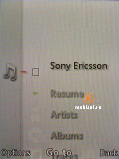
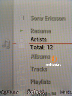
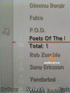
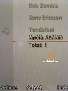
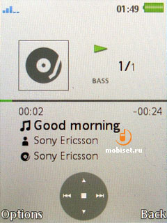
The playing window consists now from the thin progress bar occupying the whole width of the window. The bar has above a small window of Album Art, icons of playing back modes and the current position of the track in the playlist. There is also an information line on the top, where you see the indicators of the signal strength, battery, notifications and time.
Under the line the screen displays the played time and the rest time, ID3-tag and symbols of the navigational key. It is interesting that the navi key itself is equipped with these symbols. When pressing up and down, you call up the current playlist occupying the half of the active window. After changing the orientation in the landscape one, the symbols of the navi key move to the right sight of the scrolling bar.

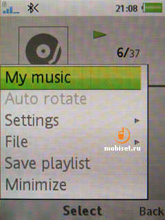
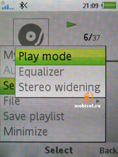
The settings feature a common visualization instead of the album cover, shuffle and repeat settings. The equalizer has 5 lines. The other remains unchangeable.
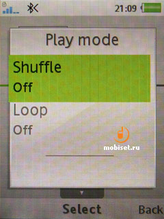
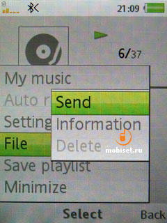
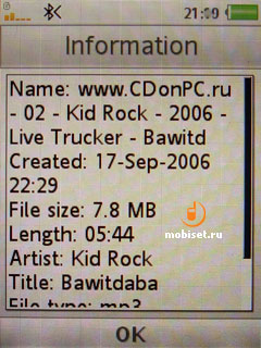
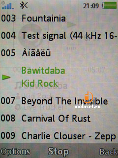
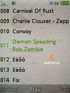
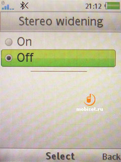
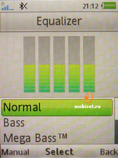
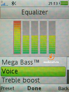
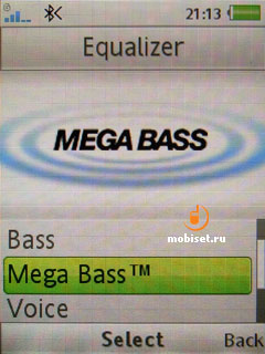
The sound quality is mediocre comparing with the G502, Nokia 5310, Samsung F250. But if we compare it with the most other phones, which can▓t boast about high-qualitative sound, our guest has rather good sound, which is enough for the users, which are not spoilt with MP3-players. In comparison with some Sony Ericsson phones running A200, the G502 has the similar sound quality. To those, who▓d like to get the maximum sound quality, we can advise to buy the wireless headset DS970 or DS200. Using the wireless headsets, you get 20% louder sound and more elaborated low frequency range, than with the wired solutions.
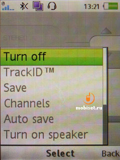
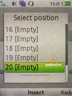
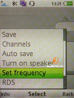
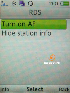
The phone also houses a FM-radio supporting an automatic search for the channels and RDS info stations. All active channels can be saved in the 20 memory cells.
Connectivity
The phone comes with Bluetooth 2.0+EDR module. The supported profiles are:
- A2DP
- Basic Imaging Profile
- Basic Printing Profile
- Dial-Up Networking Profile
- File Transfer Profile
- Generic Access Profile
- Generic Object Exchange Profile
- Handsfree Profile
- Headset Profile
- HID
- JSR-82 Java API
- Object Push Profile
- Personal Area Network Profile
- Serial Port Profile
- Service Discovery Application Profile
- Synchronization Profile
- SyncML OBEX binding
- Phonebook Access Proflle.
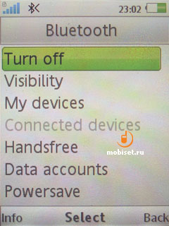
The data transferred speed amounts to 100-120KB/s.The device provides steady connectivity either when transferring bulky files or with a wireless headset.
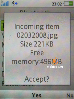
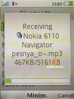
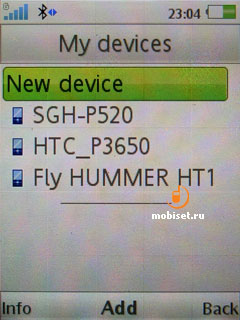
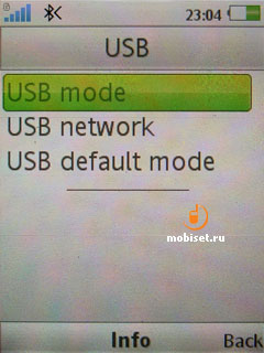
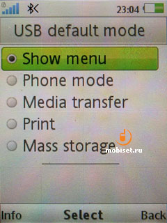
To connect the G502 to PC via cable is the simplest task. There is nothing new in it; the safety cutting off by means of Windows utility is another drawback inherent in Fast Port. The average transferred speed is about 1.5-2MB/s using 512MB Sony memory card.
Games, performance
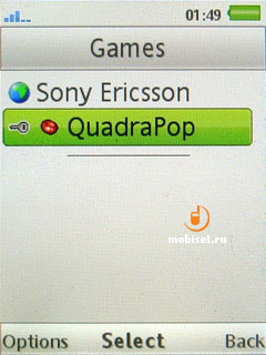
The phone comes with one preinstalled game √ Quadra Pop.

Performance
JBenchmark1: 7312
Text: 2431
2d shapes: 1771
3d shapes: 932
Fill rate: 658
Animation: 1520
Jbenchmark 2: 1084
Image manipulation: 303
Text: 640
Sprites: 566
3d transform: 678
User interface: 20001
JBenchmark 3d
JBenchmark 3d hq: 432
JBenchmark 3d lq: 433
Triangles pear second: 33808
Ktexels pear second: 1499
JBenchmark hd
Smooth triangles: 27090
textured triangles: 24269
fill rate: 975 ktexels
gaming: 165 (5.5 frames per second)
The application part is made better than games.
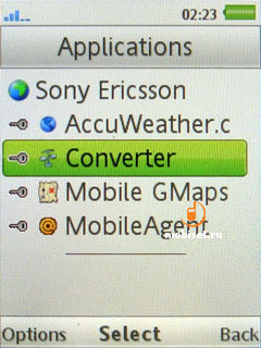
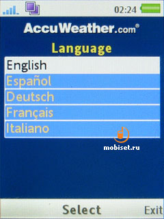
AccuWeather utility allows to view weather forecasts in most countries all over the world.
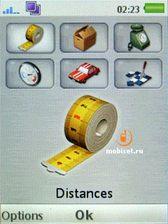
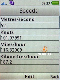
Then in the list we find value converter, which can boast about visual interface and rather big number of different values.
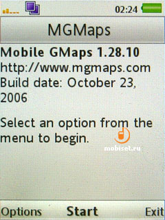
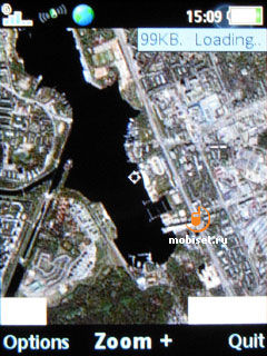
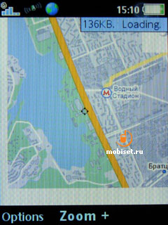
Mobile Google Maps. Google Online-maps have already become the usual thing in Sony Ericsson phones despite of presence a built-in GPS.
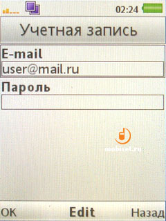
Mail Agent Mobile. As the handset is positioned in the series of handy communication devices, it is logical, that the G502 is equipped with the utility of Mail.ru allowing to look through the mail box without other settings.

Camera
The phone is equipped with a 2megapixel camera without autofocus. The camera interface copies the one in the photo focused flagship model K850i. The exception is the number of items in the menu and cycling through modes (photo, video, viewer), which can be assign to the declines of the navi key.
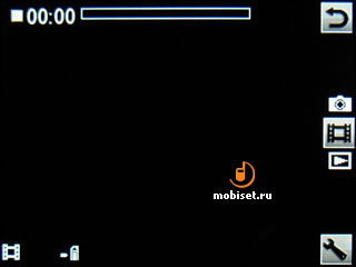
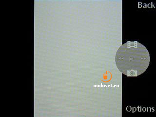
The camera settings are as follows:
- Shoot mode
- Resolution
- Night mode
- Self-timer
- White balance
- Effects
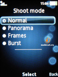
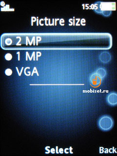
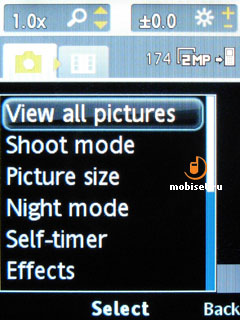
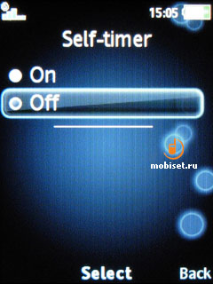
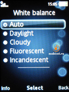
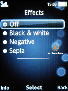
The other available settings include picture quality, review, memory type, shutter sound that can be off and reset counter.
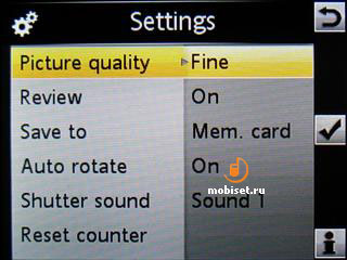
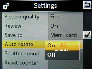
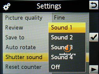
In the video mode you are enabled to adjust clip length, white balance, colour effects and use useless night mode, self-timer, mike and choose the memory type.
 [+] maximize, 1600x1200, JPEG, 320 KB |  [+] maximize, 1600x1200, JPEG, 355 KB |
 [+] maximize, 1600x1200, JPEG, 414 KB |  [+] maximize, 1600x1200, JPEG, 398 KB |
 [+] maximize, 1600x1200, JPEG, 427 KB |  [+] maximize, 1600x1200, JPEG, 338 KB |
 [+] maximize, 1600x1200, JPEG, 236 KB |  [+] maximize, 1600x1200, JPEG, 445 KB |
 [+] maximize, 1600x1200, JPEG, 503 KB |  [+] maximize, 1600x1200, JPEG, 506 KB |
 [+] maximize, 1600x1200, JPEG, 379 KB |  [+] maximize, 1600x1200, JPEG, 304 KB |
 [+] maximize, 1600x1200, JPEG, 355 KB |  [+] maximize, 1600x1200, JPEG, 425 KB |

The picture quality is expected for the ordinary 2megapixel camera without autofocus. The stills are interesting, first of all, for the good zoom. Good colour rendering allows to view the stills not only on the phone screen, but also on the PC.
The video recording has only one resolution √ 320x240 pixels with 15f/s speed. As there are some jerks in the records, we can▓t say the video recording is good in the handset. The rivalry solutions allow to record video with the same characteristics but without defects.
Video sample, mp4, 582 KB >>>
Phone quality
The standard phone characteristics don▓t substantially differ from the other handsets of the company. The signal receive level is good enough for the most places. The earpiece and microphone provide good quality of voice receiving/rendering, while the loudspeaker is loud enough for talking in a busy street. The polyphonic loudspeaker plays back music with a pretension to the wide elaboration of the frequency range, though the low frequencies are far from the real buss frequencies. It is a common loudspeaker, which is similar to that installed in the K660i, K530i and so on. The loudness of the loudspeaker is a bit higher than the average one. Its hole in the rear panel allows to carry the handset in any pocket without fear to tune down the loudness. Considering the small size and weight, the vibration provides good tactile feedback, which allows to feel the handset in the most pockets, that are close to the body.
Conclusion
Compact, light, cheap, functional Sony Ericsson G502 with unusual design deserves the title of best device for summer calls, as it perfectly suits the breast pocket of a shirt or a pocket in the shorts. The handset well fits into the small pocket in jeans, from where you can easily pull it out, when incoming call. It is the compact size, as well as the standard program platform A200 that make the impression more positive, especially considering the summer time.
If we put aside emotions, the G502 is a hardware clone of the spring K660i, but the former has less glossy parts on the casing and more ergonomic keypad. As to the rest, on the side of the G502 has $50 less price tag than the K660i and moderate colour solution, which broaden the portrait of the targeted buyers. The phone is designed for the customers aged 15-35, who are mainly fans of Sony Ericsson. The G502 looks very interesting as the compact solution for the summer, or as small functional helper. The rivalry solution is Nokia 3120 Classic, which can boast about HSDPA support and ergonomic body shape. The Finnish handset is worse than the hero of our today▓s review comparing multimedia, for instance, the work with wireless Bluetooth headset, picture quality, the comfortable work with stills. We don▓t mention here JAVA, as Sony Ericsson phones won▓t intend to yield this palm.
As the G502 has in fact no rivals, we can say, that it is a small helper for those, who use the phone mostly for calls. If you don▓t want to pay $400-600 for questionable capability, you should pay attention exactly to the G502, which concentrate all nice programs of all Sony Ericsson flagship models appeared last autumn.
Few metal parts and soft plastic haven▓t affected SAR value of Sony Ericsson G502, as Sony Ericsson handsets traditionally can boast about high measures. According to the vendor, the value doesn▓t exceed 1.37 W/kg.
╘ Written by Tikhonov Valeriy, Mobiset.ru
Translated by Arina Urban.
Published ≈ 26 August 2008.