Review of Nokia 5800 XpressMusic – Emotional Listening. Part one
It is one of the most interesting new mobile devices based on the controversial S60 Touch in expiring 2008. But what is the more foreground in the new device – OS or hardware? This we are going to discus in our today’s review.Table of contents:
In our previous review we have already covered the events preceding the first S60 Touch-based device, which some sources continue to call Tube, though the others name it Taco, the name appeared one year ago inside the company. Nevertheless, we have in practice Nokia 5800 XpressMusic with S60 5th Edition. But the most part of the heated discussions about this new device in the internet, as well as in the common chats cover the new touchscreen for single-handed use for the first time implemented by Nokia, rather the device itself with the utilized operation system. We will give thorough consideration to this issue, but let’s begin with the more detailed review of design.
Design
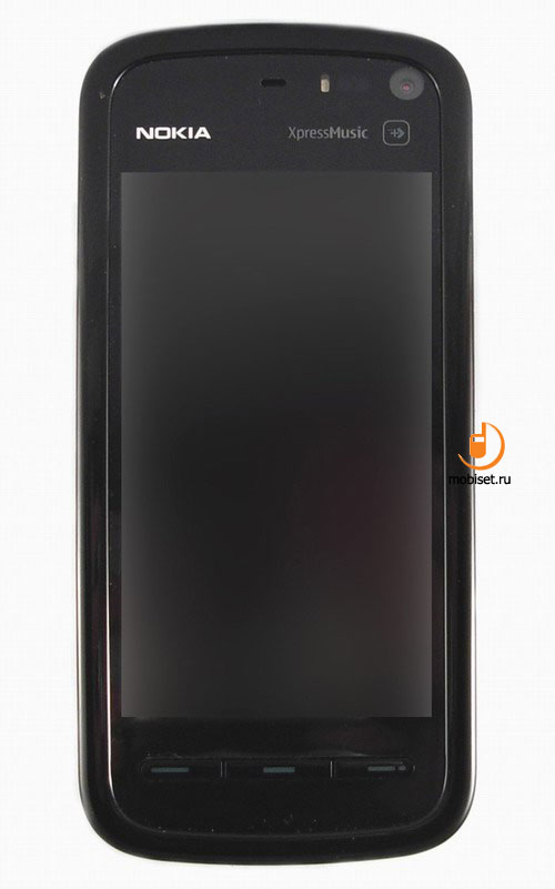
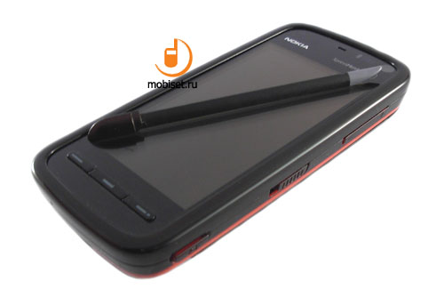
The dimensions of mobile devices with the touchscreen are often determined by the dimensions of the screen, and only then the designers begin their work by forming the design with the rugged rectangular edges. Some limitations can end in the maximal benefit, for example devices like HTC Touch Diamond, but it is often the case, when the designers just slightly rounded the edges creating a kind of plump ergonomic bar. As to Nokia 5800 XpressMusic, the designers’ work is hardly noticeable, as the classical candy-bar form-factor for smartphones in combination with the casing with the big touchscreen occupying the whole front panel can’t result in something different from N73, N82, N78.
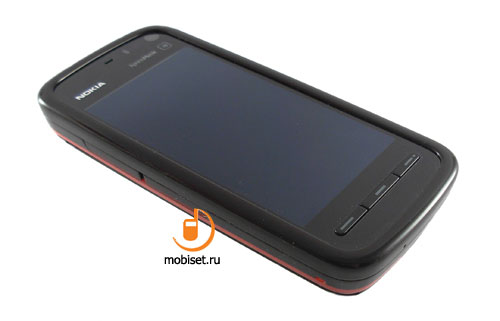
Considering this fact, we don’t surprise that our guest has the dimensions 110.9 x 51.8 x 16.2 mm.
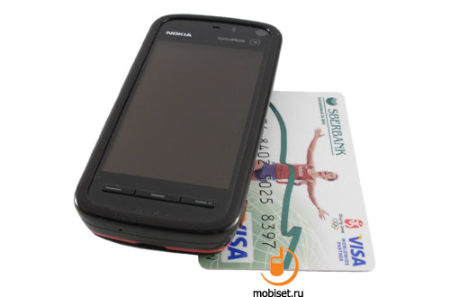
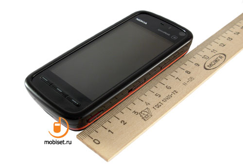
The smartphone feels not as comfortably in the hand as it may seem at the first glance. On the one hand, we have a plastic bar without metal finishing and large rounded edges, on the other hand, the handset features the solid building without gap and squeaks, of course, if you don’t squeeze it with force. The considerable weight also contributes to the positive impressions and perfectly matches the used materials and size of the casing. Yet, the breast pocket of the shirt is hardly intended to carry the 109g candybar with 16m thickness, thus this youth device is rather to be carried in the jeans or jacket pockets, where you feel it in the same way as Nokia N78, N82, N73.
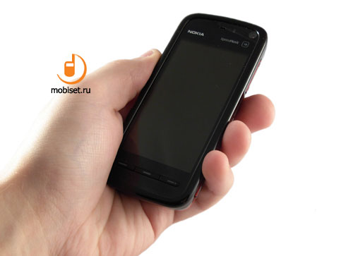
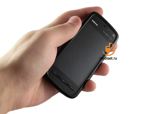
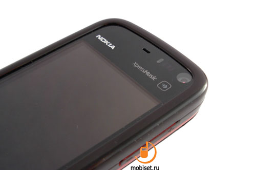
The whole front panel of Nokia 5800 XpressMusic is made of the solid film of the resistive sensor, which we can’t call a sensor glass, as in fact it isn’t a glass. This even glossy surface is framed by the large rounded frame jutting out on one millimeter. The top part of the glossy film, which has a black surface-layer, houses a small central hole of the earpiece accompanied by the light and dark sensors. The former is responsible for the screen backlight brightness, the latter allows to switch off the touchscreen and its backlight, in case there is a hindrance at 5cm or less distance. Naturally, in most cases this hindrance is your ear, but the purpose of this sensor remains as it is. On the top right edge close to the casing frame you see a big frontal VGA camera lens designed only to the video calling. Under the sensors and camera you find the sybbrand logo – XpressMusic, as well as the small square frame with the image of the arrow. At first sight, its purpose is unclear, but should you touch it when working with the smartphone, the right top corner of the screen comes with some analogue of the multimedia menu, rather simplified.
As we have already mentioned the screen, let’s move directly to its description, as it is a key control element of the smartphones. The 5800 XpressMusic is equipped with the 3.2” TFT screen measured 39 x 69.5 mm, which corresponds to 16:9, the same as in other wide-screen matrix. Nevertheless, the main attention is caught not so much by the physical matrix dimension, as by the resolution, which is 360 x 640 pixels providing 0.108 x 1.108 mm pixels. In comparison with the 2.8” screen installed in HTC Touch Diamond, our guest has pixels which are not so tiny, though its graininess is comparable only with the 1.8” QVGA matrixes, which images lacks any graininess at all.
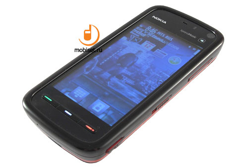
But the good screen resolution alone is not enough to be in line with the best mobile screens, thus it’s high time to pay attention to the colour rendering. The manufacturer claims its 24bit palette renders 16.7 mln colours. This parameter makes Nokia 5800 XpressMusic even better than judging by the resolution, as the bright satirized picture featuring no colour inversions not only make happy, but even surprise. Comparing these parameters the screen of the 5800 can be compared with the perfect matrix in the Touch Diamond, but it is the second detail, as here Nokia has some rivals. The viewing angles are 160 degrees in both planes, but it isn’t a wonder to the demanding user.
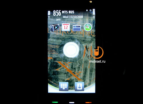
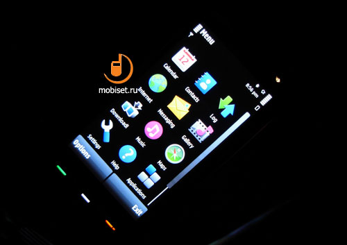
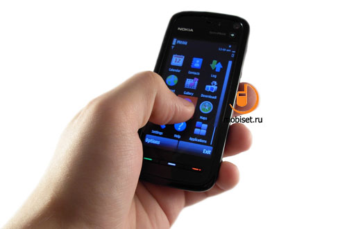
The most interesting things appear when you are outdoors, where the resistive screen sensors used to cut to a zero the brightness of the picture. The film touchscreen of the 5800 XM featuring the plastic transparent surface layer is expected to provide the same boring image in the autumn sunbeams, however, it was a great pleasure to enjoy the perfectly legible picture on the screen, besides the picture fades not more than on 50% keeping the same sharpness. It is a bit of a revolution made by Nokia, as they managed to make the resistive screens wor in the sun as a capacitive one. But as to the glossy film, they haven’t succeeded in making it less dirt-attracted, thus the regular cleaning of the screen will be the part of your work with the smartphone, otherwise you have to observe multilayer finger- and cheekprints instead of the sharp picture of the chosen theme.
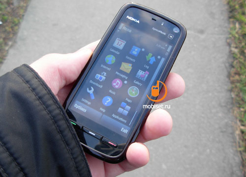
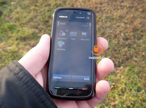
One centimeter above the bottom edge of the casing you see the idyll of the sensor surface is broken by three notably jetting-out keys, which features rather tight travel distance and soundless click. Considering their location at the same flat surface, you can easily feel them even through the trousers or jeans. As to the comfort pressing, the thumb is supported by the large frame of the front panel. The keys include the big central menu key framed by the call send and end buttons. Alas, a navy key, as well as the soft-keys are not provided by the manufacturer of the 5800, though should have been there, the touchscreen was useless.
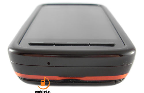
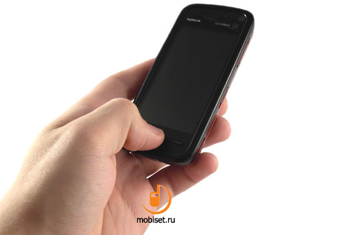
The jetting-out excrescence of the semi-transparent glossy plastic at the left panel is amusingly goes to the side edges of the casing, thus you can enjoy the funny light play of reddish and bluish colours at the sides of the 5800 XM reminding a childhood. You can also notice the playing red stripe on the sides, which is informally called semaphore, as its bright colour can be observed only at some particular angles in the sun.
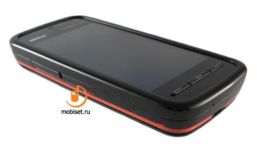
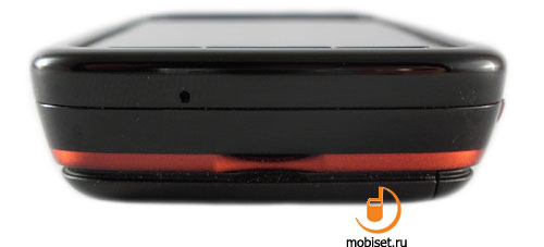
The top end is occupied only by a small hole of the mic, as well as a deep nail cut used to pull out the rear cover.
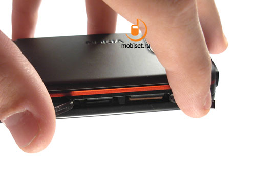
The left side is notable for two big slots for sim and microSDHC memory card, which volume is limited by 32GB. Besides, the sales pack includes the 8GB memory card Class 4. Below you can see a small hole for the wrist strap, which is fixed by the stub with a hook. On the matt surface of the rear cover you can make out two more tiny holes of the polyphonic loudspeakers placed on the ends of the edge.

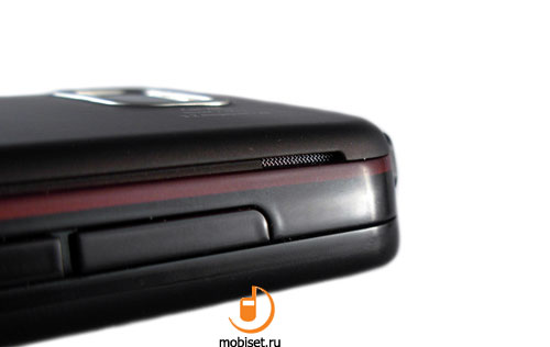
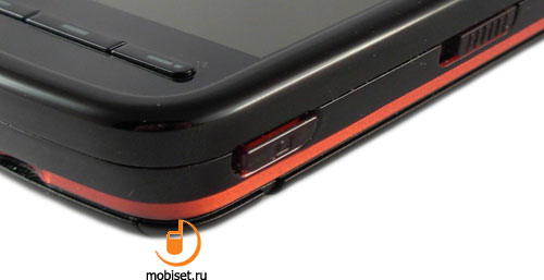
The front side surface is notable for a big volume rocker key with prominent images of plus and minus. Thanks to the soft short travel and distinct soundless click it is handy to adjust volume both to the right- and left-handed users. One centimeter below the volume key you can find a big blocking slider with prominent marks. Due to its soft travel distance the process of blocking the keys and sensors in this phone is handier than in other Nokia smartphones. The single or double vibration, which follows the blocking/unblocking just contribute to the handy work.

Close to the bottom end of the side the manufacturer placed two-step camera key having the ergonomics comparable with that of N95 and N82. The soft first click of focusing is distinguished for the distinct travel, while the tight shutter release featuring the soundless click makes you not miss a capture or checking the viewfinder.
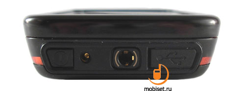
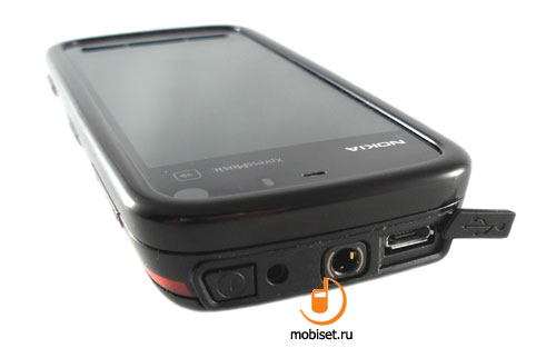
The top end of the 5800 XpressMusic houses slightly embedded power key, which rather tight travel perfectly prevents the occasional pressings. In the center of the nominal plugs set you find a 3.5 mm headphones jack, which also used to send the image to the TV via CA-75U cable from the sales package. Near the power key you see an appropriate charger slot, while on the opposite end there is a plug of the microUSB slot supporting USB 2.0 High Speed.
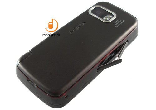
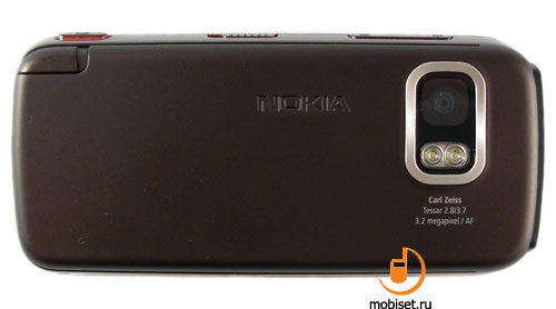
The whole rear fascia of Nokia 5800 XpressMusic works as the battery compartment cover. It is made of a thin rubberized Soft Touch plastic. In the top part of the rear panel the manufacturer inserted a transparent scratch-resistance glass of the 3.2 megapixel camera with autofocus accompanied by the two diodes of the backlight. Given that the smartphone is equipped the inexpensive camera, its slightly jetting-out silvery frame looks strange, as this device is presented in the Middle End segment of smartphones. Though it proves how important the handset is for Nokia.
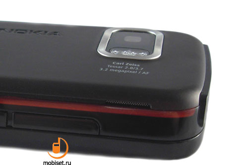
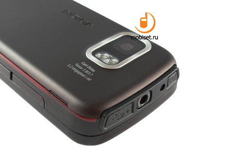
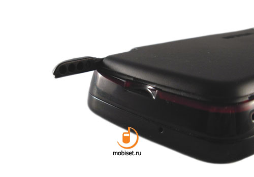
On the left bottom end of the cover you can easily notice a large silo for the fitting head of the stylus, which is made of the solid ABC-plastic in the form of a chip with a cross bend minimizing the twist of the stylus. The tactile feedback from the stylus is comparable with that from the stylus utilized in Sony Ericsson W960i, though 5800 XpressMusic’s stylus can boast about higher quality both of the plastic and manufacturing.
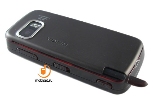
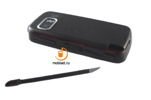
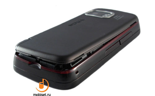
The stylus is fixed in the silo placed not in the smartphone casing, but in the battery cover, which thickness is about 3.5mm. the space between battery and the inner fascia of the cover is wide enough to pull in either a coin or a evenly folded average note, if you want. The cover is fixed to the casing with the help of two big rails on the top and five evenly placed catches placed on the edges of the casing. Due to this construction providing a tight fitting of the halves, the handset is secured from the gaps, which haven’t appeared, though we pulled the cover in and out hundred times.
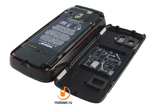
The cover hides the stub for the stripe, as well as the slot for a 1320 mAh battery of a new BL-5J format. The most alike battery of Nokia with the resembling capacity is used in the E71, though the latter is made of Li-Pol materials unlike the massive Li-Ion one installed in the 5800 XpressMusic.
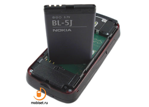
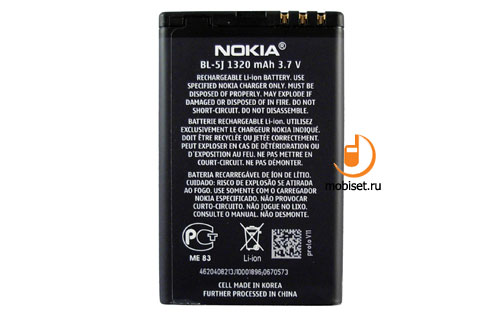
As to the time of work, our guest lags behind the E71, as one charge is enough for 3 days with 30 minutes of talks, 4 hours of playback and 90 minutes of other functions per day. Should you get heavier, for example 1 hour of navigation and 30 minutes of transferring files via Wi-Fi, the battery will drains in the morning of the third day. It’s worth mentioning, that these figures are got at the maximal level of backlit brightness, thus, if you minimize it, the device is able to run up to 4 days with more than several short calls per day. The battery needs about 2 hours to be fully charged with the charger, though you don’t notice this time.
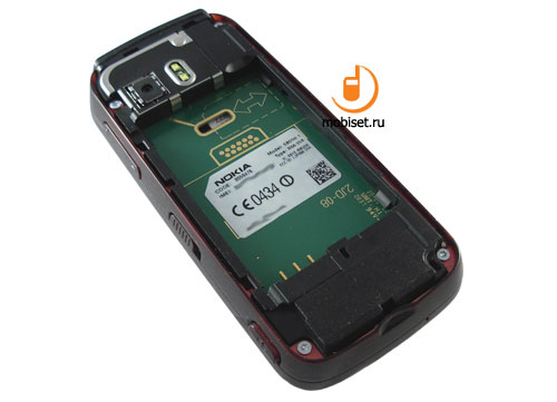
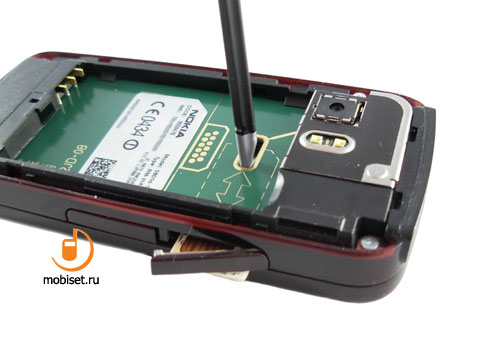
Removing the battery you see a plain sticker, under which the phone houses a service jack and one new feature, mainly, the cut to pull out the sim. The process of pulling it out is clearly shown in the comments placed on the inner surface of the cover. You are also allowed to remove the sim with the help of stylus without paying much attention to preliminary opening the plug. The last, we’d like to mention, is that the sim can’t be reregistered without the smartphone being switched on once again.
Hardware specifications
Nokia 5800 XpressMusic is based on the proprietary single-chip solution with single 369 MHz ARM11 processor, which also contribute to the energy consuming. Besides, the handset has a dedicated coprocessor for video decoding, which provides a comfort imaging of clips with a resolution 640 x 480 and higher and at the rate 30 frames per second. The only limit to the video is a bitrate and codecs, which we’d like to discuss in detail later.
Now let’s dwell upon the memory size, which used to be common not long ago only to several smartphones of Nseries:
- 128 MB RAM, with 60 MB available to the user when the start
- 256 MB ROM with 80 MB available for the user’s data.
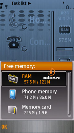
Besides, for the user’s data and new programs you can use the microSDHC memory cards up to 32GB. The other hardware specifications concern the sound quality, which will be covered in the corresponding part of the review.
User Interface
Nokia 5800 XpressMusic is the first smartphone of the company based on Symbian 9.4 together with S60 5th Edition. Though the user interface can be shortly called as S60 Touch, as here we deal with the device equipped with the touchscreen designed to be used without active use of the soft-keys. Of course, we shouldn’t underestimate how deeply Nokia touchscreen interface impressed the Techie users, though in fact, the great changes concern the scheme of control the S60-based smartphone, rather than Touch Phones segment. If you have other opinion, we suggest you should learn our short excurse in implementation of this user interface by example of the 5800.
Beginning from a far, we’d like to mention the time needed the 5800 XM to switch on and open the main menu. In result of dozen measurements we figured out the average time, which totals 30 second, which perfectly meets Demand Paging, in other words, the speed OS browsing.
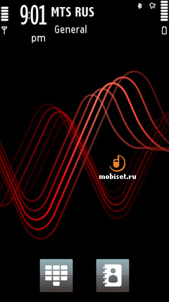
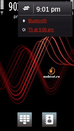
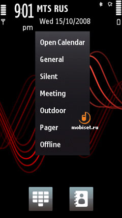
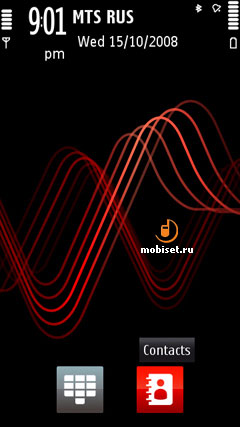
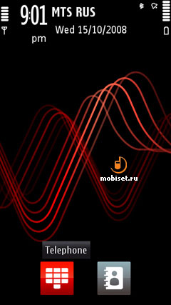
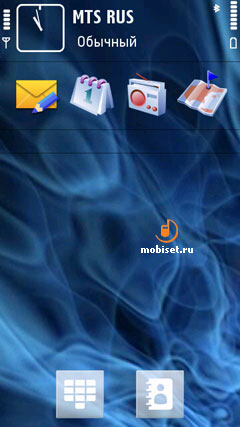
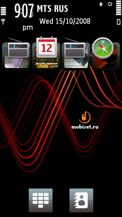
The standby mode in Nokia 5800 XpressMusic resembles the previous versions of OS, where the top part houses signal receive level indicator, charge bar (the first point disappears when the battery is half empty), active connections, missed events, date, time and provider. The other icons in the standby have nothing to do with the predecessors. For instance, the signs to the missed soft-keys were replaced with two big icons of the digital keypad and contact, but we talk about them later. And now let’s look at the various variants of the standby.
Contacts Bar
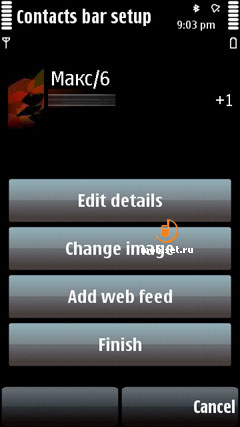
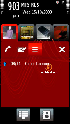
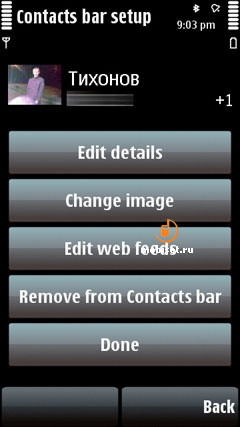
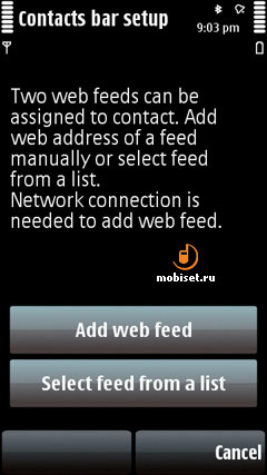
In the standby you are enabled to set up under the date a handy tag panel for four contacts. To do that you need in turn set to the each tag with an image of a cross or a man. Just touch the chosen icon and you see a menu to create this icon. You can create either a new contact or select one from the phonebook. After choosing the contact you need, you have to add to it one obligatory feature, mainly, an image acting as the identification mark. When the image is chosen, you see the last part of the settings, where you can either edit VCF-form from the phonebook, or change the image, or add a couple of home pagers of the user, e.g. blogs.
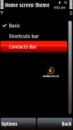
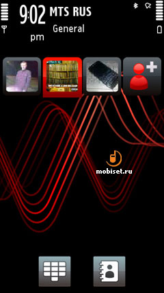
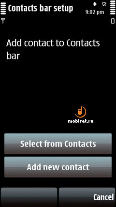
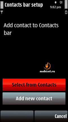
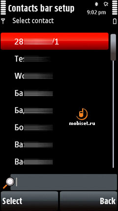
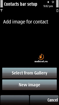
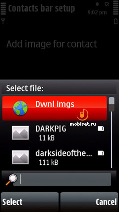
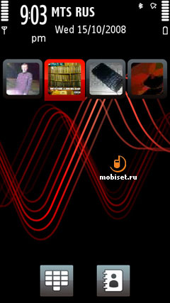
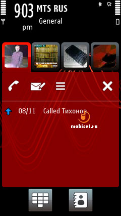
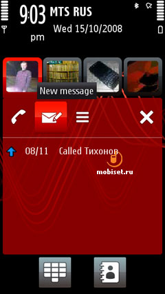
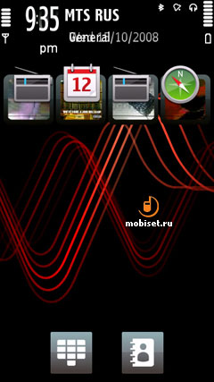
When the four forms are edited, you can look at the row of middle-sized icons with photos of the contacts you are interested in. It is funny, but the October version of the firmware allowed to set up a big image for one contact, while the 10.0.004 version installed in our sample lacks this option. After choosing the icon, you see a semitransparent area showing the history of communications with this contact, as well as three icons of different actions. The first allows to call the contact, the second – write a message, the third starts the menu of editing/deleting the contact. Besides, there is a big list of communicational actions which partially subsidize the general list of events, which was preliminary selected.
Shortcuts
The four icons of the favorite contacts displayed in the standby can be subsidized with four tags for the program shortcuts. Their size resembles that one used in UIQ, though their amount doesn’t correspond to the type of devices named “smartphone” and the corresponding amount of software. Naturally, each tag can be replaced with either any other browser tag or a preinstalled or installed program.
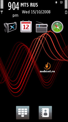
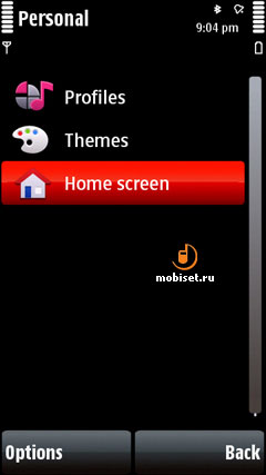
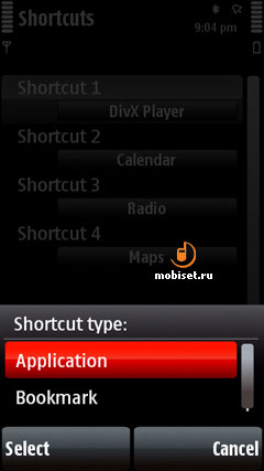
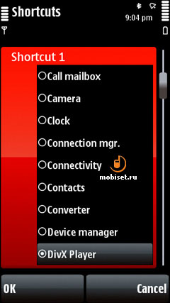
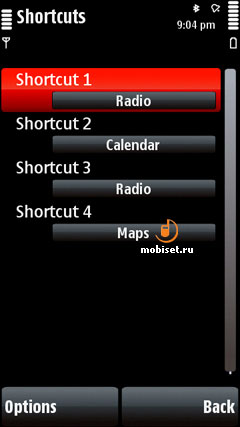
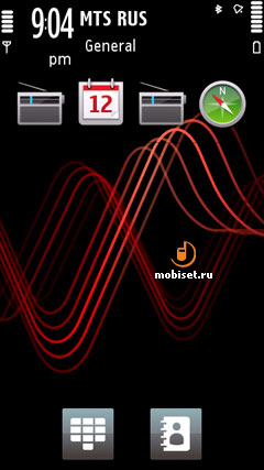
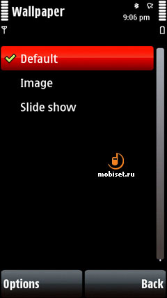
Now it’s time to speak about the wallpaper in the standby mode. The fans of the full-screen images can give a sigh of relief, as there are no empty spaces in the top/bottom parts of the screen, as an image occupies all 640 pixels from top to bottom. But it is still a picture, as only the first still from the animation can be static, while SWF files can’t stand in the standby.
To enter the main menu the manufacturer placed a big mechanical key under the screen. Pressing it you feel no vibration engines placed on the sides of the casing. They work only when you touch the touchscreen, moreover their intensity doesn’t vex at all; some user can even take no notice of the light ripple when pressing a sensor button. Nevertheless, the vibration is more distinctly felt when blocking, which is a good thing.
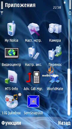
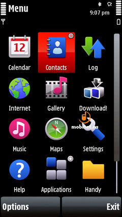
But let’s return to the main menu in the top of which you find the same bar of indicators, as well as a tiny digital clock. Mostly due to the proportion of the sides allowed to fully retain the size of the indicators bar without changing the size of icons of the main menu. The latter consists of 12 big icons displayed simultaneously. Their design is rather plain and resembles that one used in S40 6th Edition. To the right of the icons you can easily notice a large scrolling bar, which is handy in work thanks to the thick frame of the front panel. Besides, you don’t need to use it, as to scroll a list in the menu you can simply touch an icon and move it to the top end, in this way you start the progress scrolling. If you choose the list view, the screen will be able to display not more than 9 items, which can’t be scrolled progressively. Thus, you’d better use the scroll bar to look, for example, through the apps folder. Moreover, the lists of menu and submenu have a controversial feature: you need firstly to choose a necessary item with the cursor and only then touch it to start a program. To arrange them as the icons you need just to touch without choosing with the cursor.
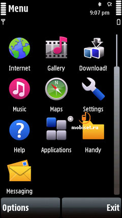
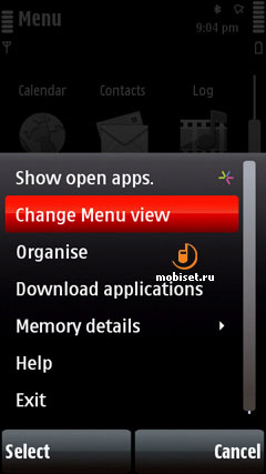
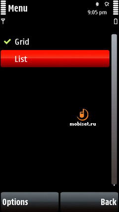
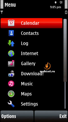
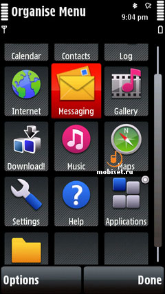
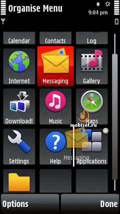
The submenu almost copies that from the previous OS versions, regardless the space between items.
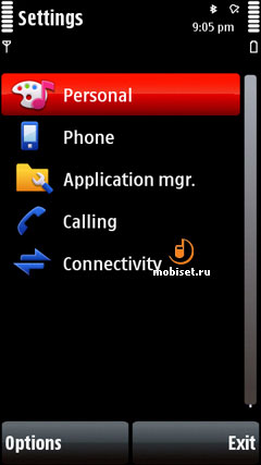
Personal
When describing the interface, we have already tackled the changes in the standby, but now let’s shortly speak the themes presented in the settings. In General section you can see all installed themes, besides, you don’t need to install it at once, as to view it without full downloading is also allowed. If you are chosen the theme, to install it you need about 7 seconds. The amount of the themes is surplus, as the phone supports all themes compatible with S60 3rd Edition Fp1 and Fp2. The only problem with themes is the higher resolution of the screen, due to which the themes with the raster wallpapers will be displayed with the visible pixels owing to the zooming. To keep it off you can either make the themes yourself or use the themes with the vector drawing.
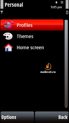
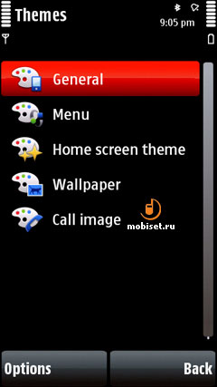
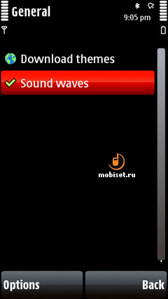
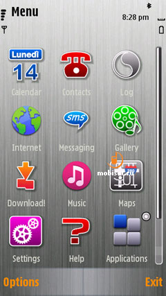
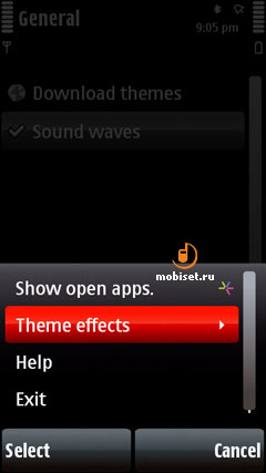
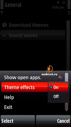
But we are more interested in the option allowing to utilize the animation effects to the themes, which can accompany changing of the active windows, as well as appearing of the menus with the smooth animation. This animation looks rather simple in comparison with the N78 and N85, but it doesn’t affect the interface speed, that is a great advantage. As to the other possibilities of the themes, you can install a general image to the incoming calls instead of the contacts’ pictures or choose several wallpapers for them to be cycling in the standby with the fixed interval. By the way, we’d like to note, that the precommercial firmwares to the 5800 XpressMusic are updated almost every week, thus it’s too early to speak about the final interface.
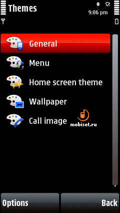
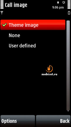
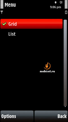

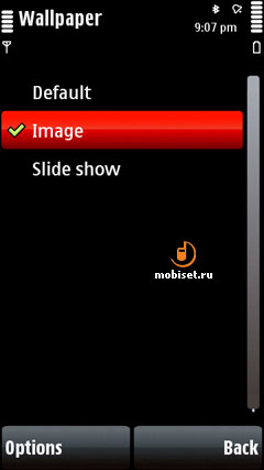
The last thing, we’d like to describe speaking about Personal, is that Nokia finally got rid of the numerous tags scattered in the settings. The settings of the profiles, as well as the communication, are now placed in the general settings utility.
Contacts
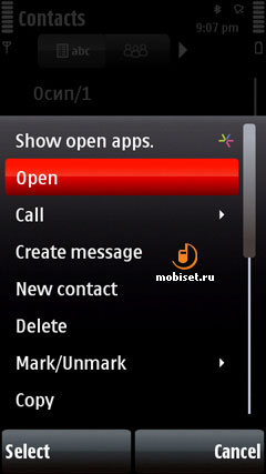
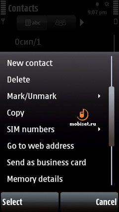
The design of the phonebook hasn’t almost changed since that used in the S60 installed in the first smartphones. Opening it reveals the common list of first and family names with the scroll bar to the right, which is already familiar to you. We recommend you to use the scroll bar to look through the list, as you have to pull the cursor not further where the list area ends, while the speed of scrolling is enough only for a mere 10-15 contacts. The settings contain the usual items of sorting and arranging first and family names, as well as the various devices to choose, copy or delete contacts. The settings are rather common and contain all necessary options.
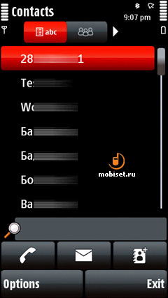

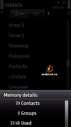
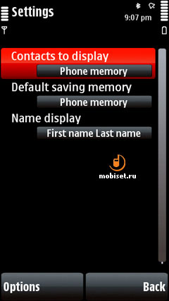
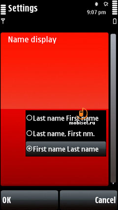
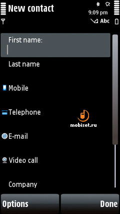
And now let’s take a look at the lower part of the phonebook placed right under the list of contacts. There are three big touch keys to send call, right a message and create a new contact. They are topped by the search field, which we are more interested in.
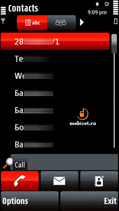
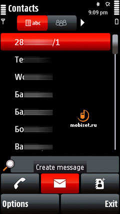
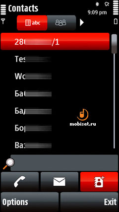
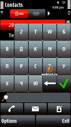
After touching it, we meet an alphabetical list of letters and symbols, as well as the virtual confirm and cancel buttons placed in the right lower corner. If you cast a glance at the keypad, you may overlook one interesting peculiarity, that is, the screen shows only those symbols, standing as the initials of the contacts, besides, they can be in all languages supported by the phone, rather than those chosen in the settings. This feature does provide a handy search for the contacts in the phonebook, as it bounded with the available data. For example, if we insert “M” letter, the phone reveals a list of first and second names filtered by this letter and starting with this very letter. But at the same time you notice, that many symbols disappear leaving behind only those, which go after “M” in the contacts. In our case we’d better choose “A”, then the list is sorted out once again by the combination “Ma”. In this way we can quickly find a person in the phonebook, even if we remember only his/her name, as the phone reveals all contacts with this name.
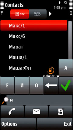
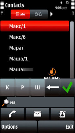

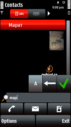
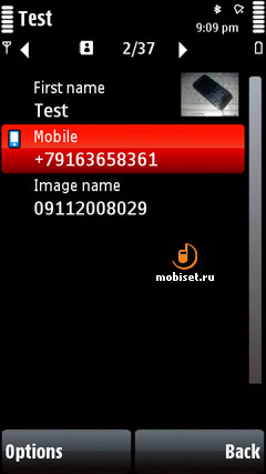
As to the other features of the phonebook, the changes are unnoticeable. It still remains one of the handiest applications to work with dozens and hundreds of contacts without any limitation to the number of phones in each contact. The overall number of phones is limited only by 80MB of phone memory, which is enough for 600.000 contacts.
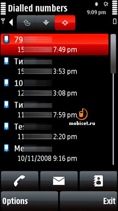
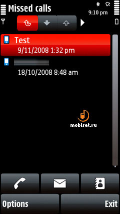
Calls lists sow no changes , except the bar of icons to send a call, to write a message, or move to the phonebook. Everything is simple and handy, but the amount of calls is limited by 30-days of keeping, as the calls dated by the 31-days time of storage are deleted.
Messages
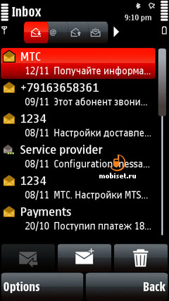
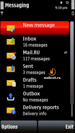
In general the messages haven’t been greatly changed including the editor for SMS/MMS, Inbox keeping received Bluetooth-files, Sent, Drafts and Delivery reports. The messages are displayed without a date and time of delivery, as this feature is still characteristic only to Eseries. But, the handy options include three virtual buttons placed under the list. The left one answers a call, the central writes a message without adding the receiver to the list, the right one is to delete if necessary.

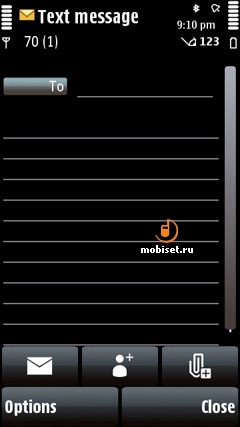
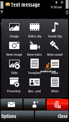
The main changes in the messages are concentrates in email, as the standard client in the devices except the Eseries used to have rather poor possibilities, as well as the comfort of using it lived much to be desired. S60 5th Edition realized, for example, in our guest gives much opportunities to observe the numerous improvements to the work with email. To decide whether they are positive or not is for you.
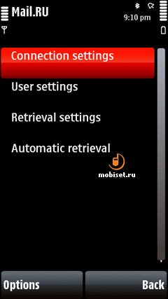
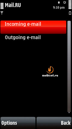
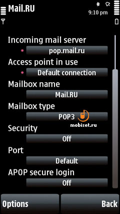
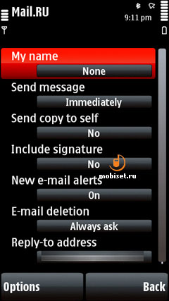
The first improvement can be noticed when you begin to set up a new mailbox via Setting Wizard. In this case you are free of any concern about the correctness of the automatic setup of the Gmail, Mail accounts, though some specific servers may want you to enter manually the servers of the incoming/outgoing mail.
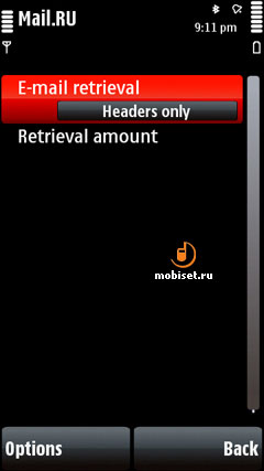
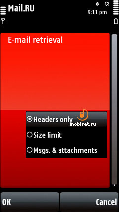
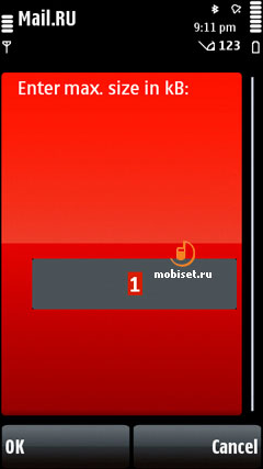
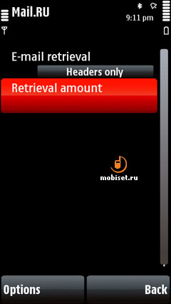
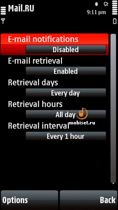
If we go right to the settings of the mail, except the manual setup of the account, we can adjust the retrieval amount, which can be headers only, size limit, or messages with attachments. So, as we have already covers the process of mail retrieval, we should tackle the options of automatic mailbox retrieval, in which you can manually adjust retrieval days, hours and interval for it to monitor new messages. The latter is rather handy, as you can choose among the available intervals, 6, 4, 3 hours, every 1hours, every 30, 15, 5 minutes. Naturally, the autoretrieval can be bounded with the home provider in order to avoid the expenditures on GDRS/EDGE in roaming.
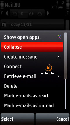
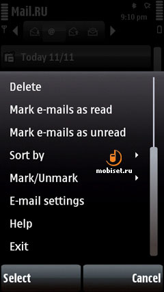
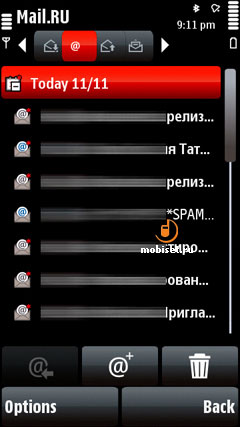
When you download the headlines of the messages in the smartphone, you can easily a peculiar scheme of arranging the incoming mail, which is sorted by the date of receiving. Thus all messages are divided into today’s ones, sent within the week and others. To open the tags with the list of messages is rather handy, as in order to aim at the tiny icon opening the list, you can simply touch the line. The lists of messages can also be sorted by the sender or the themes, which are placed in the heading.
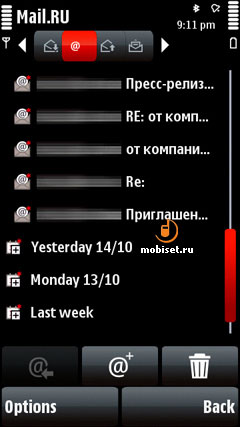
As to the way of displaying the messages, we don’t see much new. The top still displays the heading of a message, as well as the active icon to shift to the attachments. Two lines below you see the text of the message, which is correctly displayed only in case of the codings compatible with the attachment. In particular, the phone supports KOI8-R, Unicode, while UFT-8, as well as the most other codings, for example, Windows R and others are shown as some obscure symbols.
When writing a new message, the main drawback you have to face, is the lack of possibility to add the contacts data in the end, though a text, multidelivery or attachments can be added without any problem.
Internet
Many potential buyers of Nokia 5800 XpressMusic are concerned about the work of it with Nokia WEB Browser using the touchscreen. Thus we decided to pay much attention to the ergonomics and capabilities of this application.
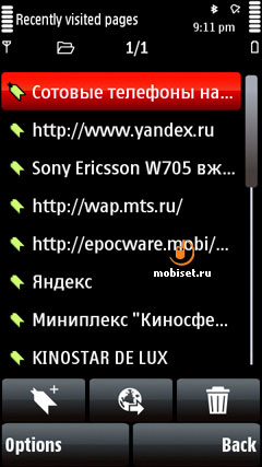
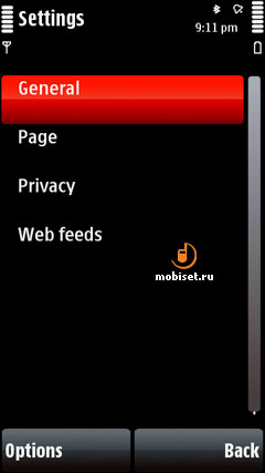
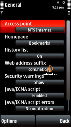
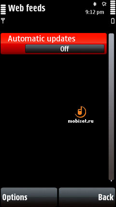
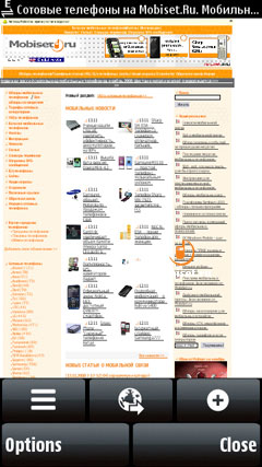
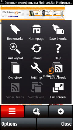
When opening the browser you see a common menu of tabs with a history standing apart from them, which has no sorting. The lower part of the screen is as usual dedicated to three virtual keys allowing to add a tab, to enter an address bar to move to the necessary HTML-page, to delete a tab. In the options you are enabled to sort the tabs, choose a link as a homepage, to use a dispatcher to delete the temporal files and to enter the passwords. The general settings provide a common set of options to change the parameters of access point, turn off the scripts, adjust the limitations to the downloaded content and other small things including update of web feeds.
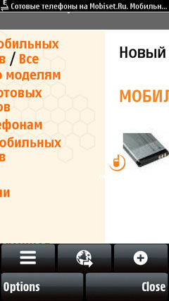
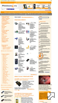
But we are more interested not in the standard options of the browser, though the manufacturer claims it can support Flash Lite 3, but in the comfortable using, as well as its quickness. The first impressions when opening the browser are rather optimistic, as it seems to speedily open the pages, while the presence of the touchscreen gives hope to the handy navigation through it comparable with Windows Mobile Opera 8.5. However, the optimism is vanishing, after you enter an address and starts opening the page. In condition of MTS with active EDGE the browsing of information starts only after 5 seconds – a page is half downloaded (in our case, it was http://www.Mobiset.ru) and only then the screen reveals its first part. Are you ready to start surfing? Take your time, as the text and graphic are downloaded, while the other elements are in line for authorization and phone blocks the other possibilities to move through the page or follow the links. Then after several seconds the bar of downloading begins to move again downloading the rest information. And only then the user is enabled to navigate through the downloaded page with the help of a finger sliding on the screen. To scroll the page you use a method of “drumming”, widely used in the devices, which mean that you move your finger to the side you want the page to move. The page moves rather smoothly, at that, the phone supports both vertical, horizontal shifts and diagonal ones. The visual part of scrolling is beyond complaint, as there are now lags, though it isn’t surprise, as you have to wait until the page is fully downloaded. (Nokia E71 downloads the site 1.5 times quicker, though it is a trifle).
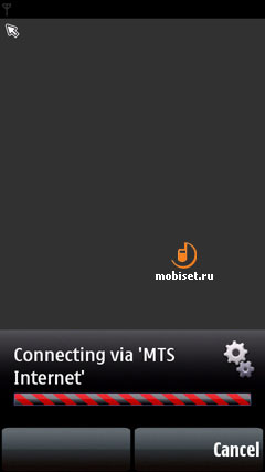
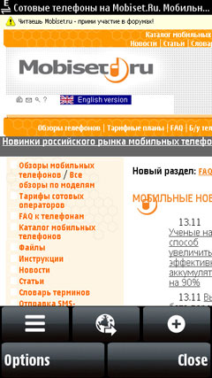
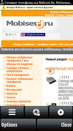
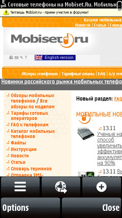
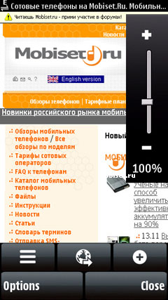
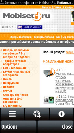
Besides the navigation, the touchscreen gives an opportunity to follow the links, to do that you’d better zoom them. This action is well-considered in the browser, as the quick switching between 50, 100 and 200% scaling is performed by the double touch. It is notable, that the popping-up scroll bars have nothing to do with navigation and that is their main drawback, as the “drumming” scrolling isn’t progressive, thus when scrolling through the bulk page you can occasionally touch the links. However, we are happy to see that the sites are still displayed correctly without cut-off elements, though the speed of downloading isn’t commensurate with the handy work with nHD-resolution screen.
On this note, we’d like to break off the review of Nokia 5800 XpressMusic. The second part of the review will contain the main features which are not covered here, as well as our appraisal of the reasons for the possible future success of the device.
© Written by Tikhonov Valeriy, Mobiset.ru
Translated by Arina Urban.
Published — 20 December 2008.