Sony Ericsson M600i review - we speak almost Russian…
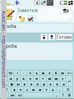
This smart phone somewhat surprised me. Thing is that I got my hands onto an M600i with English keyboard - the buttons in principle lack the Russian symbols.And this model has an interesting and not very pleasant feature. If the buttons are set with the Latin alphabet, then you cannot enter the Russian text using the keyboard and you have to start the virtual keyboard. And looks tiny on a 2.6-inch screen with 240х320 resolution – you have to adapt in order to hit the buttons with the stylus. If I got a smart with a Russian keyboard, the situation would be the same, but vice versa. I.e. I could type only in Russian from the keyboard. And if I need to enter an e-mail address or the address of a web page I have to start the virtual keyboard, English, in this case. There is also handwriting recognition in this device, but it doesn’t work with Russian… So it seems that I tried the most interesting М600i gadget – fast and useful writing – only in part, turning my imagination up to the max.
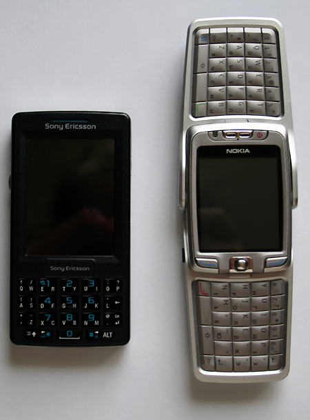
To tell you the truth, Sony Ericsson M600i doesn’t look that good as far as the keyboard goes compared to such devices as Nokia E61 (I don’t have it yet) and E70 (this one is lying near). Yes, you can enter the symbols with one hand, but the E61 can do it, too. And what’s the point of toiling with one finger if you have a stylus that, in the M600i case is always in the hand – that’s just a feature of the device? And if you won’t limit yourself and take the phone with both hands Nokia E70 leads by far. E70 is a very, very comfortable “writer”. Haven’t seen anything like it before… But we are reviewing Sony Ericsson M600i. That’s why the delights about the competing smart look, at the least, untimely.
Let’s see what interesting gadgets this M600i has. Are there any? Yes, there are. And there should be enough of those (useful, practical and very reasonable) to make you look at the device and even buy it… Although, there is no need to rush. You have to understand M600i dos and don'ts. If the advantages outweigh then, yes, please, I’d like that one. If not… then it’s not the only nice device staring at you from the shop window.
That’s the preface. You could think that I am going to severely criticize the M600i. But you are wrong. I am going to work with it in order to figure out its advantage and let you know about the disadvantages. This complex device is not very cheap. You can’t expect it to be perfect. What is perfect, after all? Do you think that Nokia is perfect? No, sir. There are no ideal smart phones…
And I dub thee… the pocket PC….
You get these associations right away. By its proportions, the M600i looks a lot like a PC. Or like a keyboard communication device that are in abundance in the Windows Mobile family. But it’s not a Windows Mobile, it’s a “Zyshsh’t” (that is what Psion fans call their old devices – you get this word if you type the platform name without switching the language). Sony Ericsson M600i works under a special version of Symbian OS 9.1 UIQ 3.0 that is used by smart phones of this company.
I’ll tell you right away that in my unprofessional opinion (I am a regular user, not an analyst or a technician) this work environment looks differently then in Nokia smarts. I suppose that the differences are just cosmetic, but, in fact, they are so vast that you cannot find anything in common. That makes you even more interested in trying the new (still new, although it’s been on the market for a long time) device.
Smart isn’t small or light. It’s 107x57x15 mm in size and weights 112 grams. Not a giant, of course, but the overall dimensions, especially, the frame width, are quite tangible.
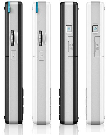
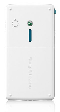
M600i is made in two versions – white and silver, black and silver. I got a black and silver smart phone. It looks a bit heavy compared to the white device, but lacks the flippancy that is characteristic of the light phone.
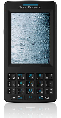
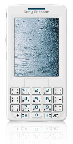
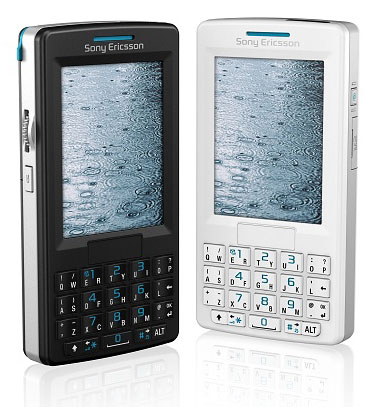
Front panel is made from black lusterless plastic (not colored). Thin slot of the "phone" speaker covered on the interior by a green grid. Screen is located on the most of the upper part… It is magnificent. It’s not very big as it takes up only 2.6 inches diagonally, but the resolution is 240х320 pixels. Backlight is bright and thorough. There is no light sensor as there is no backlight brightness automatic control system. Who needs it anyway as this automatic control system doesn’t do much good.
Screen is sensory. You can see a light sagging when a stylus touches it. From frequent experience with pocket PCs, I can tell you that an M600i user needs to get a protective cover. I don’t know if the cover used for other smarts will fit in size, but you can always cut it (if it it’s too big).
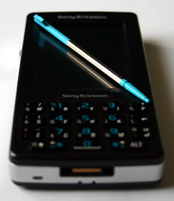
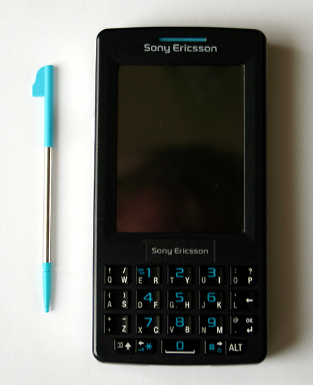
Keyboard… This is the main feature of an M600i. Main keyboard consists of 15 large buttons, each of which has a concave surface and can be pressed in both directions – left or right. Symbols (Latin, in my case) are backlighted by light green and the button block in the three middles rows of the keyboard is backlighted by bright green. Backlight is not blinding and bright enough. But the light that seeps from the button side edges bothers a bit.
Is it hard to press the buttons left – right? No, it’s very easy. And you get used to this typing mode very fast. Although, Nokia E70 keyboard is bigger and more comfortable, even though, you have to use both hands on it. I cannot compare M600i and Nokia E61 as I haven’t tried the last one yet.
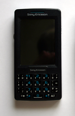
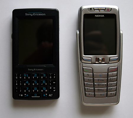
And again I have to mention the difficulties of smart phone localization. M600i that I got is from the first engineer samples that have been in the hands of testers for a while now. Later on Russian smart version followed in its path. But the fact remains that I could not experience the pleasantries of Russian keyboard input. English is not my language. Of course, I tried to work something out, but the result was quite obscene (woe is me). That’s why I am saying that the device is surely great, but I wasn’t impressed by it. And I used the virtual keyboard for text input instead of the input buttons wearing… two pairs of glasses…
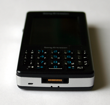
Five extra small buttons are located under the main keyboard. These are the same as Shift, Alt, Space, Left and Right PC buttons. Space button also bears the number “0”.
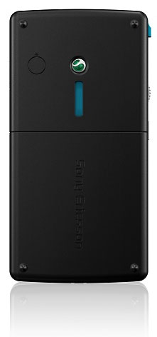
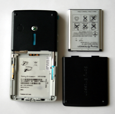
There is nothing except for the rectangular “loud” speaker slot, also covered by a green grid (from the inside), trademark SE logo (green and white drop) and a cork for the exterior antenna adapter on the front phone panel, also made from black lusterless plastic. Main part of the panel is removable – it’s a battery cover.
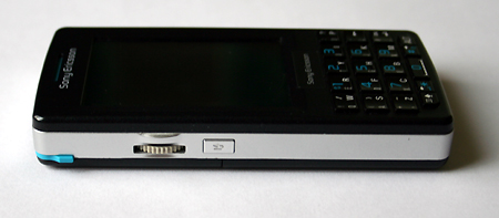
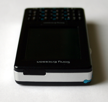
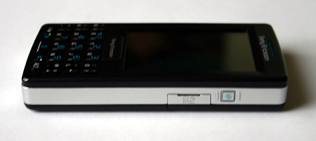
Window of an IR port and a tiny phone switch button interlocked with it are located on the right (if you look on the front phone panel) upper edge (all edges are made from silver painted grey plastic, the paint can fall off with time). On the right edge, there is a programmable button (mine starts the system menu – that’s how I programmed it in the settings) and a Memory Stick Micro (M2) format memory card slot cover. Flash memory cards up to 1 GB volume are supported. In my case, there was no card, so I had to do with 80 MB of system memory. Not a big trouble, considering that the smart has no camera and I had no M600i adapter set (i.e. no music). There are a few programs for this platform anyway. And books (Java, I never found a text files reader) don’t take up much space.
Slot cover is fastened by a taut loop. And I suppose that it’s not very comfortable to insert and take out the memory card as the cover wants to stay in the closed mode. I cannot say anything about the solidity of the loop, although it is obvious that it’s not metal.
On the lower edge, there is a standard for all SE third generation phones system adapter that connects all the accessories beginning from the charger and ending with the PC and wire set synch cable. Near the back panel, there are two ears for the neck lace that is fastened Sony Ericsson-like, i.e. inserted under the battery cover. You can see a microphone slot on the left (looking at the front cover).
And now – the left edge of the phone. Stop action is the only button. Very smart – while one finger is working with the stylus, you can always stop an option chosen in error or a wrong command… And what’s near it? Yes, it is the navigation wheel. Thing that was always included into the brand style set of Sony gadgets. Was, but not anymore as the pocket PCs from that great company are nowhere to be seen any longer… But this wheel came back. And that’s very good news.
You can choose menu options with this wheel and also start programs. Very useful thing.
Stylus is inserted into a slot at the meeting point of the upper and left frame edges. It is composite. Tiny metal stick with two plastic ends. Upper one with a sharpened inner end is removable. I have no idea why you would need this. I didn’t find any restart wholes (like in Palms).
What else? Lithium battery. 900 mAh volume. Working time in the waiting mode - up to 340 hours. Working time in the active mode (conversation) is huge – up to 7.5 hours. In one word – excellent.
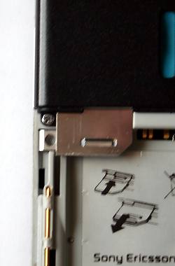
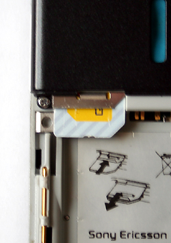
SIM card has a complex fastening. It is inserted into a slot in the upper part of the frame and is held by the battery. In order to take out the card, you have to pull the metal plate of the frame towards yourself. It’s not very nice, but quite original. And… comfortable. I am telling you for sure – the card isn’t loose and the fastening doesn’t fall off (like in the most expensive Nokia smarts).
All in all, Sony Ericsson looks like a solid and trustworthy device. More than a phone and not a “calculator” like Nokia E61... One individual, an E61 user, already got his share – someone in the subway told him to call using an accountant’s abacus. Funny people…
System
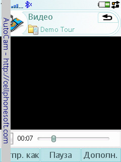
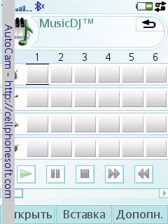
I can say just a bit about the multimedia M600i composition as the smart phone has no camera and I had no earphones. There is a video and audio player. I like the video (demo). It is enough to tap the screen with the stylus n the playing mode and the window opens to the landscape mode (horizontally), taking up the whole screen. Quality is good. I suppose that you can try to convert a real movie for this device – there is enough memory on the memory card (there should be a 64 MG memory card included with the device).
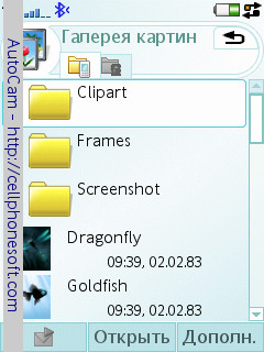
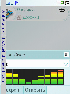
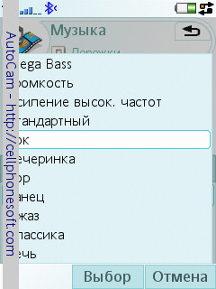
Audio player has an equalizer with a large amount of presets. It only lacks user settings. And it’s such a pleasure to look at photos (downloaded from a PC) on this screen…
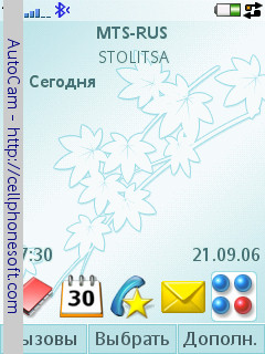
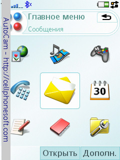
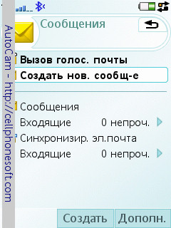
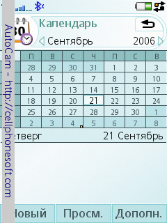
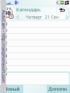
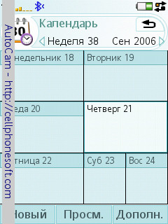
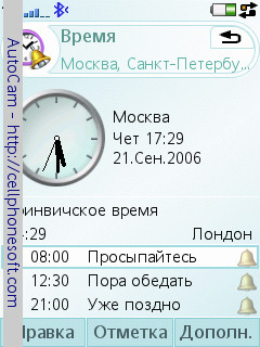
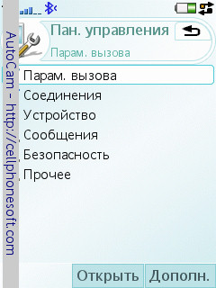
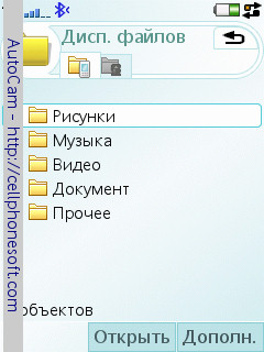
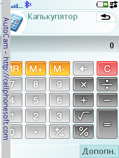
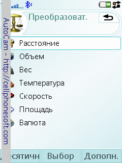
What did I like about the system itself – the program environment that an M600i will use? First, the screen space. Fonts are not big, but are better visible than the Nokia fonts (with the S60 3rd version system). Second – comprehensive and useful applet and settings location. Again, it looks better than on Nokia smart phones... But these are only subjective impressions.
And the objective ones are not only delightful. Sensory screen and stylus are not the best instruments for the use of the smart as a phone. I’ve already mentioned the difficulties with Russian keyboard input (to be exact, the impossibility of such). But you can write using the keyboard on screen. And it’s very uncomfortable as the buttons are tiny. You can just play around with the handwriting recognition as the system does not understand Russian.
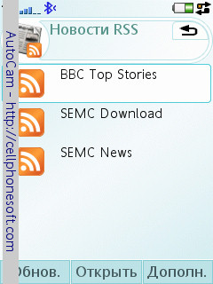
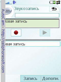
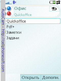
I would get a totally different impression from Russian device. Main M600i function (besides phone functions, of course) is that the smart is a miniature typewriter with vast communication capabilities. It’s not hard to get used to writing with double motion buttons – that I already figured out from my bit of experience. Phone has a full set of office programs. I.e. you can open, edit and create text documents in Word format and tables in Excel format. Great dictaphone as well. Also fast text notes. And a great mail client. As well a web browser (“Opera” – what else do you need?). Also, practical business programs that you can find on the Internet (free and commercial). And etc…
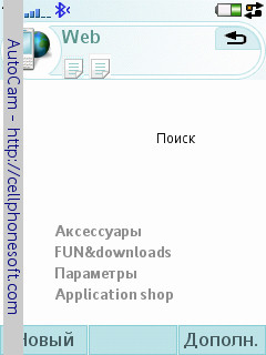
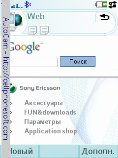
M600i has a great built in Bluetooth adapter. You can connect to a PC for synch via cable. There is no Wi-Fi... But that’s not the point. I don’t think that Wi-Fi is a serious and essential instrument for business application of a smart phone. Nevertheless, the screen of the smart is too small for web pages and the memory is too limited for downloading something to the device. ICQ? You’ll get tired clicking the buttons, trying to type fast a proper answer. To make a long story short, I wasn’t impressed even though I have a wireless net at home – an ADSL modem with a built in Wi-Fi adapter. When you connect to the Internet from a laptop, while lying on your couch, that’s a big deal, yes. Staring at the smart screen, endlessly wiping off your glasses – no, thank you… That’s why I don’t consider a great disadvantage the absence of a Wi-Fi in M600i as well as I don’t consider a great advantage the presence of a Wi-Fi in the last Nokia smart phones...
Well, of course, you cannot escape comparing with technology from Nokia. They play on the same field. And Sony Ericsson M600i in this company looks suitable, at the least.
Conclusion
In the end of every review I ask myself one and the same question – would I buy this device? Would I pay my hard earned money for it (although, I don’t make enough to buy a new phone every week)? Question is a bit naive, but reasonable.
Thing is that every new device practically gets me all worked up. I fall in love with some phones. I get angry at others for not living up to my expectations. And I, like many of the readers of these notes, constantly toil with the problem of choice. I want everything – practically, everything, including the least expensive (but so nice) phones. And constantly say, look, friends, how precious it is! Go ahead and try it out yourself (for example, come into a store and talk to a manager about “buying” a new phone). And don’t suspect me of prejudice or dirty advertising. There is none of that. And never was any. Advertising is one thing and an attempt for an independent technological review is another. I don’t advertise anyone or anything here… except, maybe, for my own… misgivings…
So this device was a discovery for me. I read reviews, looked at photographs. When I took it into my hands, everything turned out to be different. Yes, the phone is unusual. Yes, with a good quality sensory screen (that greatly fades in the sunlight – I forgot to mention that). But if you would only see the screen. And the video it plays. And the text that you do not have to convert on a computer.
Would I buy it? I don’t know. But I won’t pick it on it either. Device is interesting… That’s my verdict, as vague as it sounds.
© Nikolay Nadezhdin, Mobiset.ru reviews
Translated by Olga Mexina (info@mobiset.ru)
Published — 28 September 2006